Skip to content
Details

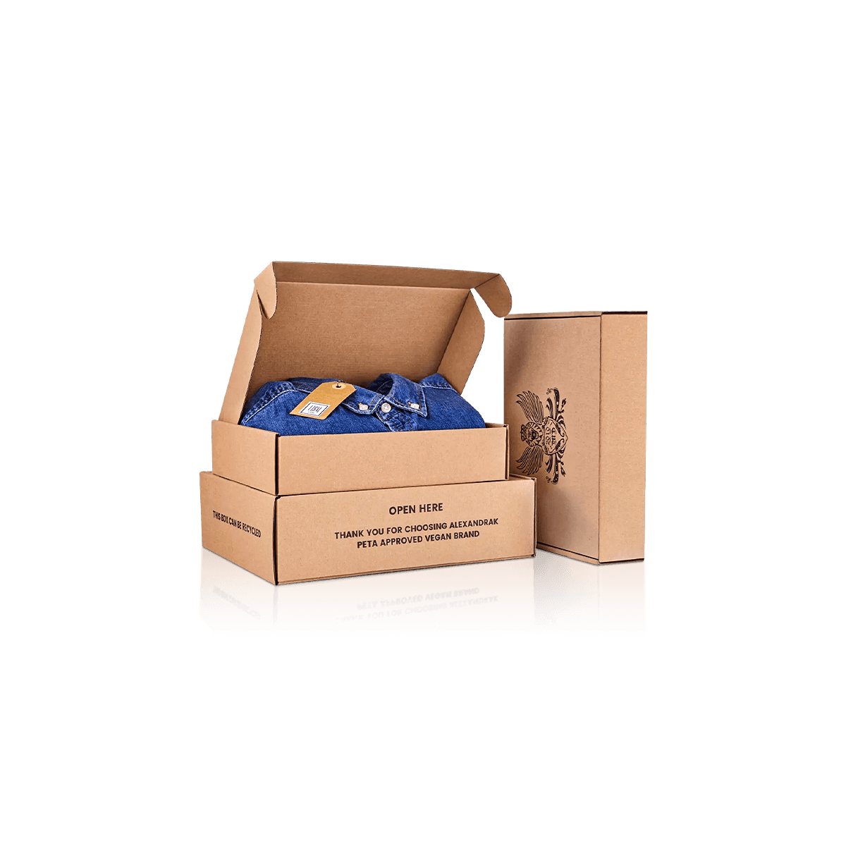
Custom Kraft Apparel Boxes

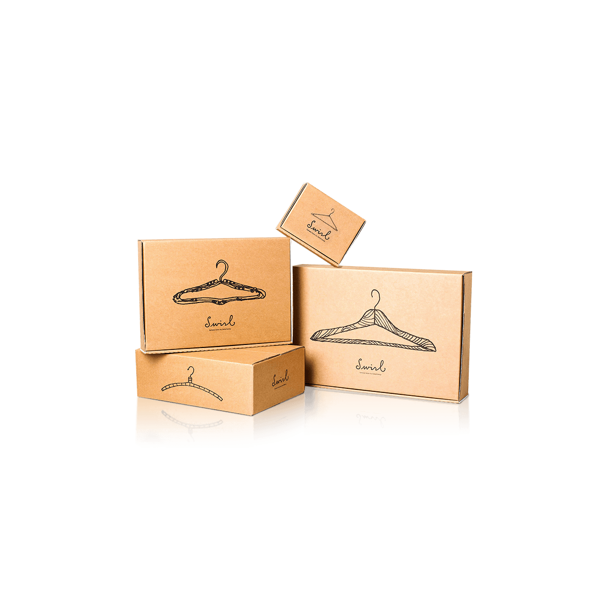
Use the natural brown stock deliberately, with print contrast, board construction and garment presentation planned around what kraft changes rather than treating it as a color swap.

Brown Stock Changes Every Color

Kraft is not a neutral background.

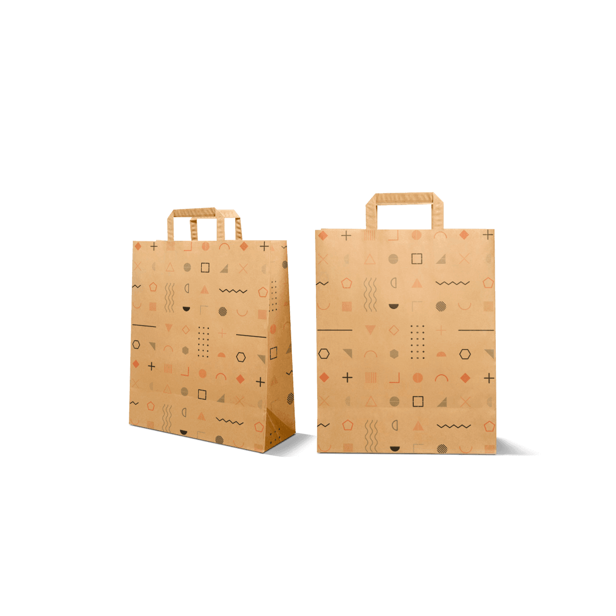
Artwork created on a white screen or approved on white paper can look noticeably different once it is printed over brown stock. Pale colors lose contrast. Bright hues can appear more subdued. Areas left unprinted show the board itself, so the material becomes part of the visual design.

Custom Kraft Apparel Boxes work best when that brown base is treated intentionally from the first artwork decision.

This is what separates the pack from a generic Apparel Box that happens to be produced in kraft. Here, the substrate affects the color system, graphics, surface character and structural choices throughout the specification.

Design With the Brown Showing

Kraft often works particularly well with strong typography, dark inks, line art, limited-color graphics and layouts that deliberately leave areas of stock exposed.

The unprinted surface can create contrast without covering every panel in ink.

Dense artwork developed for bright white board deserves more scrutiny. Fine tonal distinctions that look clear against white may become harder to separate once the kraft tone sits underneath them.

That does not mean kraft requires minimalist branding. It means artwork needs enough tonal separation to survive the substrate.

Do Not Approve Color From a White Screen

A digital mockup is valuable for composition and panel placement, but a monitor cannot reproduce the physical interaction between ink and natural brown paper.

If a particular brand color is commercially important, validate how it behaves on the intended stock rather than assuming the artwork file itself defines the final appearance.

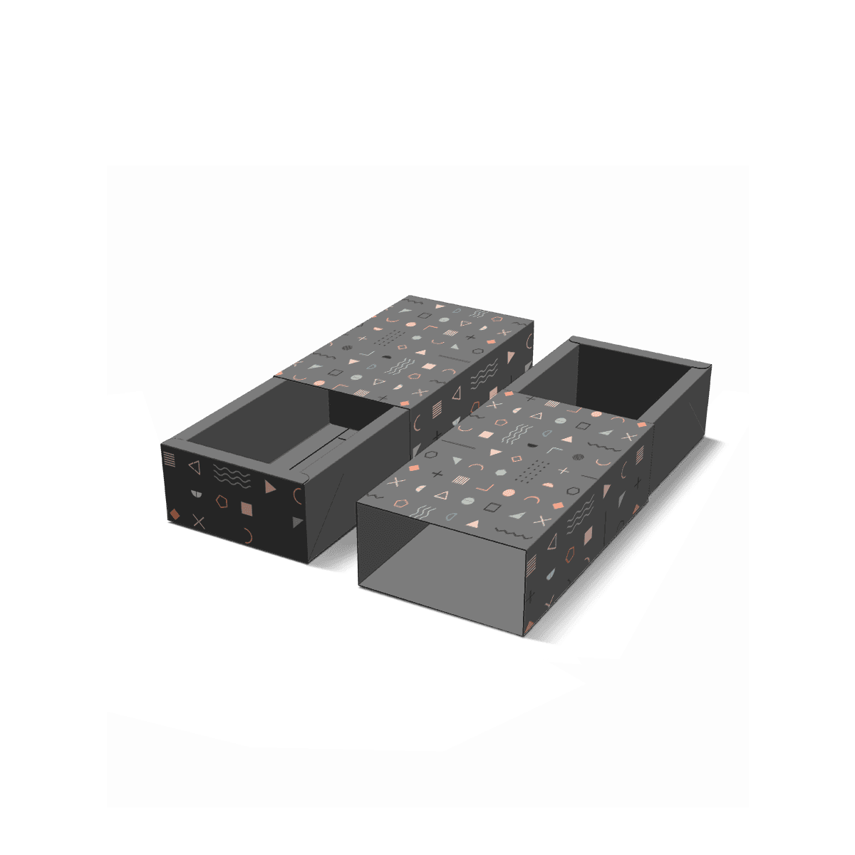
Custom Packly includes free 3D mockups for layout review. When the exact print-on-stock result needs physical confirmation, a fully custom pre-production sample can be arranged as a paid sample.

Testing belongs at the color decision because this is where the substrate changes the result.
Decide What “Kraft” Means in the Pack

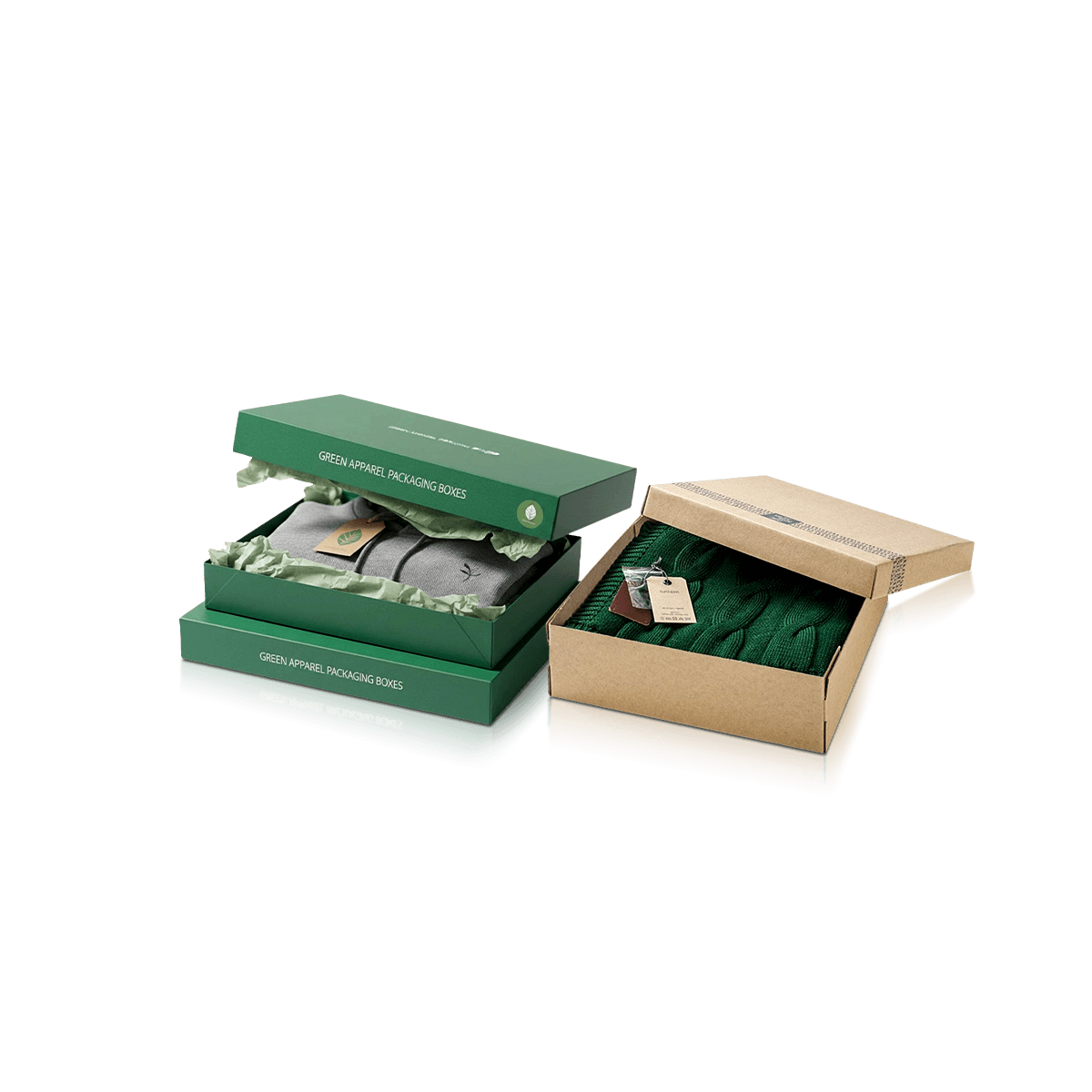
A kraft appearance can be used across very different box constructions.

A lightweight brown kraft paperboard carton, kraft-faced corrugated box and rigid box wrapped in kraft paper do not behave the same way. They may share a natural visual direction, but their wall strength, folding behavior, storage footprint and shipping duty are different.

Choose the construction before treating kraft as the complete specification.

Paperboard Keeps the Pack Light

Kraft paperboard suits folded shirts, light knitwear, lingerie, scarves and other apparel that primarily needs retail presentation and basic organization.

It can be die-cut, scored and stored flat, making it practical when packaging volume matters in the stockroom.

Brands that prioritize flat storage and quick erection can use Folding Apparel Boxes with kraft stock when that structure suits the garment.

Corrugated Kraft Handles More Duty

A kraft-faced corrugated structure makes more sense when the box itself needs greater resistance to stacking and parcel handling.

The fluted layer changes the thickness and edge appearance. It also changes the way folds, print and box proportions behave compared with a lightweight paperboard carton.

When the branded apparel pack must move directly through fulfillment, Mailer Apparel Boxes place that shipping duty at the center of the structure.

Kraft Wrap Can Still Be Premium

Natural-looking packaging does not have to mean lightweight packaging.

A rigid board box can use a kraft outer wrap when substantial walls and a stronger gift presentation are required. In that case, the brown paper creates the visual surface while the rigid board underneath provides the structural body.

The differences between paperboard, corrugated material and rigid board matter more than the fact that all three can appear brown.

High Contrast Beats Forced Color

Kraft rewards artwork that acknowledges the substrate.

Black, deep colors and strong line work can remain visually clear because they create enough difference from the brown stock. Very light hues and subtle tonal changes need more care.

The practical question is not how many colors can be printed. It is which colors still perform after the white background has disappeared.

Brand Colors May Need a Different Route

Suppose a clothing label uses pale coral, cream and a medium tan as its core palette.

On white stock, the three colors separate cleanly. Put the same artwork directly onto natural brown kraft and the cream may lose much of its visual presence while the tan moves closer to the substrate.

Increasing ink coverage everywhere is not necessarily the best correction.

The brand could simplify the kraft version around its darker coral and typography, allow more natural board to remain visible and reserve the full pale palette for other packaging. If exact reproduction of the original palette is essential, white stock may be the stronger choice.

The practical improvement comes from changing the design decision, not pretending the substrate is invisible.

If precise color reproduction carries more weight than the brown surface, Custom Printed Apparel Boxes put print execution at the center.

CMYK and Pantone Still Depend on the Stock

CMYK and spot-color systems control ink differently, but neither turns brown paper into white paper.

The choice between CMYK and Pantone printing should therefore be made with the final stock in mind.

Premium offset printing can support sharp artwork and controlled reproduction across apparel runs. The kraft base remains part of what the eye sees.

Unprinted Areas Still Need Art Direction

Leaving kraft visible is a design choice, not the absence of design.

Large blank zones can create strong contrast around a logo or garment name when spacing is intentional. The same empty area can look unfinished if artwork merely stops because the brand chose to print less.

Use panel proportions deliberately.

A centered wordmark on a broad lid may need considerably more surrounding space than the same mark on a small cosmetics carton. Side panels can carry size, color or SKU information without crowding the main surface.

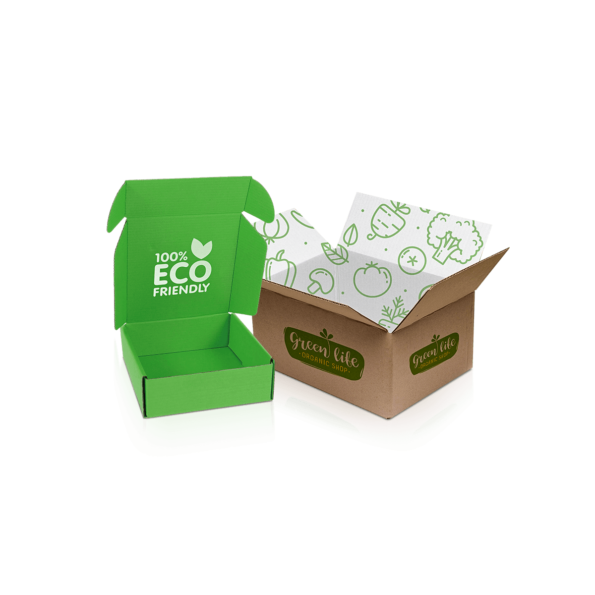
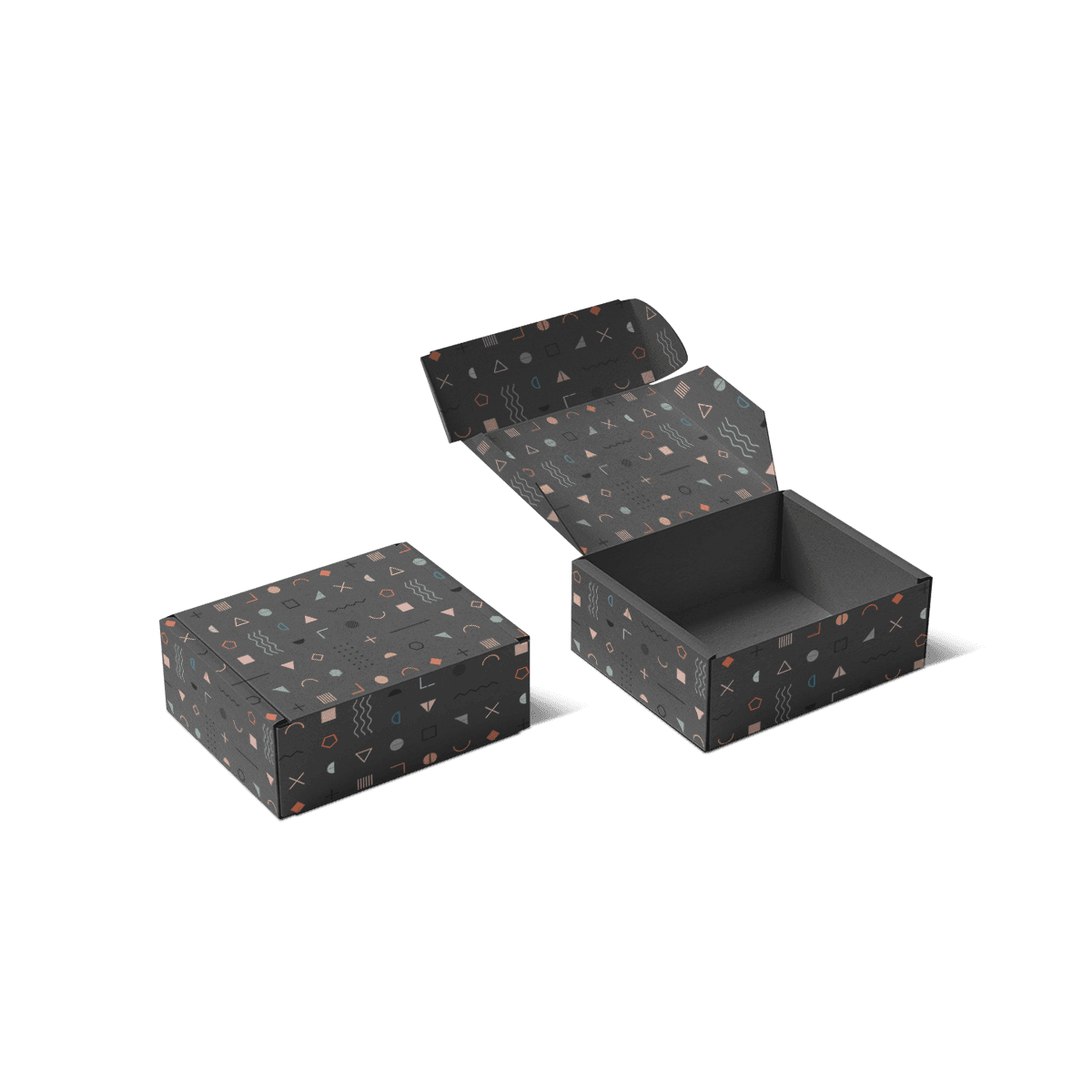
Interior printing can also create a useful change in visual intensity. A restrained kraft exterior can open into stronger graphics inside, giving the garment a distinct reveal without saturating every exterior panel.

The box and garment should work together. A highly patterned clothing line may benefit from quieter packaging. A simple neutral apparel collection can give the box more graphic responsibility.

Scores Interrupt Heavy Print

Kraft Apparel Boxes frequently use folding structures, and folding introduces physical stress exactly where flat artwork crosses a score.

Large areas of ink that pass over working folds can look different once the board bends. Fine artwork placed too close to creases can also lose visual precision after assembly.

Plan the graphics around what the carton does.

Give Logos Stable Panels

Primary logos, small typography and precise line art belong on areas that remain comparatively flat after assembly.

Patterns and broad background fields tolerate folds more comfortably because small visual changes at a crease are less disruptive.

This matters on shallow garment cartons where large lid and base panels are connected by relatively narrow wall sections.

Board Thickness Affects Folding

A thicker kraft construction can add stiffness, but it also changes how a score needs to form.

More material is not automatically better. The board must still fold cleanly enough for the intended structure and packing process.

Paper stock, print method and board construction should be settled after the garment footprint and handling duty are known.

Surface Wear Is More Visible in Some Designs

Apparel boxes are stacked, slid across packing tables, handled by retail staff and sometimes placed inside outer shipping cartons.

Those actions affect the printed surface.

A kraft design with generous unprinted areas may disguise some handling variation better than a large field of solid ink. Conversely, dark printed areas can make rubbing or edge wear easier to notice because any disruption contrasts strongly with the surrounding color.

Think about where hands and neighboring boxes make contact.

Bottom edges, lid corners and broad side panels tend to encounter more handling than a protected center area.

Matte coatings, foil, embossing and spot UV should be placed where folds and high-contact edges will not undermine the intended effect.

A highly finished kraft box can work. It simply stops behaving like an intentionally raw, low-intervention surface once several treatments are layered over it.

Kraft Does Not Prove a Sustainability Claim

A brown box may look natural, recycled or environmentally preferable to a customer. Appearance alone does not establish any of those facts.

Do not use the color of kraft as evidence of recycled content, certification, recyclability or a particular environmental impact.

Those claims depend on the actual material specification, coatings, laminations, adhesives and sourcing documentation behind the package.

This distinction matters for apparel brands because packaging copy sometimes turns the visual language of brown paper into an unsupported sustainability statement.

A safer design approach is to let the material look like kraft without making claims the specification cannot prove.

The physical material choices behind paperboard, kraft, corrugated and rigid board should be evaluated separately from marketing language placed on the carton.

If a verified environmental requirement is central to the project, it should be established as a material requirement before artwork begins.

Garment Fit Still Comes Before Material

Choosing kraft does not solve an oversized box.

The garment still needs a sensible folded footprint and depth. A tee sliding around inside a large kraft carton is still poorly fitted packaging, even if the board and artwork look coherent.

Measure apparel in the actual packed state with tissue, garment bands, tags and other pieces included.

Light Garments Need Less Depth

T-shirts, shirts, lingerie and scarves can suit shallow kraft cartons when their folds remain stable.

A paper belly band or tissue wrap can control slight movement without filling the box with additional components.

Heavy Apparel Can Bow the Walls

Denim, thick knitwear and multi-piece packs produce more weight and outward pressure.

A lightweight kraft carton chosen primarily for appearance may no longer be the correct structure. The answer may be a deeper specification, stronger paperboard, corrugated construction or a different packaging direction entirely.

Material identity should never override the mechanical job.

Store-led programs can align the garment, labeling and merchandising decisions through custom retail packaging when shelf handling matters as much as the kraft appearance.

Shipping Can Change Which Kraft Structure Wins

Natural brown packaging is used in both retail cartons and corrugated shipping boxes, which can make the two jobs look deceptively similar.

They are not interchangeable.

A kraft paperboard box can present a garment cleanly at a boutique counter while lacking the edge and stacking strength expected from a parcel shipper. A corrugated kraft mailer can handle more transit duty but creates thicker walls and a different visual finish.

For online orders, decide whether the Kraft Apparel Box is the presentation pack or the parcel pack.

If it is presentation packaging, a fitted shipping box can take carrier labels, stacking and external wear.

If the kraft box itself must travel directly to the customer, corrugated construction may be the cleaner choice.

Do not strengthen every retail box solely because part of the apparel business sells online. Separate the duties when doing so creates a better pack.

Use Kraft Where Variation Helps the Brand

One of kraft's strengths is that it does not have the visually perfect, highly uniform character of a bright coated white surface.

For some fashion brands, that physical paper character fits the intended identity. For others, small material variation or a less luminous printed color can feel inconsistent with the brand system.

That distinction should be made before quantities grow.

A workwear label, craft-led fashion line or restrained boutique identity may integrate the brown substrate naturally. A brand built around bright cosmetic-like color fields and exact pale tones may spend more effort fighting the kraft surface than benefiting from it.

Neither direction is inherently superior.

The question is whether the substrate supports the brand without forcing constant compromises in artwork.

This also prevents kraft from becoming a trend decision. Material selection should survive the next collection rather than depending on one seasonal visual mood.

Price the Print You Will Actually Use

Kraft can encourage simpler graphics, but simple-looking packaging is not automatically simple to produce.

Box dimensions, construction, print method, coverage, finishing and quantity still affect the specification.

The USA MOQ starts from 100 boxes, which can suit a smaller apparel launch or a controlled test of a new material direction.

When color-on-kraft is unfamiliar to the brand, it can be smarter to settle that print behavior before expanding into several box dimensions or artwork variants.

Pricing should follow the exact size, construction, print coverage, finishing and quantity rather than a generic kraft-box assumption.

Let Brown Be a Deliberate Brand Asset

The strongest Kraft Apparel Boxes do not use brown board because kraft packaging happens to be fashionable.

They use it because the stock contributes something specific to the apparel presentation.

That may be contrast against black typography. It may be the tactile character of an uncoated surface beside denim or workwear. It may be a restrained exterior that lets a colorful garment dominate after opening.

It may also be the wrong material for a collection that depends on brilliant whites, pale color accuracy or a highly polished visual surface.

Knowing when not to use kraft is part of specifying it well.

Keep the substrate when its natural tone, print behavior and structural form strengthen the clothing brand. Change direction when the artwork spends most of its effort trying to hide the board underneath.

That gives Custom Kraft Apparel Boxes a clear purpose: brown kraft becomes an active part of the packaging system rather than a generic material label placed on another apparel carton.

FAQs

Bold logos clean typography and high-contrast artwork usually read better than overly dense graphics because the brown base tone stays visible.

Folded T-shirts denim sleepwear scarves lingerie and lightweight accessory sets are common fits when the pack is sized around the garment depth.

Kraft is the better fit when the natural brown stock and its print character are part of the intended presentation. Luxury Apparel Boxes make more sense when rigid structure, heavier finishes and keepsake reuse matter more.

Yes. A simple paperboard platform or folded insert can hold belts scarves socks tags or thank-you cards in place and keep the box from looking loose.

They can be when the board choice matches the route. Paperboard works for lighter retail packs while reinforced kraft or corrugated formats handle direct-to-consumer shipping better.

Process

How it works

Your Packaging Journey, From Idea to Production and Delivery

01

Tell Us Your Specs

Custom packaging boxes

Tell Us Your Specs

Provide size, quantity, printing, and finishes.

02

Get a Fast Quote

Custom packaging boxes

Get a Fast Quote

Instant transparent pricing, no hidden fees.

03

Design and Approval

Custom packaging boxes

Design and Approval

Artwork checks, revisions, and final sign-off.

04

Produce

Custom packaging boxes

Produce

Expert manufacturing to meet deadlines.

05

Ship to Your Door

Custom packaging boxes

Ship to Your Door

Hassle-free, flexible delivery options.

Get Your Quote for Custom Kraft Apparel Boxes

Share your product details, size, quantity and artwork needs. We’ll help choose the right packaging style and send a clear quote.