Skip to content
Details

Custom Die-Cut Cone Sleeves

Change the sleeve silhouette without sacrificing grip, cone clearance or service speed by designing every cut around the formed cone.

Shape Removes Structural Material

Die cutting matters when the shape itself needs to do something a standard curved edge cannot.

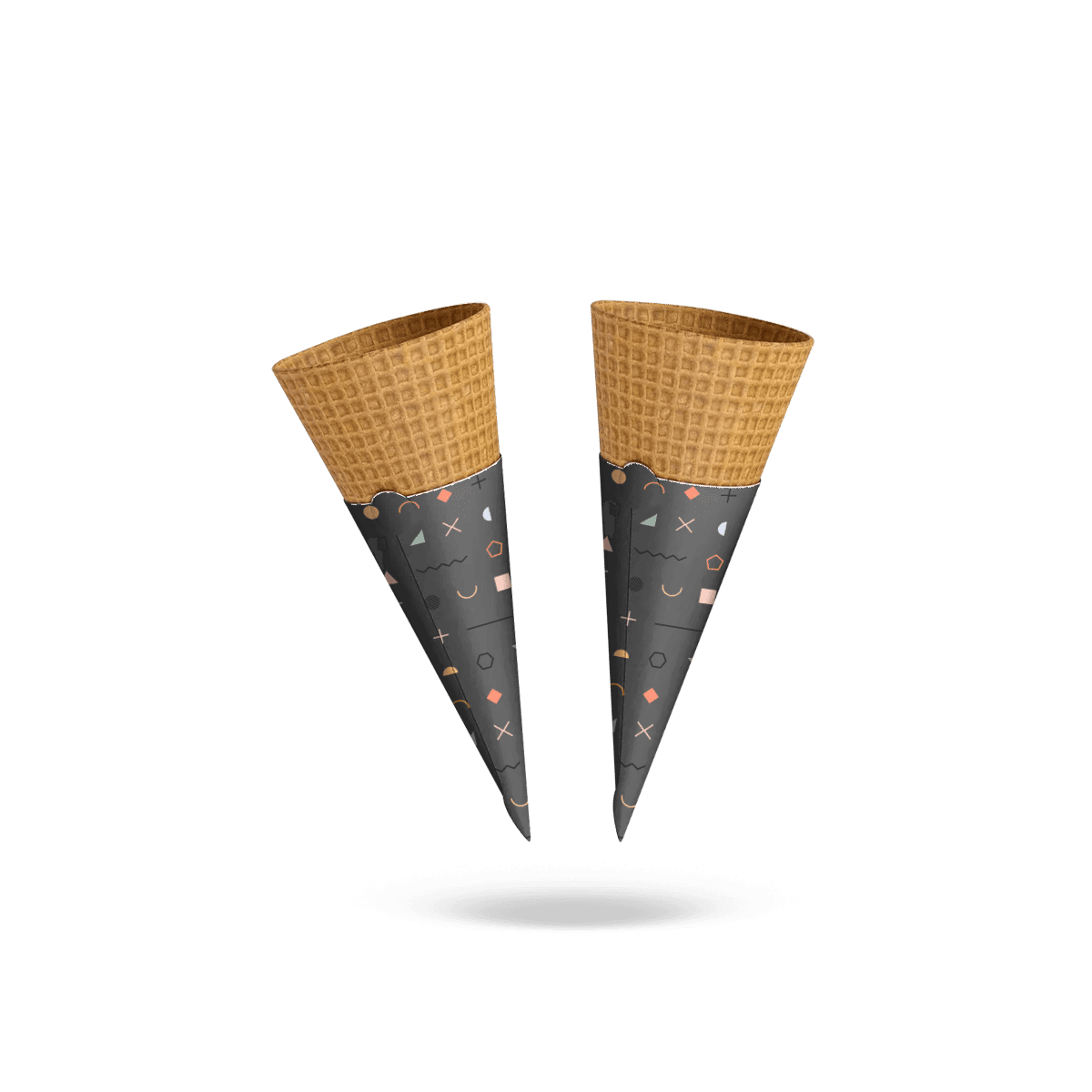
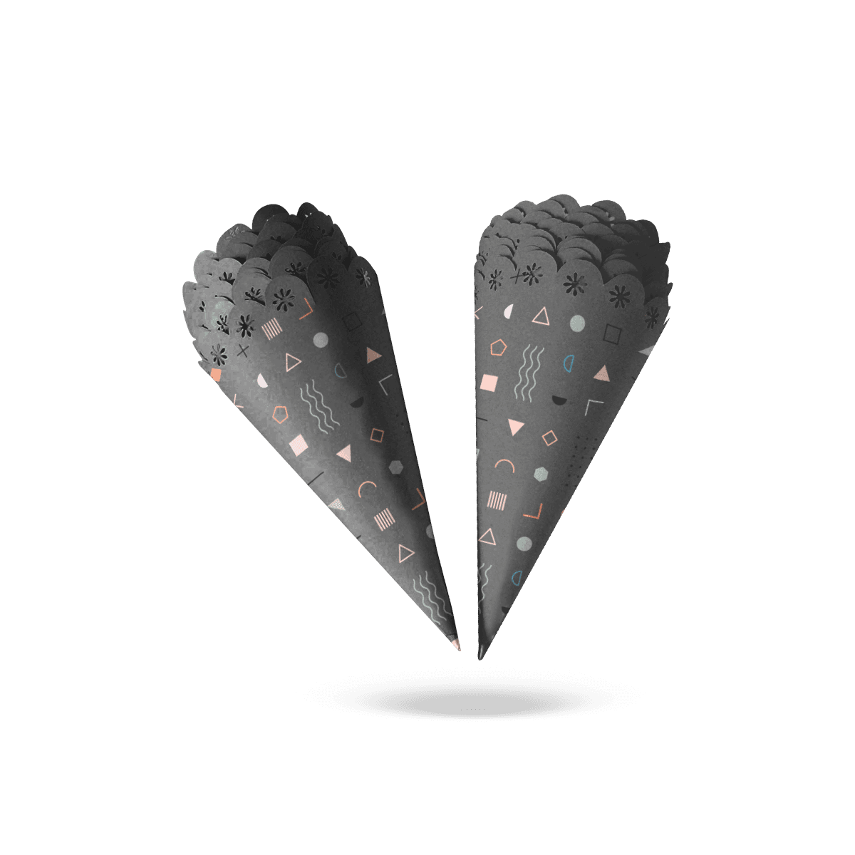
A scalloped top can frame the serving. A stepped contour can create a stronger silhouette. A small notch can establish a recognizable brand feature. A carefully placed cutout can expose part of the cone or create visual interaction between the food and printed sleeve.

The cut should have a job.

Custom Die-Cut Cone Sleeves become weaker when decorative shapes are added simply because the production process can make them. Every removed piece of material changes edge strength, printable area and how the sleeve behaves in the hand.

The strongest starting point is therefore not the artwork. It is the finished outline around the actual cone.

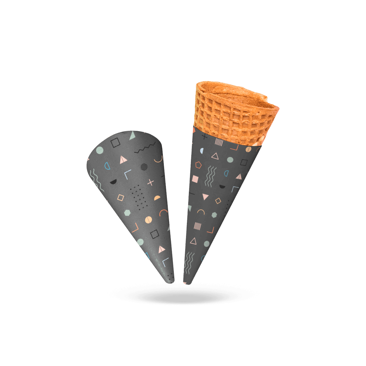
The custom cone sleeve still needs the correct taper and grip position underneath the shaped edge.

Shape the Upper Edge

The upper edge is usually the safest place to introduce a visible contour because it sits away from the narrowest part of the wrap.

A shallow wave, branded profile or asymmetric rise can make the serving easier to recognize without removing much material from the grip zone.

Deep cuts require more caution. They can reduce the sleeve’s ability to stay flat against the cone or leave narrow paper points that bend during stacking.

The shape needs to survive service, not merely look distinctive on the dieline.

Protect the Holding Area

Avoid decorative cuts that remove too much material where fingers naturally close around the sleeve.

A dramatic side notch may look strong when the piece is lying flat, but it can create a weak point once the sleeve wraps around the cone. Pressure from the customer’s hand can bend that area or make the edge uncomfortable.

Keep the main grip zone continuous unless the cut itself solves a real handling problem.
Cut Depth Controls Strength

The deeper a contour enters the sleeve, the more it changes the remaining paper structure.

This is particularly important on small tapered pieces. There is less material to begin with, so a few extra millimeters of cut depth can noticeably change stiffness.

A die-cut sleeve should retain enough uninterrupted stock to carry hand pressure between the upper edge, lower edge and overlap.

Narrow Bridges Bend First

Some shapes leave thin bridges of paper between cutouts or around decorative points.

Those narrow areas can curl, crease or tear earlier than the rest of the sleeve.

If the feature is essential to the design, give it enough material around the cut to behave like part of the sleeve rather than a fragile tab.

Tiny projections also complicate stacking because they can catch on neighboring pieces.

Corners Need Restraint

Very sharp internal corners concentrate stress.

Softer transitions and practical radii generally survive converting and handling better than extremely tight decorative corners.

The visual identity can still feel distinctive without forcing the die to reproduce fragile features better suited to print.

If the brand idea depends on fine illustration rather than actual shape, Custom Printed Cone Sleeves may preserve the visual effect with a simpler physical edge.

The Dieline Starts With Fit

The standard cone profile should be settled before decorative cutting begins.

Start with cone height, rim diameter, diameter through the holding zone and the intended sleeve height. Establish the wrap and overlap. Then develop the die-cut feature inside that working geometry.

Doing this in the opposite order creates unnecessary compromises.

A designer may create an attractive outline first, only to discover that the lowest point lands inside the customer’s grip or that the highest point climbs too close to the food.

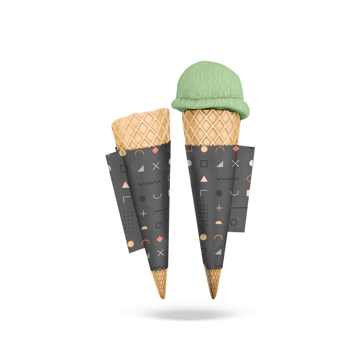
The cone sleeve sizing process begins with the real cone dimensions before the outer shape is finalized.

Form Before Refining

Review the contour on a formed sleeve, not only as a flat vector path.

The two-dimensional dieline can make a curve look balanced even though one side appears higher once it wraps around the cone.

Asymmetrical shapes need particular attention because the seam and natural front-facing area affect how the silhouette is perceived.

Seam Limits the Cut

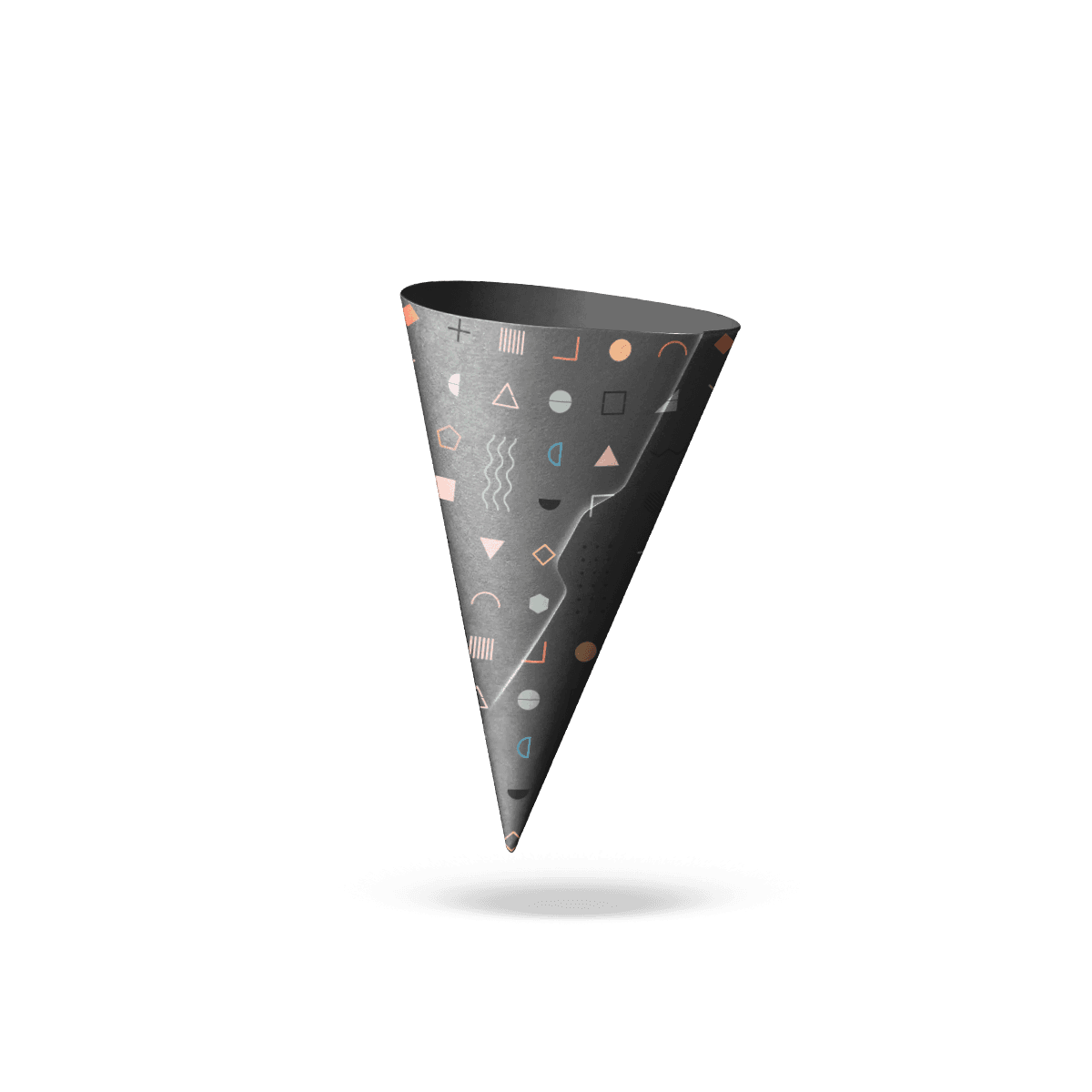
The overlap needs enough uninterrupted material for reliable joining.

Do not run a deep decorative contour into the seam unless the construction has been deliberately developed for it. A reduced bonding area can create lifting, uneven edges or a visible discontinuity after forming.

Keep structural and decorative geometry separate where possible.

Cutouts Need a Reason

An internal cutout can expose the cone, create a recognizable motif or make a campaign design more distinctive.

It also removes material.

That trade-off should be explicit.

A window-shaped opening through the sleeve is different from a printed window effect. The real cut can expose the cone texture and create depth, but it may also reduce grip coverage and bring fingers closer to the food surface.

Exposure Changes Handling

If the opening sits where fingers naturally rest, the customer may touch the cone through it.

That may defeat the reason for using a sleeve in the first place.

Place openings where they contribute visually without sacrificing the primary holding area.

The exact position will change with cone size, sleeve height and how the serving is handed over.

Small Openings Can Disappear

A tiny decorative hole may be obvious on the flat artwork but nearly invisible after the piece curves around the cone.

Before paying for a more complex die, ask whether the feature is large enough to read at normal viewing distance.

If the customer has to rotate the cone and inspect it closely to notice the cut, print may communicate the same idea more efficiently.

The Silhouette Can Carry Branding

Die cutting is most effective when the outline becomes part of brand recognition.

A recognizable contour can work without adding more printed copy. That is valuable on cone sleeves because the physical area is already small.

The shape can echo a brand mark, product theme or campaign concept while leaving the main printed face comparatively simple.

This gives the sleeve two communication layers: silhouette first, artwork second.

Repeat the Brand Shape Carefully

A logo element can inspire the top edge, but reproducing a complex logo literally as a cut line is rarely necessary.

Simplify it until the shape remains recognizable at sleeve scale.

Fine lettering, tight counters and tiny projections generally belong in print rather than the structural outline.

A die-cut profile should read instantly.

Seasonal Shapes Need Longevity

Seasonal campaigns can justify temporary contours, but the die itself becomes part of the production setup.

Before creating a one-event shape, consider whether it will be reused enough to justify a separate cutting tool and specification.

For a short-lived promotion, changing artwork on an existing sleeve shape may sometimes make more commercial sense.

For recurring holiday, venue or franchise campaigns, a distinctive die can earn its place through repeated use.

Artwork Must Respect the Edge

The die-cut line becomes a visual boundary, so artwork near that boundary needs more control than it does on a simple sleeve.

A printed outline that tries to follow the die exactly can expose normal cutting variation. Small shifts become noticeable because the eye compares the printed line directly with the physical edge.

Give the design enough tolerance to remain intentional after converting.

Avoid Hairline Borders

Thin borders running immediately beside a shaped cut are difficult to keep visually even.

The problem becomes more obvious around curves, points and asymmetrical contours.

Either move the border farther inward or use a broader graphic treatment that tolerates small positional movement.

Let Color Meet the Cut

Solid color extending through the bleed can make a shaped edge feel deliberate without demanding exact print-to-cut alignment along a fine decorative line.

The contour then does the physical work while the color field supports it.

Custom Packly can support the final dieline, artwork setup, prepress review, digital proof and free 3D mockup before production.

Stacking Tests the Shape

A standard smooth edge gives neighboring sleeves little to catch on.

A shaped edge changes that.

Points can hook into adjacent pieces. Deep scallops can interlock. Small tabs can bend while sleeves are packed, transported or separated at the counter.

That makes stack behavior one of the most important checks for a die-cut sleeve.

Separate at Working Speed

Take a production-style stack and have staff separate sleeves the way they would during service.

Do not pull each one carefully from a presentation sample.

Watch whether shaped edges snag, whether narrow features bend and whether sleeves remain easy to open.

If the contour adds several seconds of fiddling to every order, the shape is too demanding for the intended workflow.

Orientation Can Matter

Asymmetrical sleeves may need to face a particular direction for the shape and print to work together.

If orientation matters, storage should make that obvious.

Staff should not have to inspect both sides or rotate every sleeve repeatedly during a rush.

A simpler contour may outperform a visually stronger one if it removes an unnecessary service step.

At high-volume food counters, Food, Bakery & Restaurants packaging should support the same service speed as the sleeve.

Material Supports the Die

Stock choice affects whether shaped features hold cleanly.

Very light paper may flex too easily around deep contours or narrow projections. Heavy paperboard can preserve a defined edge but may resist forming around a tight cone.

The correct material depends on both the die-cut geometry and the cone radius.

Stiffer Stock Holds Profiles

A firmer paperboard can make scallops, peaks and stepped edges feel more deliberate because the material retains the intended outline.

But extra stiffness also increases springback and seam bulk.

Cardboard Cone Sleeves address caliper, springback and seam bulk when stock stiffness becomes the primary concern.

Barrier Still Stays Separate

Die cutting does not create grease or moisture resistance.

If the serving needs a barrier, choose the material construction for that requirement first and then determine whether the shaped edge remains practical.

A highly absorbent stock does not become better suited to wet service because the contour is distinctive.

If oily residue is the main risk, Grease-Proof Cone Sleeves put that material requirement first.

Shape Can Help Identification

A die-cut silhouette can distinguish servings without requiring customers to read small text.

That can help when a business uses several cone programs, event themes or promotional products.

The distinction should still be systematic.

One variant might have a shallow scalloped edge and another a stepped profile, but creating a different complex die for every flavor can create unnecessary production and stock complexity.

Reserve Shape for Big Differences

Use physical shape to distinguish differences that matter enough to justify separate tooling or separate sleeve specifications.

Use print for smaller changes.

That boundary keeps the packaging system manageable.

A permanent product line, recurring sponsor program or recognizable signature serving may justify its own die. A weekly flavor change normally does not need one.

Twin Geometry Comes First

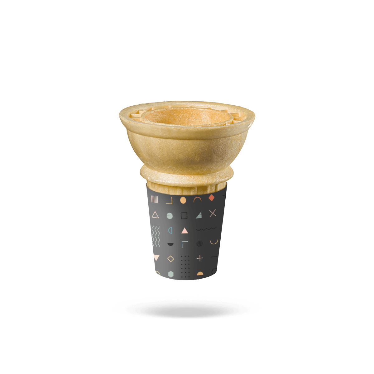
A molded twin wafer cone has two upper serving positions joining into one lower body, so its sleeve geometry is different from a decorative single-cone wrap.

If the edible cone has two molded upper serving positions joining into one lower body, the Twin Cone Sleeves decision should start with the shared lower geometry before decorative cutting is considered.

Events Reward Recognizable Shapes

A shaped sleeve can work particularly well where servings are photographed, carried through a venue or connected to a specific campaign.

The edge can create recognition before anyone reads the logo.

That makes die cutting more practical for recurring branded activations, seasonal food programs, concessions and event concepts than for a serving where the only requirement is inexpensive clean handling.

For venue and guest-service programs, Hospitality packaging should account for the event identity and serving sequence.

Photography Exposes Weak Cuts

An irregular or crushed edge is more noticeable when the shape itself is supposed to be a design feature.

If the sleeve will appear heavily in customer photos or campaign imagery, the contour needs enough structural integrity to survive filling and handoff cleanly.

This is another reason to avoid fragile points and unnecessarily deep cutouts.

Price the Die Separately

A die-cut sleeve should be quoted from its actual contour, not treated as a standard sleeve with a decorative label.

The production brief should include:

  • actual cone dimensions
  • sleeve height
  • intended grip position
  • finished contour
  • internal cutouts if any
  • paper or paperboard choice
  • print coverage
  • number of artwork versions
  • total quantity
  • anticipated repeat use of the die

Once the contour and production quantity are established, request an instant custom packaging quote from the final die-cut specification rather than a generic cone-sleeve estimate.

Simpler Cuts Often Work Better

A die-cut sleeve does not become stronger by becoming more complicated.

The most successful shapes usually make one clear physical change: a recognizable top profile, a controlled opening or a contour tied directly to the serving or brand.

Complexity should stop when it begins to weaken the grip, reduce seam area, slow stack separation or create fragile paper features.

The last decision is therefore whether the cut still earns its manufacturing complexity after the sleeve has been formed and handled.

If a simple curved edge plus strong artwork accomplishes the same job, printing may be the better tool.

If the silhouette itself remains recognizable, manufacturable and easy to serve, Custom Die-Cut Cone Sleeves have a clear purpose that standard printed wraps cannot reproduce.

FAQs

They make the biggest difference in high-visibility selling environments where packaging needs to catch attention fast, such as cinemas, mall kiosks, trade shows, stadium concessions, and branded pop-ups.

Not usually, as long as the structure is engineered well. The sleeve should still stack, open, and fill smoothly without turning the design detail into a production problem.

Choose Die-Cut Cone Sleeves when the physical edge, contour or cutout is the main visual or functional feature. Jacketed Cone Sleeves make more sense when the sleeve is intended to stay fitted through prep, storage and filling before handoff.

Usually, less detail works better. A clean die line, one strong contour, and good spacing around the artwork tend to hold print quality and shape retention better than overly intricate cuts.

No. They also suit fries, snack mixes, churro bites, tasting portions, and promotional food handouts where the package needs to look more event-ready or brand-led than a plain sleeve.

Process

How it works

Your Packaging Journey, From Idea to Production and Delivery

01

Tell Us Your Specs

Custom packaging boxes

Tell Us Your Specs

Provide size, quantity, printing, and finishes.

02

Get a Fast Quote

Custom packaging boxes

Get a Fast Quote

Instant transparent pricing, no hidden fees.

03

Design and Approval

Custom packaging boxes

Design and Approval

Artwork checks, revisions, and final sign-off.

04

Produce

Custom packaging boxes

Produce

Expert manufacturing to meet deadlines.

05

Ship to Your Door

Custom packaging boxes

Ship to Your Door

Hassle-free, flexible delivery options.

Get Your Quote for Custom Die-Cut Cone Sleeves

Share your product details, size, quantity and artwork needs. We’ll help choose the right packaging style and send a clear quote.