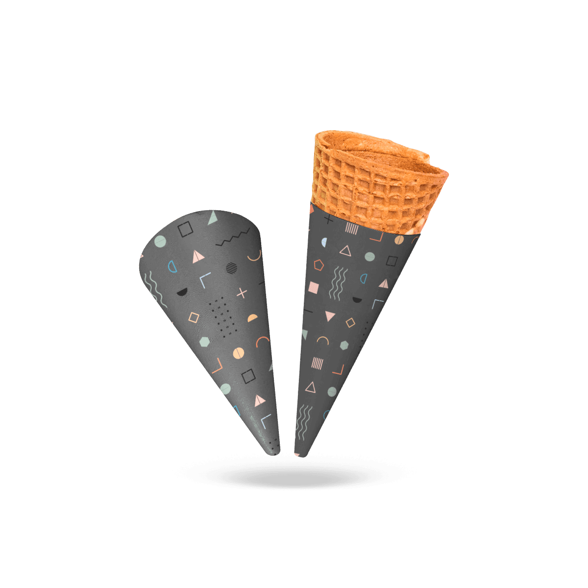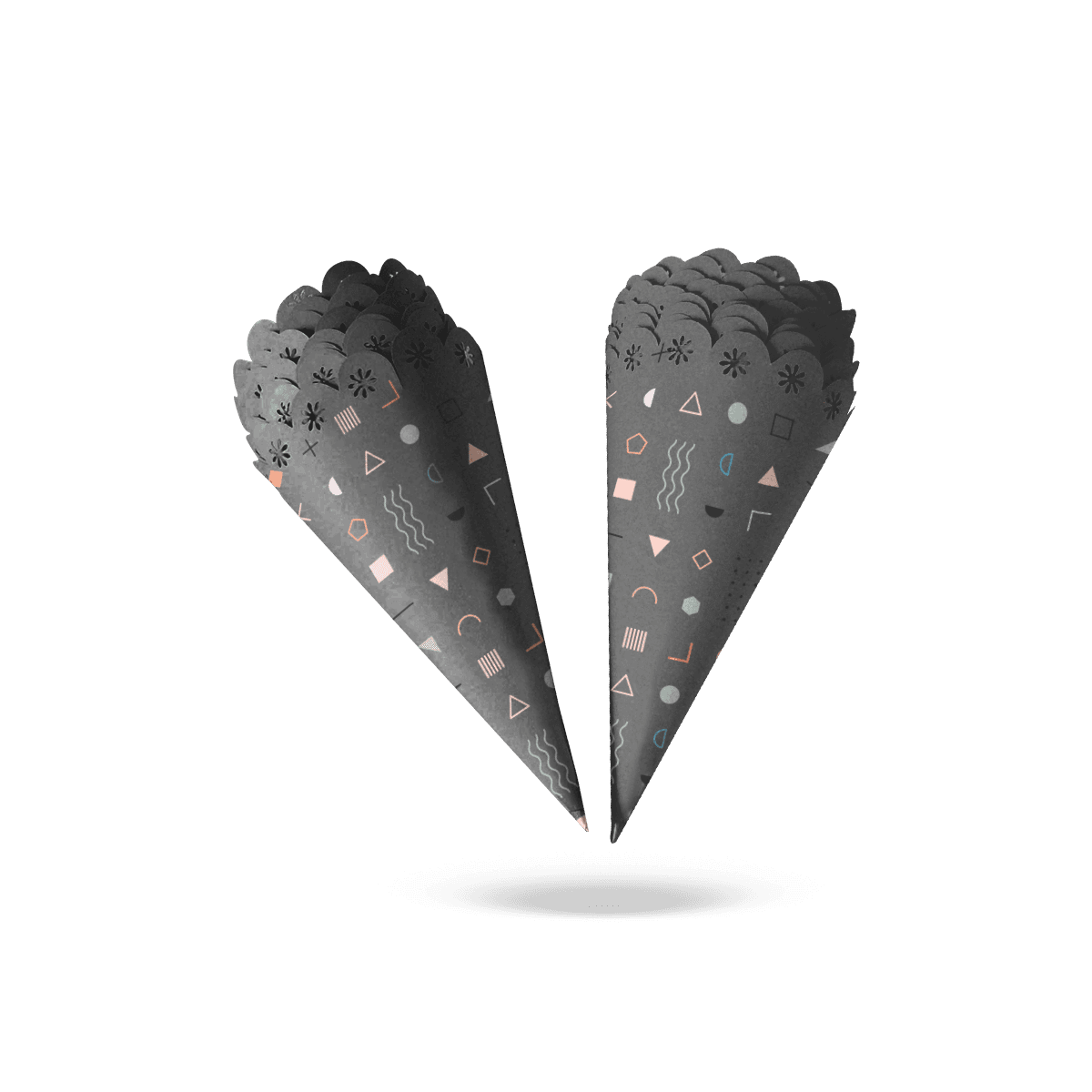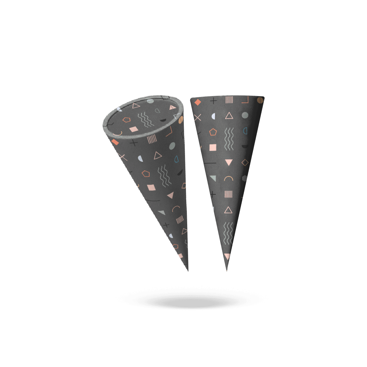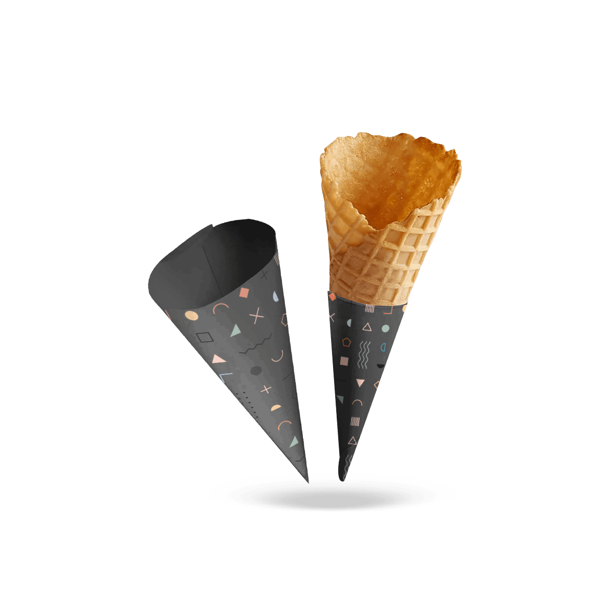
Design the Assembled Face
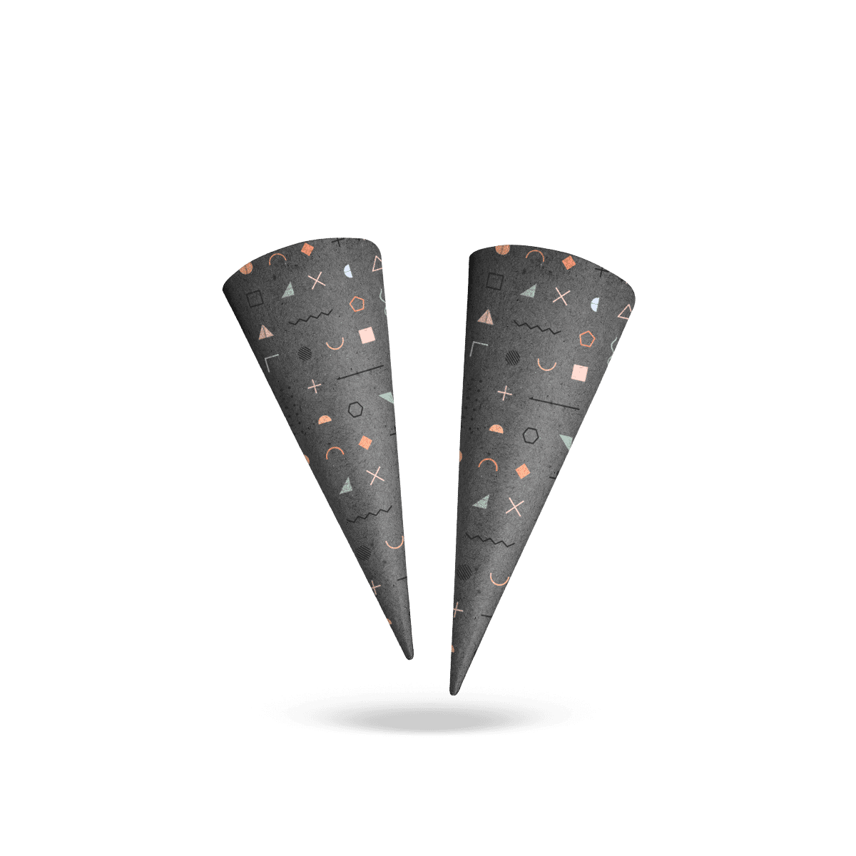
A logo can look perfectly centered on a flat artwork file and sit noticeably off-center once the sleeve wraps around a cone.
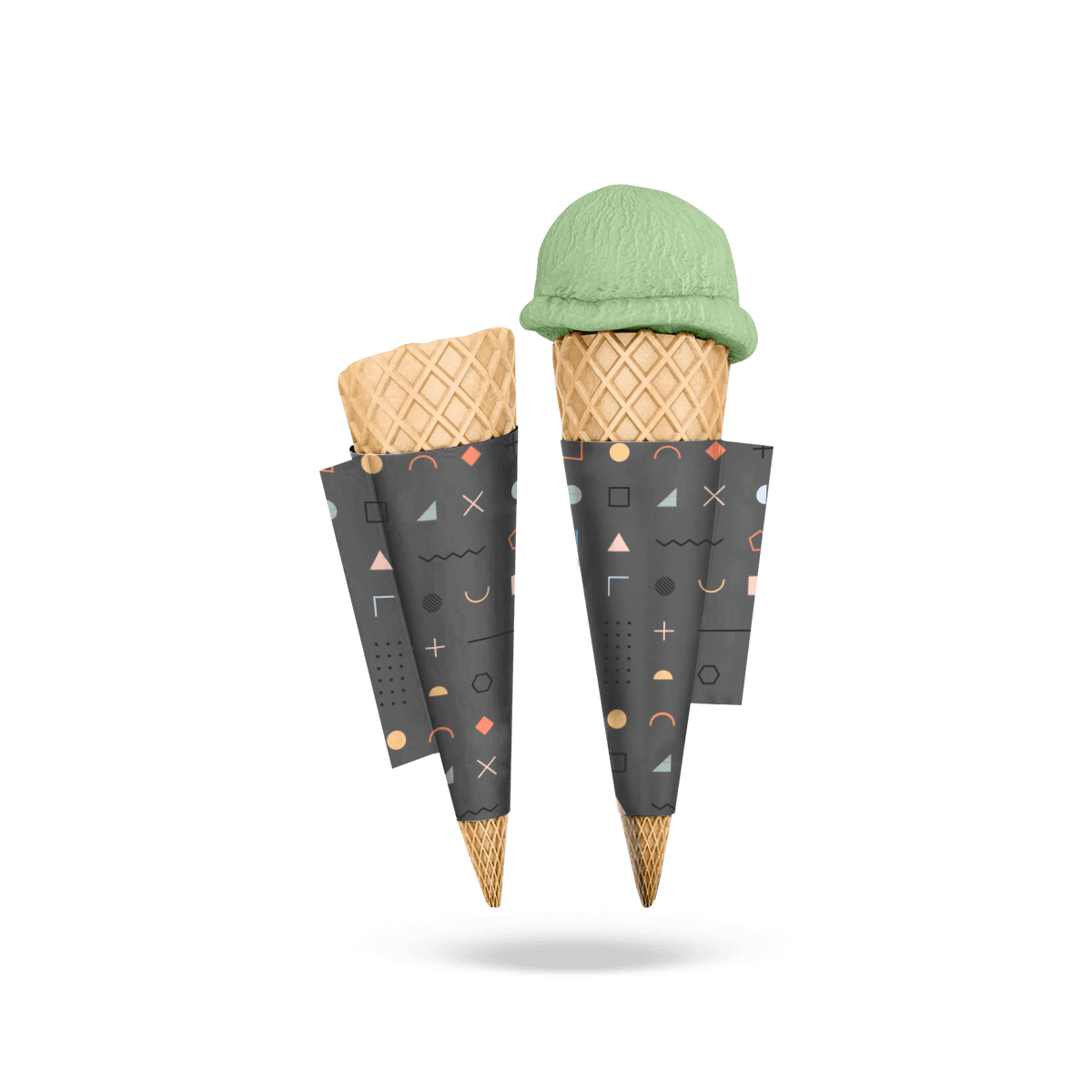
That is the defining print problem with Custom Printed Cone Sleeves. The artwork is being placed on a tapered curved surface, not a rectangular panel. The most important graphics therefore need to be positioned for the sleeve after forming.
The customer normally sees only part of the circumference at one time. A hand can hide another part. The overlap removes more visual space. Printing works best when the strongest brand elements occupy the part of the sleeve that naturally faces outward during handoff.
This is where printed sleeves differ from a material-led choice. Custom Cone Sleeves establish the fit and serving geometry first. This sleeve earns its separate role when artwork itself becomes a major part of the serving experience.
Find the Front Face
A cone does not give you one obvious rectangular front panel.
Before placing the logo, form the sleeve around the real cone and decide which part usually faces the customer. That visible area becomes the primary brand zone.
Place the main mark there first. Secondary graphics can wrap farther around the sleeve.
This matters most when staff insert cones quickly without deliberately rotating every sleeve. Artwork that only works from one exact angle can become inconsistent across a counter full of servings.
Leave the Grip Alone
Customers hold the same surface you are printing.
Dense copy, small QR codes and important promotional text can disappear under fingers. Place high-priority content where it stays visible after the cone is gripped.
The lower sleeve can carry pattern, color or secondary branding without depending on perfect readability. The upper visible area usually deserves the clearest hierarchy.