Skip to content
Details

Custom Child-Size Cone Sleeves

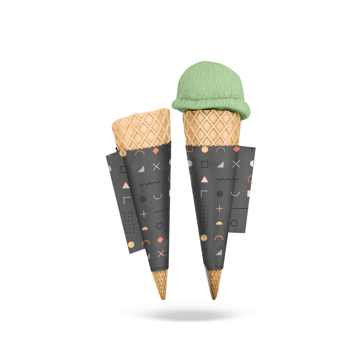
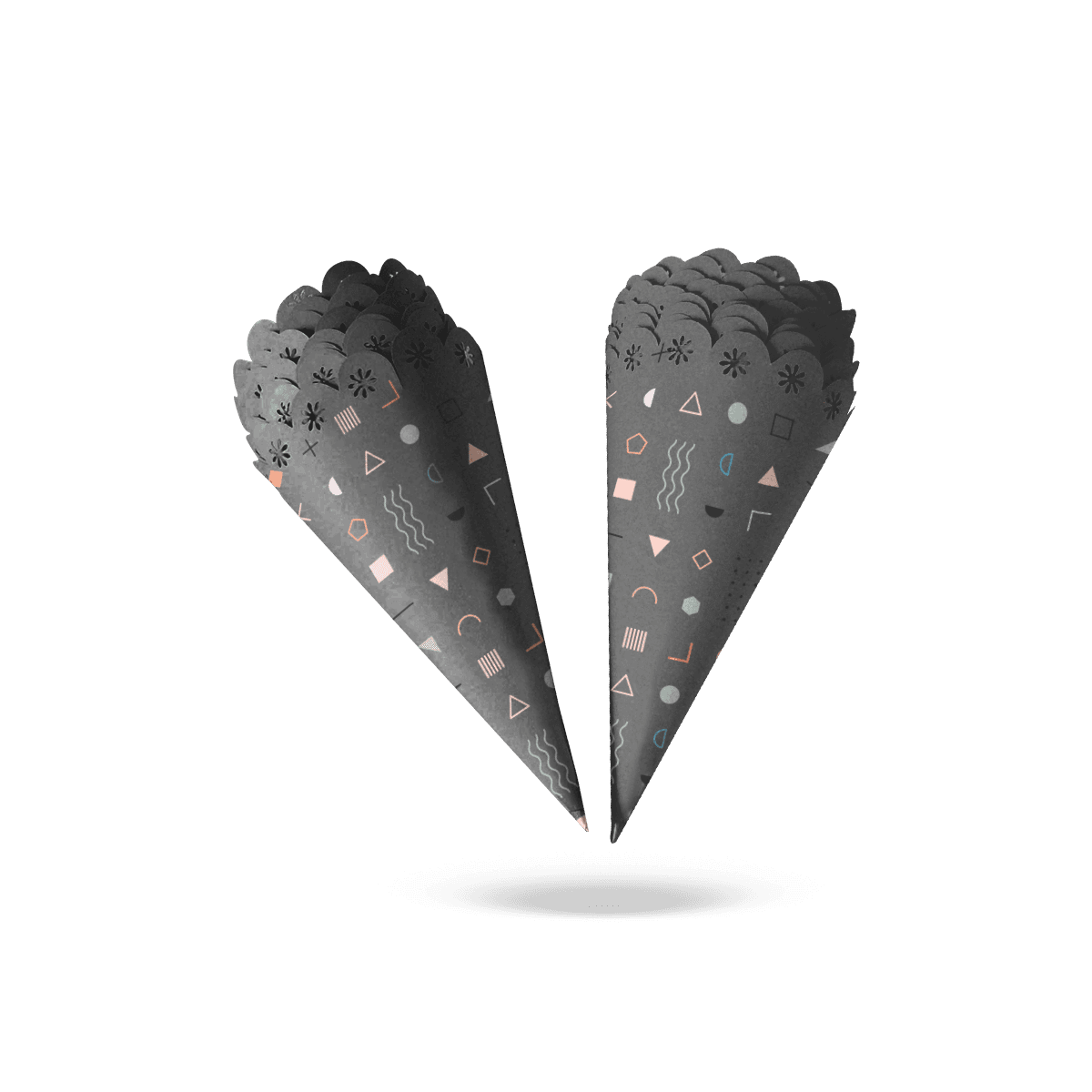
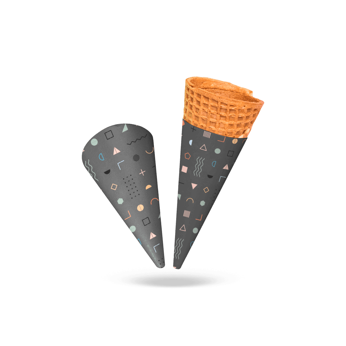
Scale the sleeve around a smaller cone and smaller grip instead of shrinking a standard sleeve until the proportions stop working.

Smaller Grip, Different Geometry

A sleeve that fits the cone can still feel oversized in a child’s hand. On a smaller serving, sleeve height, wrap width and grip position all become more sensitive because there is less cone surface to work with.

Custom Child-Size Cone Sleeves should therefore be drawn around the smaller serving itself rather than created by scaling every dimension of a standard sleeve by the same percentage.

The sleeve needs enough area for a clean grip without climbing too far toward the food. It also has to leave enough exposed cone for the serving to look proportionate instead of wrapped from tip to rim.

Across custom cone sleeves, actual cone geometry determines fit. Child-size pieces make small sizing errors more noticeable because the working area is already limited.

Hand Position Comes First

Watch where a smaller hand naturally closes around the cone.

That point may sit lower than the grip position on a full-size serving. If the sleeve starts too high, the child may still grab exposed cone lower down. If it extends too far toward the tip, the package can feel bulky relative to the serving.

The sleeve should occupy the actual holding zone rather than simply covering a predetermined percentage of the cone.

Leave Enough Cone Visible

A small serving can disappear visually when the sleeve is too tall.

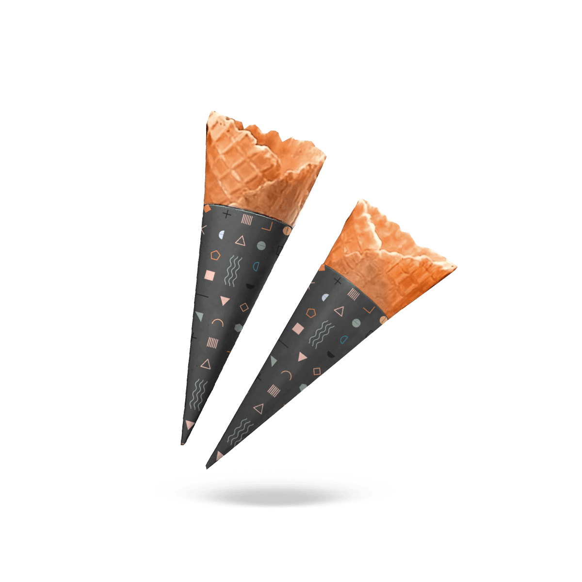
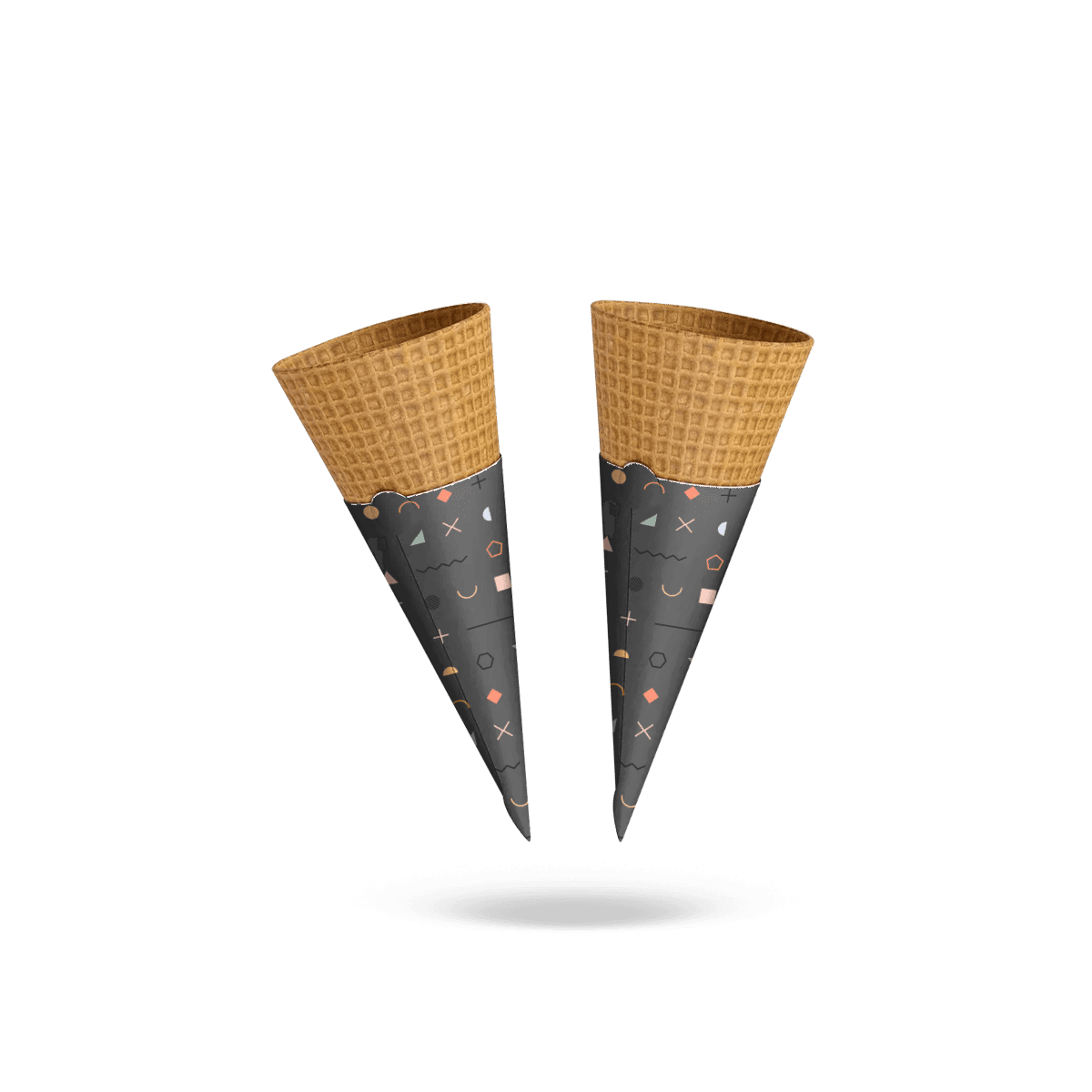
That matters because the cone itself contributes to the presentation. A child-size waffle cone still benefits from visible texture. A small sugar cone still needs enough exposed body to look like a cone rather than a printed wrapper with food at the top.

Reducing sleeve height can make the serving look more balanced while still giving the hand a controlled contact area.
Mini Cones Need Their Own Taper

A child-size cone is not always a standard cone made shorter.

Its opening diameter, taper angle and body shape may all differ. That means a sleeve copied from the regular-size cone and trimmed at the bottom can still fit badly.

Measure the actual smaller cone.

Record full cone height, top diameter and the diameter through the intended grip position. These measurements show whether the miniature cone narrows faster or slower than the full-size version.

The cone sleeve sizing process starts from the real cone rather than another shop’s size or a generic small-medium-large label.

Shorter Is Not Narrower

Cutting height from a full-size sleeve does not automatically reduce its circumference.

A shortened sleeve can still sit loosely on a smaller cone, especially if its taper was calculated for a larger upper diameter. It may rotate during handoff or slide toward the tip as the child grips it.

A true child-size dieline adjusts the arc and overlap as well as sleeve height.

Tighter Curves Stress Stock

Smaller cones create a tighter wrap.

A paper or paperboard stock that forms smoothly around a full-size waffle cone may resist the tighter radius of a miniature cone. Heavy board can spring outward at the seam or develop a less natural curve.

Material therefore has to be judged against diameter as well as desired hand feel.

If a firmer sleeve is required, Cardboard Cone Sleeves put board stiffness and springback at the center of that decision.

Grip Should Not Become Pressure

A smaller hand can squeeze harder through a smaller contact area.

That makes sleeve firmness a balancing decision. The piece needs enough body to create a clean holding surface, but excessive rigidity can transfer pressure directly into a thin or brittle cone.

The sleeve should stabilize the grip without acting like a clamp.

Fragile Cones Need Give

Sugar cones and smaller waffle cones can crack when pressure becomes concentrated at one point.

A slightly more forgiving stock can distribute hand pressure more gently than a very stiff wrap. Fit also matters: a sleeve already under tension before the customer touches it leaves less room for the cone to tolerate squeezing.

For narrower cone profiles, Sugar Cone Sleeves require their own fit logic when the cone geometry differs materially.

Overlap Adds a Ridge

On a small sleeve, the overlap occupies a larger share of the circumference.

That makes seam thickness more noticeable in the hand. Excessive overlap can create a raised strip exactly where fingers close around the cone.

The joint still needs enough bonding area to stay secure, but extra overlap should not be added casually. Seam width, material thickness and hand position have to work together.

Small Artwork Needs Editing

A standard cone-sleeve design cannot simply be reduced until it fits the smaller dieline.

Fine type becomes harder to read. Thin logo strokes can lose clarity. QR codes can become too small or too curved. A long slogan may occupy most of the visible face.

The smaller the sleeve, the stricter the visual hierarchy needs to become.

Keep One Main Mark

The primary logo deserves the strongest visible position.

Secondary messages should earn their space. On a child-size sleeve, a clear wordmark and one strong color or illustration often communicate more effectively than several lines of copy.

If the brand identity includes a complex emblem, prepare a simplified small-use version rather than forcing the complete mark onto a narrow curved surface.

Type Needs Breathing Room

Text close to the seam or cut edge becomes especially vulnerable when the printable area is small.

Keep short copy inside a generous safe zone. Avoid stretching words horizontally simply to fill the arc. The assembled sleeve is the real design surface, so judge readability after forming rather than only on the flat file.

Custom Printed Cone Sleeves focus on artwork placement, seam clearance and print behavior when branding is the dominant requirement.

QR Codes May Not Belong

A QR code is only worth printing if it can remain large enough, flat enough and unobstructed enough to scan reliably.

A child-size sleeve may not give it that space.

If the code competes with the logo or sits where fingers naturally cover it, move the digital interaction to another piece of packaging instead of shrinking the code until it becomes unreliable.

Service Speed Exposes Bad Sizing

A child-size sleeve has to work for staff before it works for the customer.

During busy dessert service, employees should be able to identify the correct sleeve, open it and place it on the cone without checking the fit repeatedly.

A sleeve that needs twisting, squeezing or careful positioning creates unnecessary friction at the counter.

Separate Sizes Visually

If full-size and child-size sleeves are stocked at the same station, make them easy to distinguish.

That distinction does not require entirely different branding. A controlled color cue, carton label or clear storage position may be enough.

The operational goal is simple: staff should not discover they picked the wrong sleeve after trying to force it onto the cone.

Do Not Nest Too Tightly

Smaller sleeves can be tempting to stack very tightly to save space.

But excessive nesting can make individual pieces harder to separate, especially when coatings, static or a firm material create friction between surfaces.

Test the real stack at service speed. The sleeve should release cleanly without requiring staff to pinch or damage the top edge.

Restaurants, dessert counters and catering setups often coordinate several serving pieces, so Food, Bakery & Restaurants packaging should reflect the same service sequence.

Smaller Portions Create More SKUs

Child-size cones often sit beside regular, large or specialty servings.

That means the question is not simply whether a smaller sleeve can be produced. It is whether the operation actually benefits from keeping a separate sleeve size.

A second size is worthwhile when it eliminates poor fit, improves hand comfort or prevents excessive coverage.

It is less compelling when two cones are physically close enough that one sleeve performs properly on both.

Test Shared Geometry First

Place the proposed sleeve on every cone it is expected to serve.

Check where it stops, whether it rotates, how much cone remains visible and where the hand naturally lands.

If the same sleeve performs cleanly on both sizes, keeping one specification may simplify stock control.

If it fits one cone and merely “almost fits” the other, separate dielines are usually clearer than asking staff to compensate during every serving.

Portion Names Are Not Dimensions

“Kids,” “small,” “mini” and “tasting” are menu terms. They are not manufacturing dimensions.

Two shops can both sell a child-size cone and use physically different products from different cone suppliers.

Production specifications should therefore record measured geometry rather than relying on the menu name.

Sampling Uses the Same Logic

Small cone sleeves can also suit tasting portions, sampling programs and event servings where the cone is physically smaller.

The use case changes, but the sizing rule does not.

A tasting cone still needs a stable grip, sensible coverage and artwork that survives a compact curved surface. The fact that an adult may hold it does not make a full-size sleeve appropriate.

This distinction is practical for launches and sampling counters because the package can remain proportionate to the serving without looking like leftover stock from the main menu.

Event Branding Needs Restraint

A small event sleeve may need a sponsor name, event mark or campaign identifier in addition to the core brand.

There is rarely room for all of them at equal visual weight.

Prioritize the mark that must be recognized during handoff and photography. Reduce secondary material or move it elsewhere in the event packaging.

At catered functions and guest-service programs, Hospitality packaging should follow the same serving sequence as the cone station.

Material Still Follows the Serving

Child-size does not determine whether the sleeve should be paper, paperboard, foil-faced or grease-resistant.

The food and service conditions make that decision.

A dry serving may need little more than clean printable paper. A sleeve exposed to melting dessert, condensation or oily toppings may need a more deliberate barrier treatment.

Do not add complexity just because the sleeve is intended for children.

Barrier Needs Evidence

A thicker stock is not automatically grease resistant or moisture resistant.

If the serving creates a real barrier requirement, specify the actual coating or material construction instead of relying on thickness.

Grease-Proof Cone Sleeves focus on oil and residue control when that is the dominant service problem.

Food Contact Needs Confirmation

If the sleeve is intended to contact food directly, confirm the actual material, inks, coatings and adhesives for the intended use before production.

Do not assume suitability from paper, kraft, foil or another material name alone.

The construction has to be evaluated as a complete piece.

Specify the Small Cone

Accurate pricing starts with the actual child-size cone, not the dimensions of the regular version.

The most helpful production brief includes:

  • full cone height
  • top diameter
  • diameter at the intended grip position
  • preferred sleeve height
  • material direction
  • quantity
  • number of sleeve sizes
  • artwork files
  • print colors
  • intended serving conditions

Custom Packly can support the dieline and artwork setup, create a free 3D mockup and issue a digital proof before production.

Small Should Feel Intentional

The finished sleeve should look as though it was created for the small serving from the beginning.

It should not resemble a regular sleeve cut shorter, a large logo compressed into a narrow arc or a loose wrap that staff have to push into position.

Judge the final piece by proportion.

The child should have a comfortable holding zone. The cone should remain visible. The seam should not dominate the grip. The artwork should remain readable and staff should be able to distinguish the sleeve quickly from larger sizes.

If the cone size stays unchanged and only the child-facing graphics change, Custom Kid Cone Sleeves address that visual program instead.

That is the value of Custom Child-Size Cone Sleeves: the geometry, material and print are reduced intelligently rather than simply reduced uniformly.

FAQs

Because the serving looks more balanced and feels easier to hold. Standard sleeves can make mini portions seem undersized and can feel awkward in smaller hands.

Yes, for light to moderately warm servings. If the product is heavily oily or very hot, buyers may want a barrier-focused material option or a different cone sleeve style.

Choose Child-Size Cone Sleeves when the edible cone itself is physically smaller and needs a reduced taper and grip area. Pretzel Cone Sleeves suit warm pretzel bites or sticks served inside a tapered paper snack cone.

Yes. Their smaller footprint makes them easy to stack, quick to fill, and simple to hand over during rush periods at kiosks, cafeterias, and concession stands.

Less is usually better. A strong logo, one or two brand colors, and a clean graphic block tend to outperform crowded artwork on a compact sleeve.

Process

How it works

Your Packaging Journey, From Idea to Production and Delivery

01

Tell Us Your Specs

Custom packaging boxes

Tell Us Your Specs

Provide size, quantity, printing, and finishes.

02

Get a Fast Quote

Custom packaging boxes

Get a Fast Quote

Instant transparent pricing, no hidden fees.

03

Design and Approval

Custom packaging boxes

Design and Approval

Artwork checks, revisions, and final sign-off.

04

Produce

Custom packaging boxes

Produce

Expert manufacturing to meet deadlines.

05

Ship to Your Door

Custom packaging boxes

Ship to Your Door

Hassle-free, flexible delivery options.

Get Your Quote for Custom Child-Size Cone Sleeves

Share your product details, size, quantity and artwork needs. We’ll help choose the right packaging style and send a clear quote.