Skip to content
Details

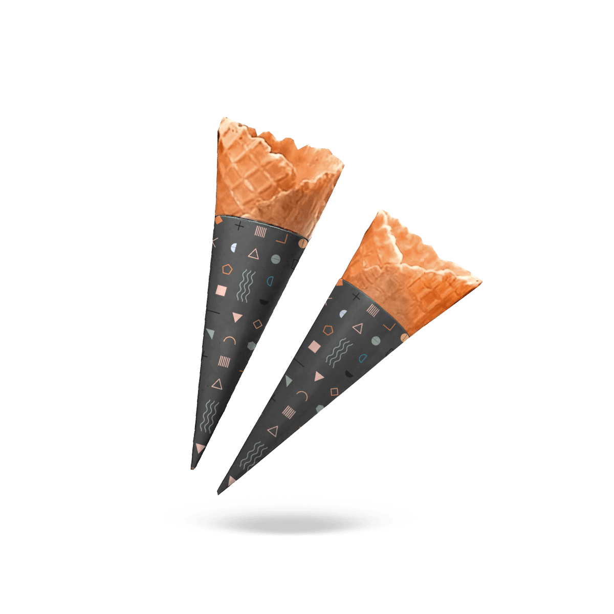
Custom Kid Cone Sleeves

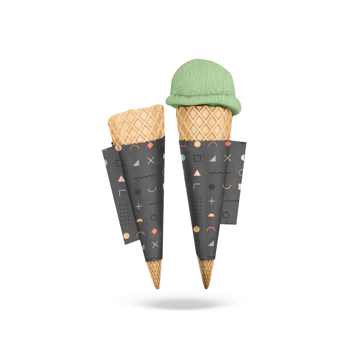
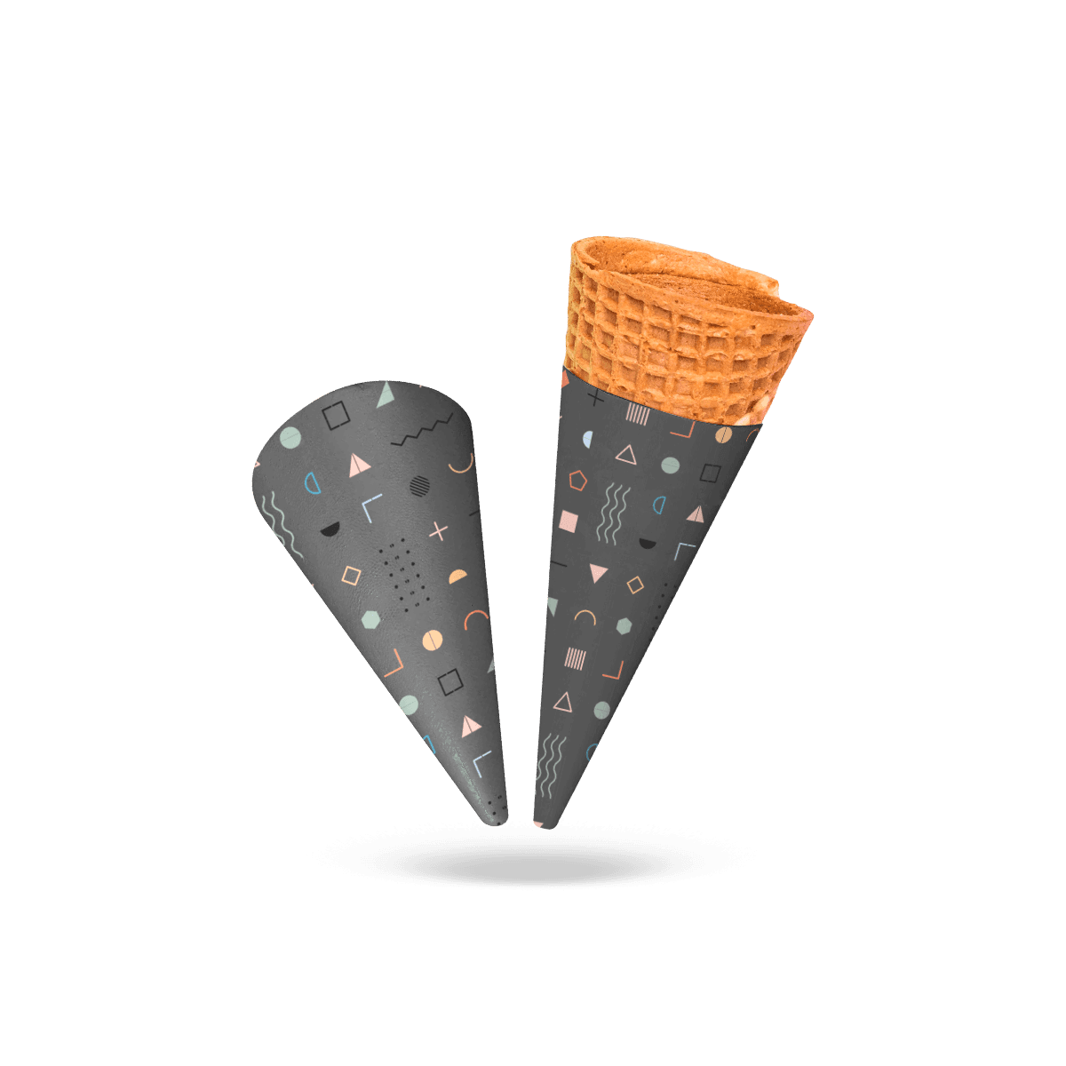
Create a cone sleeve children notice and adults can recognize quickly, without assuming every kid-focused serving needs a miniature sleeve.

Kid Focus Is Visual First

A kid-focused cone sleeve does not automatically need to be smaller.

Some dessert shops use the same waffle or sugar cone for children and adults but change the portion, toppings or presentation. Others have a dedicated smaller cone. Those are two different packaging decisions.

Custom Kid Cone Sleeves should therefore begin with the audience and serving experience. The physical sleeve still follows the actual cone, while the graphics, visual hierarchy and campaign idea make the piece specifically child-oriented.

That distinction keeps the packaging from becoming a duplicate of a miniature sleeve specification.

The main custom cone sleeve geometry still controls where the wrap sits. “Kid” describes who the presentation is aimed at, not a manufacturing dimension.

Size Follows the Cone

Measure the cone even when the menu calls the serving “kids.”

A child portion may use the same cone with one smaller scoop. It may use a narrow sugar cone. It may use a purpose-made mini cone.

Those situations should not share dimensions merely because they belong to the same menu segment.

If the cone itself is materially smaller, sleeve height and taper should be developed around that smaller profile. If the cone is unchanged, there is no reason to shrink the structural fit simply to make the graphics child-oriented.

Audience Changes the Artwork

The stronger distinction is what customers see.

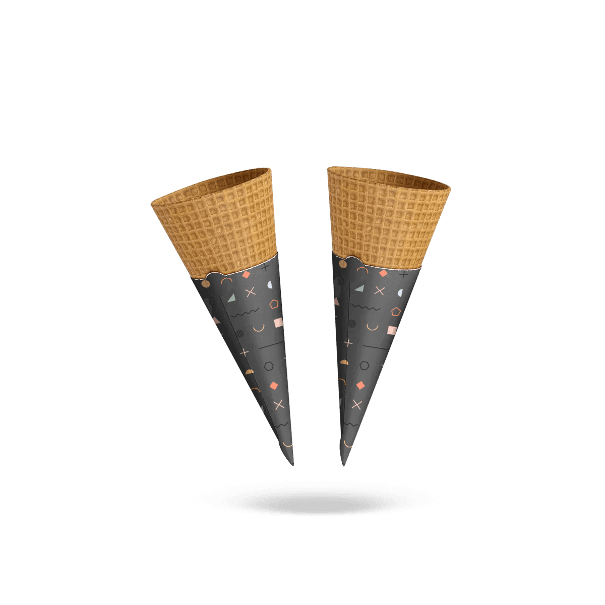
Bright color, a mascot, simple illustration, seasonal characters or a playful pattern can signal a child-oriented serving before anyone reads the menu name.

The graphic system should still belong to the main brand.

A kid sleeve can feel playful without looking disconnected from the restaurant, ice cream shop or dessert brand that produced it.

One Idea Beats Visual Noise

Small packaging becomes crowded quickly.

Children’s graphics often tempt brands to add everything at once: several characters, multiple colors, a slogan, flavor name, social handle, QR code, promotion and logo.

The result can be harder to recognize than a simpler design.

Choose one dominant visual idea.

That could be a character, one bold illustration, a recurring pattern or a strong color system. Let the logo remain easy to identify around it.

Give the Character Room

A mascot works best when it can be recognized immediately after the sleeve is curved around the cone.

Avoid squeezing a detailed character into the narrow lower part of the wrap.

Faces, eyes and other recognizable features should stay away from the seam and natural hand position. If the artwork depends on expression, make sure the formed sleeve does not split or hide the important part of the illustration.

Short Messages Read Faster

A few words can work.

A paragraph cannot.

Short phrases, flavor names or simple celebratory messages are easier to absorb while a child is receiving the cone. Long copy competes with the food, artwork and logo for a very small surface.

The most effective kid-oriented sleeve usually communicates visually before it communicates verbally.

Color Can Organize the Menu

Color is practical for more than making the sleeve look playful.

It can help distinguish portions, flavors, event groups or promotional programs while the core design remains consistent.

A dessert shop could keep one logo and character system while changing one dominant color between vanilla, chocolate and strawberry servings. A party venue could use a small number of preplanned themes without rebuilding the entire artwork each time.

The goal is recognition, not maximum color count.

Keep the Brand Recognizable

A children’s version should still look like it belongs to the same business.

Retain recognizable brand elements such as logo treatment, typography or one core color while allowing the secondary graphics to become more playful.

That continuity matters when a parent is carrying several items from the same order or when adult and kid servings appear together in photographs.

Versions Need Control

Once there are several characters, flavors or seasonal designs, artwork management becomes part of the packaging program.

Give each approved design a clear identifier.

Do not rely on filenames such as “kids final,” “kids final 2” and “new kids final.”

Version discipline becomes more important when similar sleeves are reordered months later or distributed across more than one location.

For programs where artwork variation is the dominant production challenge, Custom Printed Cone Sleeves focus on curved artwork, print systems and version quantities.

Characters Must Survive the Curve

A tapered sleeve changes the way an illustration is seen.

The character may look centered on the flat dieline but rotate away from the main viewing area once the sleeve is formed. A long arm, hat or word bubble may disappear into the overlap.

Review the artwork as an assembled object.

Faces Need the Cleanest Zone

People notice faces quickly, including illustrated ones.

Keep a mascot’s main facial features inside the strongest visible zone rather than stretching them around the circumference.

Secondary elements can wrap farther around the cone.

This makes the sleeve easier to recognize from normal handoff distance and reduces dependence on perfect orientation.

Avoid the Finger Zone

The child’s hand may cover much of the lower artwork.

Place the logo, character face and important menu cue where they remain visible after the cone is naturally held.

Patterns can continue behind the grip because they do not depend on complete visibility.

The cone sleeve sizing process helps establish coverage before artwork is committed to the tapered space.

Interaction Needs Restraint

Interactive packaging can sound attractive for children, but not every idea belongs on a cone sleeve.

A tiny maze, spotting game or collectable character can work because it is understandable immediately. A complex instruction sequence or tiny activity often asks too much from a package being used while someone is eating melting ice cream.

The food remains the main experience.

Simple Games Fit Better

A short visual challenge can sit on the reverse side of the sleeve without competing with the logo.

Examples might include finding one hidden symbol in the pattern or collecting several character designs across repeat visits.

The activity should still work when part of the sleeve is curved away from view.

Avoid putting critical steps across the seam.

QR Codes Usually Serve Adults

A QR code may be practical when it connects a parent to a menu, promotion or brand experience.

Do not make it the central child-facing feature simply because digital interaction is possible.

Curvature, hand placement and small print area can all reduce scanning reliability.

If a code is used, give it adequate clear space and verify it on the assembled sleeve.

Parties Change the Design Brief

Kid-focused sleeves can take on a stronger role at birthdays, school functions, child-focused events and dessert stations.

In those settings, the sleeve may need to connect the serving with a theme, event identity or coordinated table presentation.

That does not require printing every guest’s name or creating a completely new structure for each occasion.

Often the strongest event system uses one repeatable cone specification with artwork that can change between campaigns.

For catered celebrations and guest-facing service, Hospitality packaging should fit the same event identity as the cone station.

Theme Without Losing Identity

A birthday design can use stars, animals, confetti or another visual direction while still keeping the business logo recognizable.

Event branding should support the food business rather than replace it.

That becomes particularly important for venues that host many parties because the packaging may appear repeatedly in customer photos.

Date-Specific Art Raises Waste Risk

Printing a specific date, age or one-time message can make the sleeve highly personal.

It can also make unused stock difficult to reuse.

For recurring party packages, a more flexible design may be commercially smarter: keep the permanent sleeve generic to the celebration theme and customize another element only when required.

The decision depends on quantity and how confidently the final usage can be predicted.

The Parent Sees It Too

Children may be the intended audience, but adults frequently choose, pay for and photograph the serving.

A kid-focused design should work at both distances.

The child sees the color and character. The parent should still be able to recognize the brand, distinguish the serving and understand any short practical cue included on the sleeve.

That dual audience is one of the strongest reasons not to make the design unnecessarily chaotic.

Flavor Cues Should Be Clear

If several kid servings look similar, one clear flavor identifier can reduce confusion.

Use readable text alongside color rather than depending entirely on color coding.

The sleeve does not need a full menu description. It needs enough distinction to prevent two similar servings from becoming difficult to identify during handoff.

Essential Copy Stays Legible

Do not reduce important wording until it merely fits.

Small type on a curved surface becomes difficult to read quickly, especially once fingers and the seam remove part of the viewing area.

If essential product or service text cannot be presented clearly on the sleeve, another packaging element may be the better place for it.

Mess Control Still Matters

A playful design cannot compensate for a sticky exterior.

Ice cream can melt toward the holding area, and toppings or sauces can reach the sleeve during eating. Material should follow those real service conditions.

For ordinary dessert service, suitable paper can create a clean grip and printable surface.

When the serving creates a meaningful grease or residue problem, Grease-Proof Cone Sleeves put that physical requirement ahead of the kid-oriented graphics.

Do Not Overspecify Stock

Children’s packaging does not automatically need thicker paperboard.

More thickness can add stiffness and a more substantial feel, but it may also make a narrow cone harder to wrap and increase seam bulk.

Material should follow cone diameter, service conditions and required hand feel.

The graphics can remain playful on a lighter structure when heavier board adds no practical value.

Food Contact Is Construction-Specific

If the sleeve directly contacts food, confirm the intended stock, inks, coatings and adhesives for that exact use.

Do not infer suitability from words such as paper, kraft or cardboard alone.

The complete construction determines the appropriate application.

Kids Programs Can Repeat

A one-off children’s promotion and an everyday kids menu need different production thinking.

A short campaign can tolerate artwork that will not be reused.

An ongoing kids program benefits from a controlled master design that can survive seasonal changes, new flavors and repeat orders without rebuilding everything.

Build a Master Layout

Fix the elements that should not move:

  • logo position
  • primary character zone
  • seam clearance
  • basic typography
  • flavor-name position
  • safe area
  • main color logic

Then change the campaign-specific elements inside that system.

This reduces artwork errors and makes future approvals easier.

Rotate Art Without Changing Fit

Physical sleeve dimensions should not change simply because a summer illustration replaces a winter one.

Keep approved cone geometry separate from artwork revisions.

That helps maintain reliable service while giving marketing teams freedom to refresh the visible treatment.

Free design and dieline support, digital proofing and free 3D mockups can help review each artwork version against the established sleeve structure before production.

Kid Size and Kid Theme Differ

This distinction should be explicit before ordering.

A Child-Size Cone Sleeve is physically smaller because the cone or intended holding area is smaller.

A kid-themed sleeve is visually aimed at children and can be produced for whatever cone the business actually serves.

Some orders need both. Others need only one.

A restaurant using the same waffle cone for every customer may need a child-facing print design but no dimensional change. A shop using dedicated miniature cones may need both new geometry and a separate visual treatment.

Confusing those requirements can create unnecessary SKUs or a poorly fitted sleeve.

For standard frozen-dessert handoff where the primary issue is clean grip rather than a youth-specific campaign, Ice Cream Cone Sleeves keep the service use at the center.

Mixed Orders Test the System

The sleeve should be considered in the context of an actual mixed order.

A parent may be carrying two cones and a bag. Staff may be preparing several flavors at once. A child may hold the cone lower than expected. Different artwork versions may be stored next to each other.

Those conditions reveal whether the visual system is helping or adding friction.

Ice cream shops and dessert businesses often coordinate sleeves with takeout packaging, so Food, Bakery & Restaurants packaging should support the same handoff.

Staff Need Fast Recognition

If one design represents a child portion, staff should recognize it immediately.

Do not create several nearly identical sleeves that require reading small copy before use.

Color blocks, character changes or another consistent visual cue can make selection faster without disrupting the brand system.

Handoff Should Stay Obvious

A child-oriented sleeve can help make the smaller or special serving easy to identify in a mixed order.

That operational benefit matters more than adding decoration purely for novelty.

If the artwork makes the serving clearer for staff, children and parents at the same time, it is doing real work.

Count Sizes and Artworks

Pricing should reflect how many physical sleeve sizes and how many artwork versions the program actually contains.

Practical inputs include:

  • cone type and dimensions
  • sleeve size count
  • total quantity
  • quantity per artwork design
  • number of characters or themes
  • print colors
  • material direction
  • seasonal or permanent use
  • artwork status
  • intended reorder pattern

One sleeve size with four printed characters is a different production program from four sleeve sizes carrying one identical design.

Separate those variables before requesting pricing.

Playful Still Needs Discipline

The final sleeve does not need to look serious.

It does need to look intentional.

Use color deliberately. Give the character enough space. Keep the logo recognizable. Protect the important graphics from the seam and hand position. Distinguish flavors or programs clearly when that helps service.

Most importantly, do not confuse audience with size.

Custom Kid Cone Sleeves have a clearer role when they own the child-facing brand experience, party program or recurring youth menu identity. Physical dimensions should still come from the cone itself.

That creates a practical separation between making a sleeve for a smaller cone and making a sleeve for a kid-focused serving.

FAQs

Kid Cone Sleeves are most distinct when the artwork, menu program or event presentation is aimed at children. The physical sleeve size should still follow the actual cone rather than assuming every kid-focused serving uses a smaller cone.

Bold color blocking, simple shapes, readable logos, and one clear visual theme usually perform better than crowded graphics on a compact sleeve.

Choose Kid Cone Sleeves when the goal includes youth-focused branding, themed presentation, or menu placement aimed at children. Child-Size Cone Sleeves are the better fit when the priority is mainly smaller dimensions and easier handling without as much emphasis on playful visual identity.

They work best in places serving fast, child-friendly portions, including dessert kiosks, family restaurants, amusement venues, and event stations where staff need quick, repeatable packing.

Yes. This format works well for short-run, made-to-order graphics tied to birthdays, sponsor events, school functions, or limited-time family campaigns.

Process

How it works

Your Packaging Journey, From Idea to Production and Delivery

01

Tell Us Your Specs

Custom packaging boxes

Tell Us Your Specs

Provide size, quantity, printing, and finishes.

02

Get a Fast Quote

Custom packaging boxes

Get a Fast Quote

Instant transparent pricing, no hidden fees.

03

Design and Approval

Custom packaging boxes

Design and Approval

Artwork checks, revisions, and final sign-off.

04

Produce

Custom packaging boxes

Produce

Expert manufacturing to meet deadlines.

05

Ship to Your Door

Custom packaging boxes

Ship to Your Door

Hassle-free, flexible delivery options.

Get Your Quote for Custom Kid Cone Sleeves

Share your product details, size, quantity and artwork needs. We’ll help choose the right packaging style and send a clear quote.