Small Lids Magnify Artwork Errors
A jewelry box gives branding very little room to hide.
On a large package, a logo that is slightly oversized or a border that sits a little too close to an edge may still look acceptable. On a ring, earring or pendant box, the same decisions can make the entire pack feel crowded.
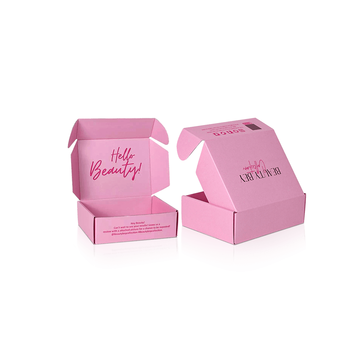
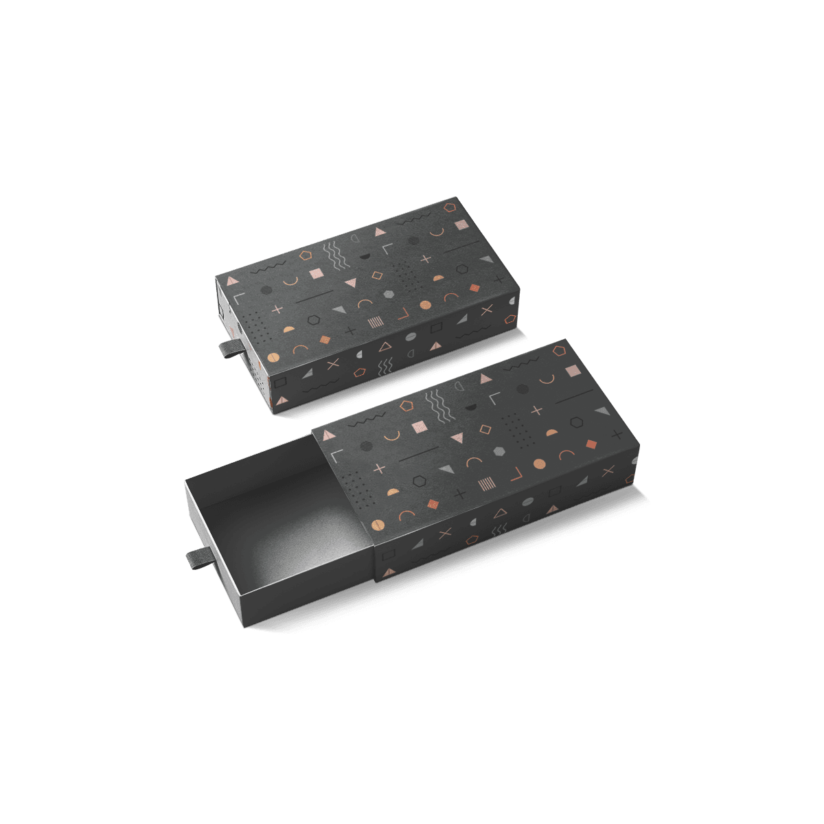
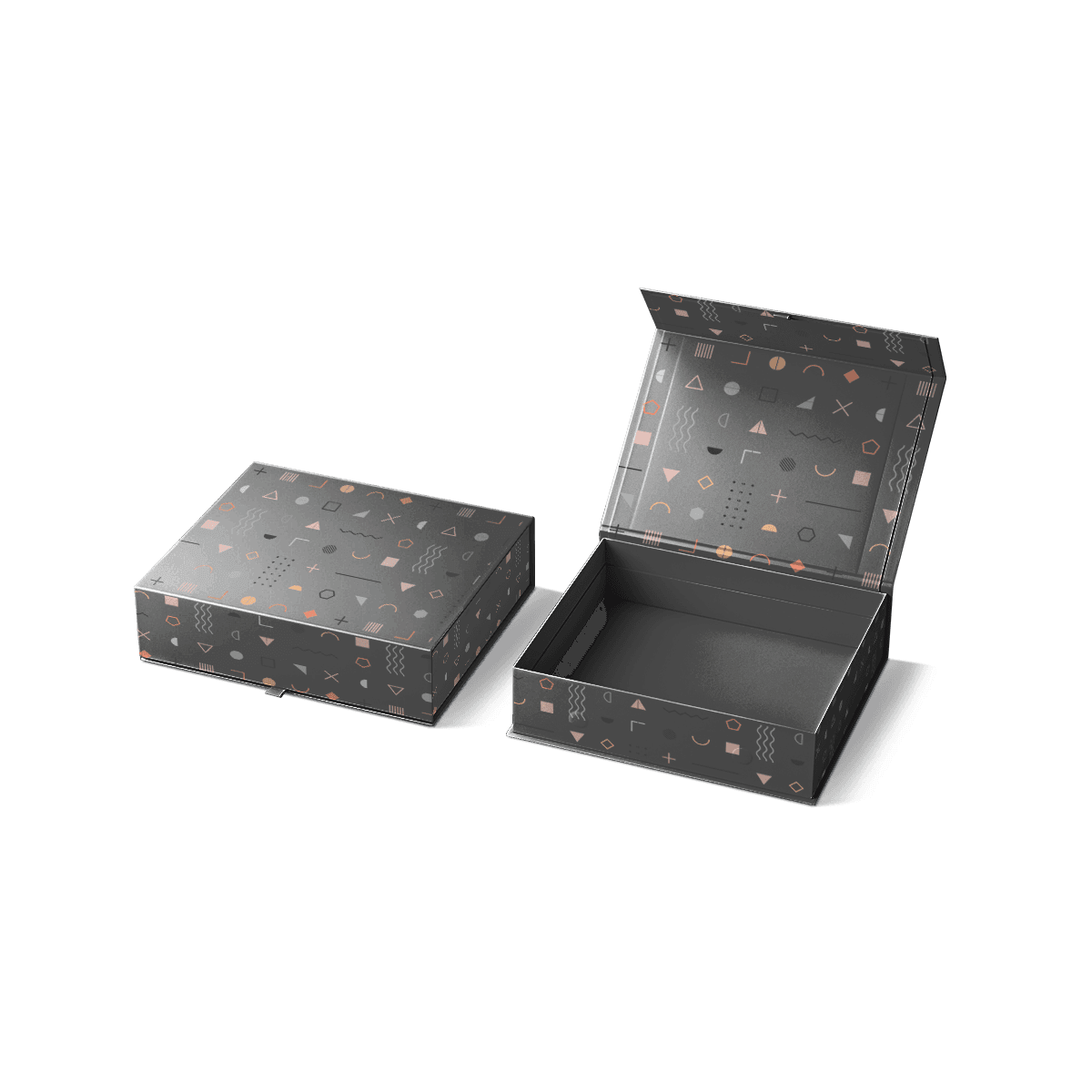
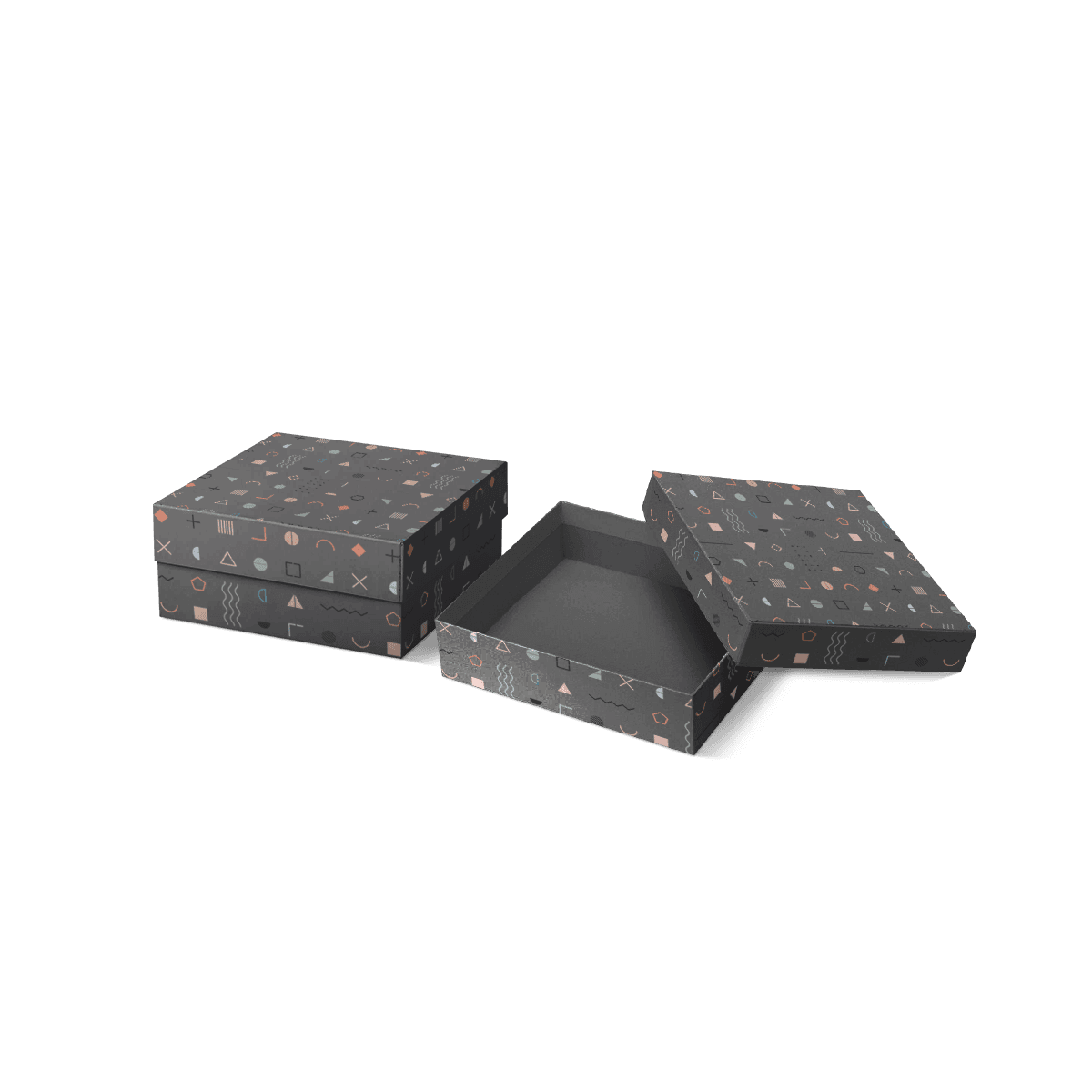
That is why custom printed jewelry boxes should begin with the visible print area rather than with a list of finishes.
The first question is what needs to be recognized when the box is closed. For many jewelry brands, that is the logo or wordmark. A collection name, product type or secondary message can sit elsewhere instead of competing for the same small lid.
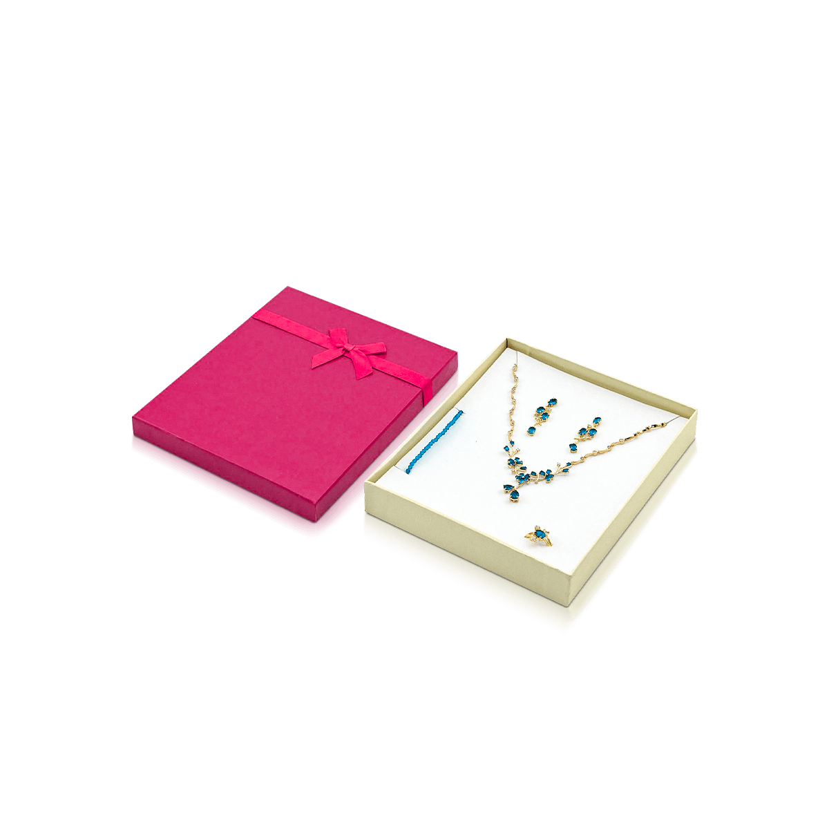
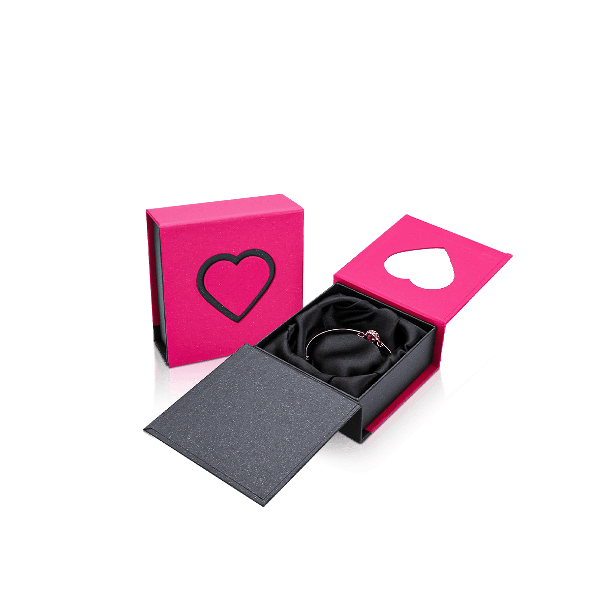
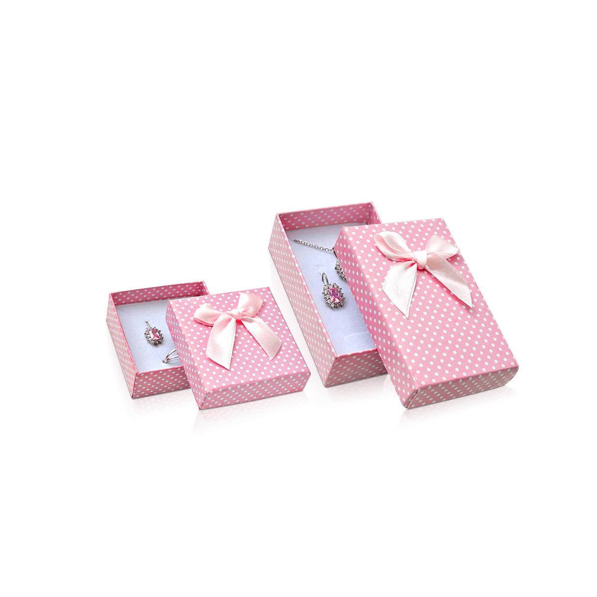
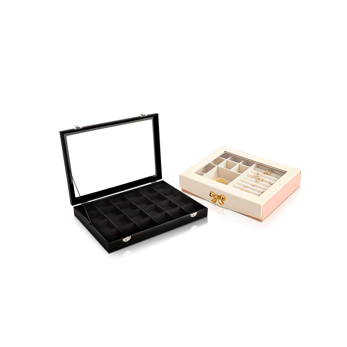
The larger jewelry and accessories packaging system can keep rings, necklaces, bracelets and watches visually connected even when their box dimensions differ.
Scale the Mark to the Smallest Box
A logo that looks balanced on a necklace box may dominate a compact earring box.
If several box sizes share one identity, set the smallest practical logo first. Then decide whether larger boxes should retain that same physical logo size or increase it according to a controlled rule.
Do not simply scale every artwork file proportionally with the box dimensions. That can make the brand mark change character from one SKU to another.
Give the Logo Breathing Room
Jewelry packaging often benefits from negative space because the product itself carries visual value.
A centered mark with clear margins can feel more deliberate than a lid filled with borders, patterns, taglines and multiple finish effects.
Print density should reflect the size of the box and the jewelry tier rather than the amount of empty artwork space a designer feels compelled to fill.