Formula Cues Need Sightlines
A shopper should be able to tell waterproof from volumizing before pulling every mascara from the tray. That makes sightline control one of the first structural decisions in a mascara display.
The important visual cue might sit on the tube body, cap, individual carton or a small label near the base. The display has to expose that area while still holding the product securely enough for repeated picking.
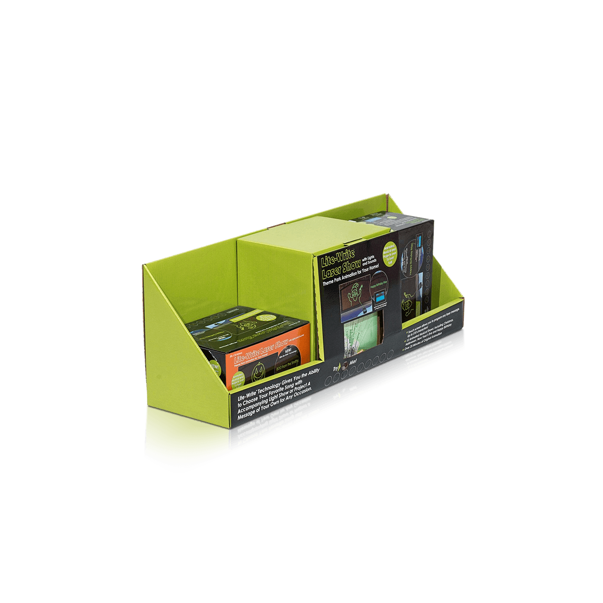
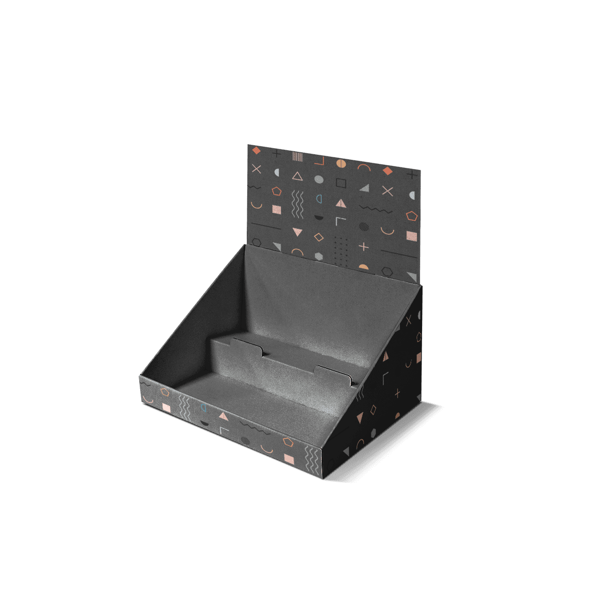
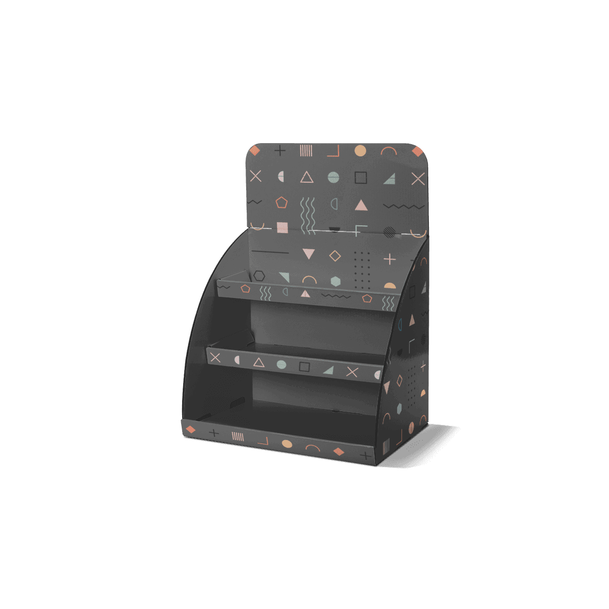
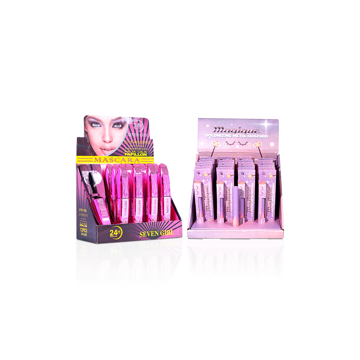
A front lip that rises too high can cover shade or formula names. A header that begins too low can crowd tall units visually. Deep lanes may leave only the caps visible, which works only when the cap itself carries a reliable identifier.
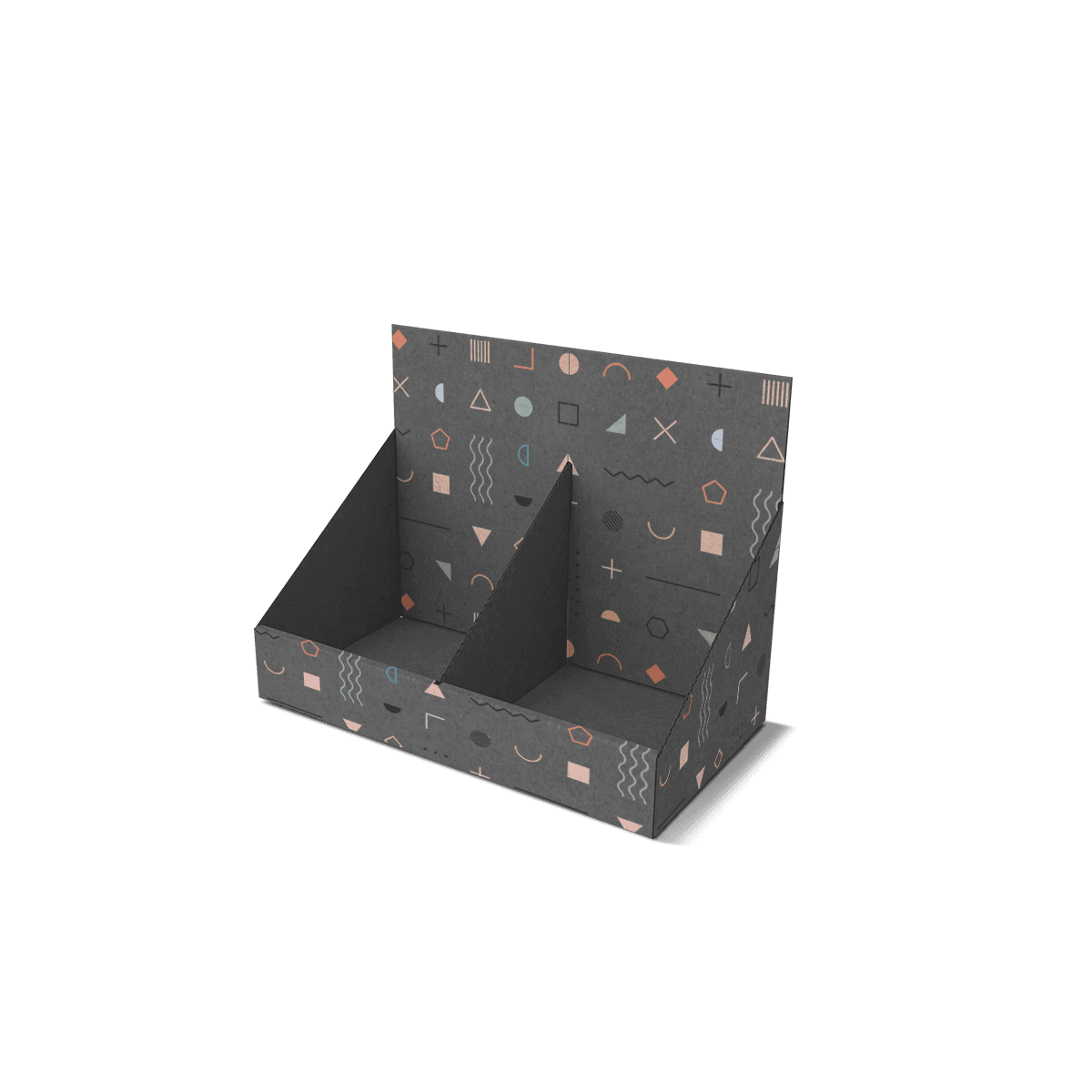
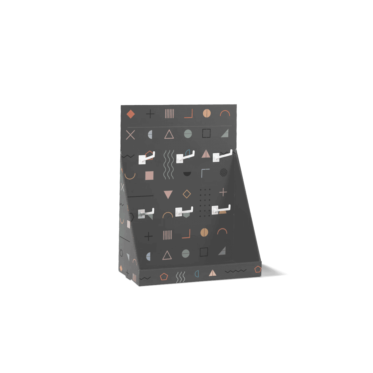
Custom mascara display boxes should therefore be designed from the shopper's viewing angle as well as the product dimensions.
At a busy counter, shelf visibility improves when the product name and strongest buying cue can be recognized quickly.
Decide What the Shopper Must Read
Mascara lines often separate products by effect rather than color alone. Lengthening, volumizing, curling, primer, clear and waterproof variants can use similar tube silhouettes.
If the variant is printed low on the tube, exposing only the cap is not enough. If each cap has a distinct color and that system is consistent, the tray can use a slightly higher front wall without hiding the decision cue.
Set the viewing requirement before finalizing the front opening.
Header Copy Has a Different Job
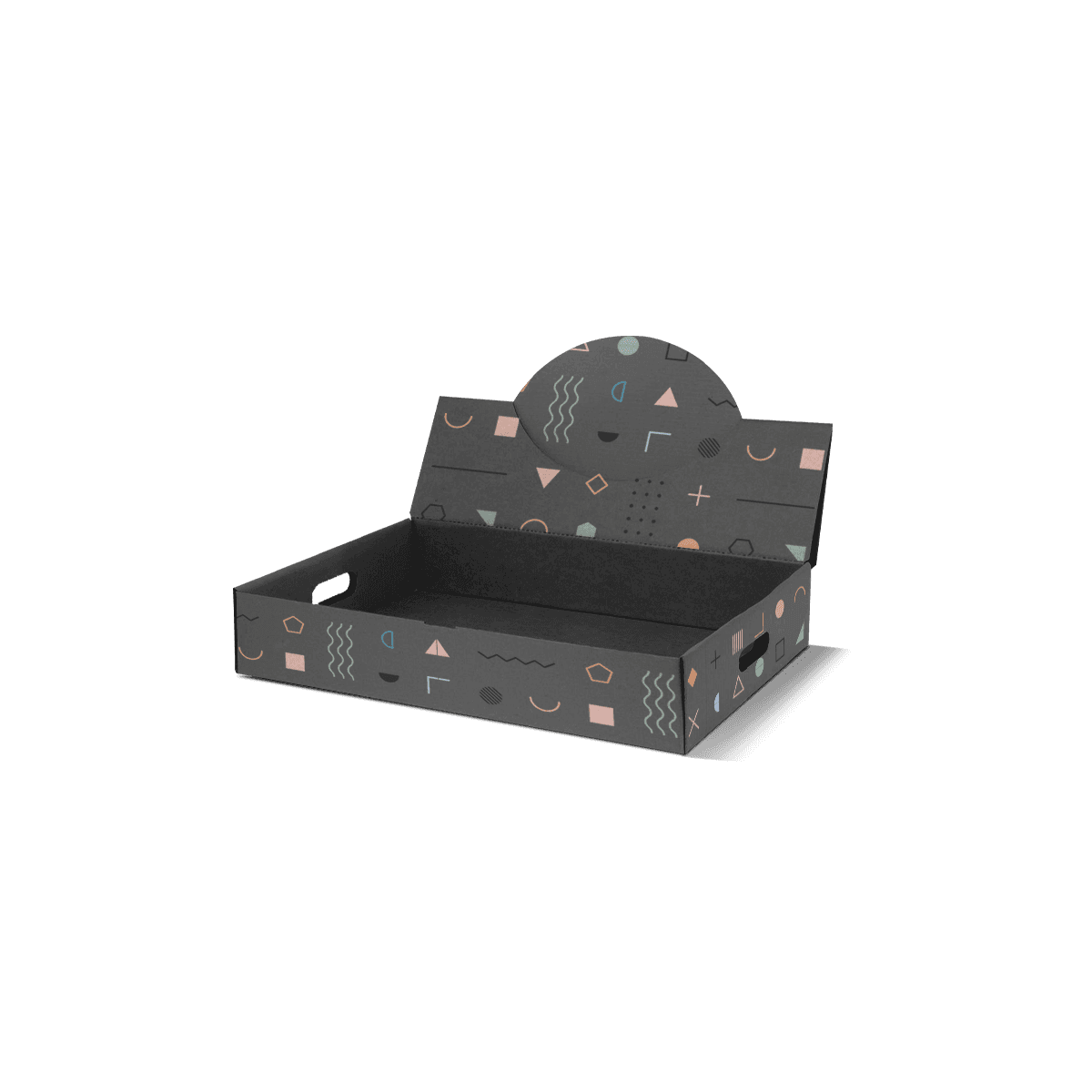
The header should communicate the campaign, brand or dominant product promise. It should not carry every distinction that individual units need.
If three mascara formulas sit in the same tray, the header can identify the launch while the units themselves remain responsible for formula identification.
That separation keeps the display readable instead of turning a small counter unit into a wall of competing claims.