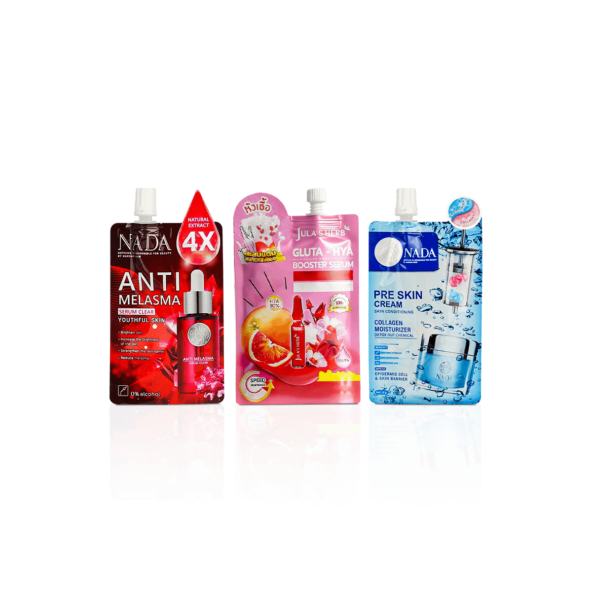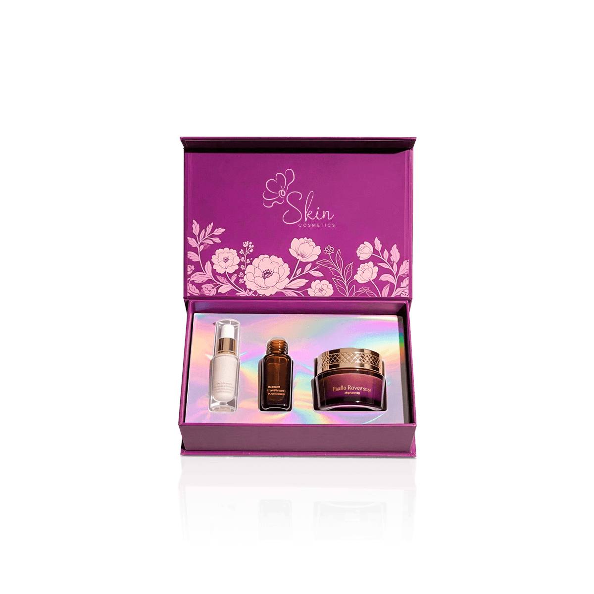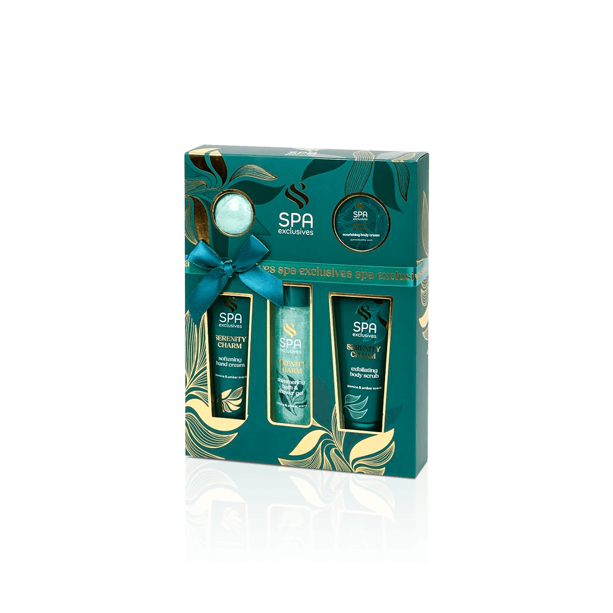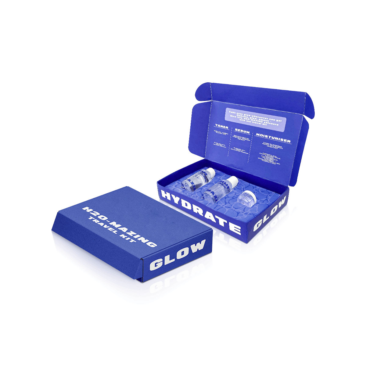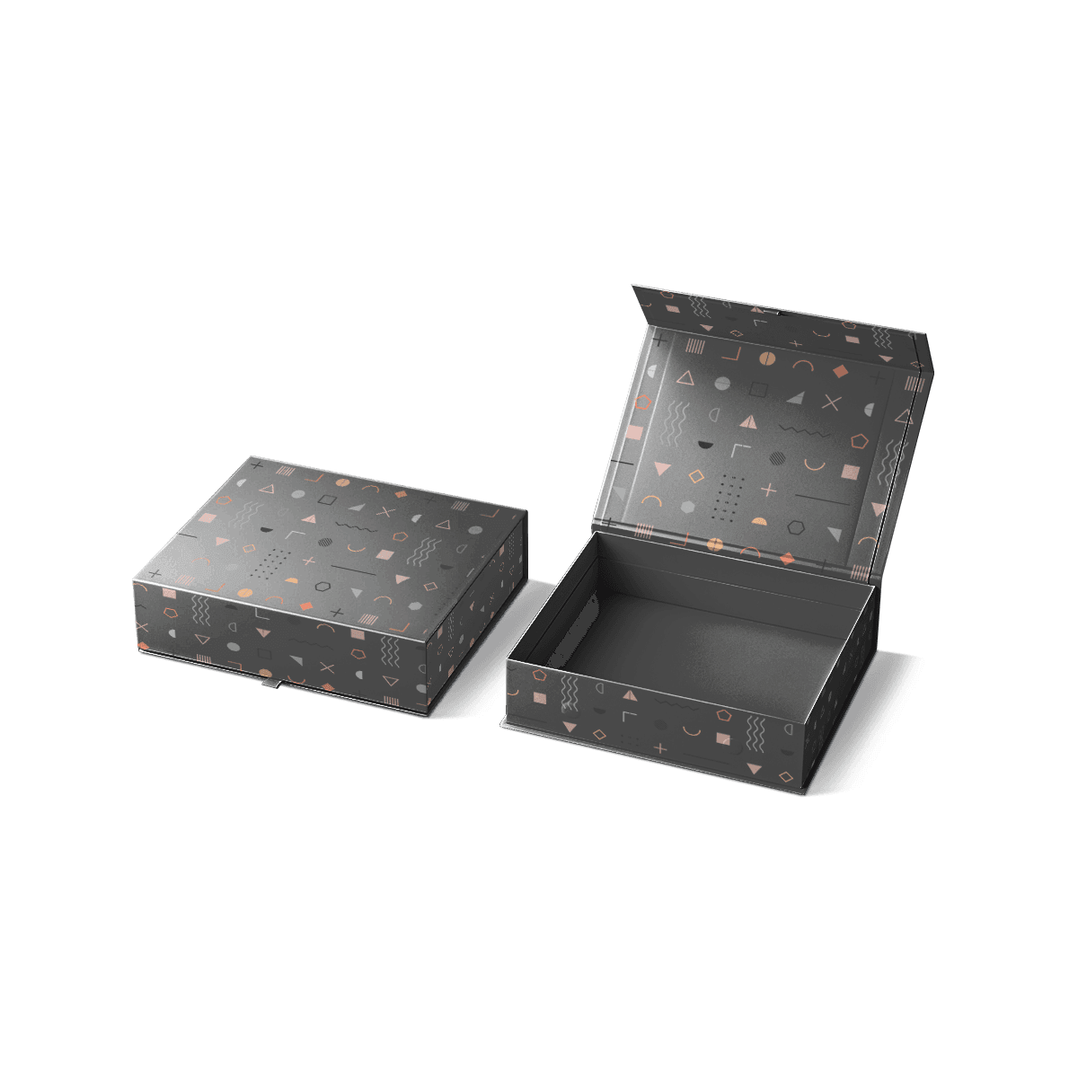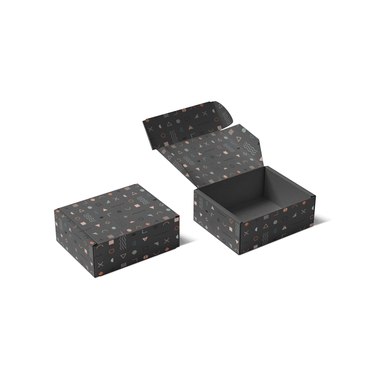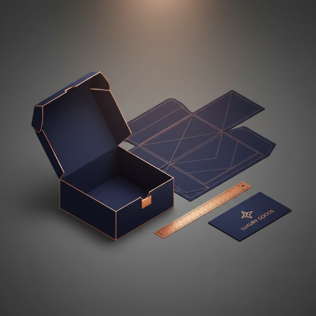
One Line, Several Pack Geometries
A skincare range becomes difficult to package when every SKU is forced into the same box logic.
A low cream jar, tall cleanser tube, glass serum dropper and pump bottle may share the same logo and visual identity, but they create different structural demands. The strongest custom skincare boxes preserve the brand system while allowing the physical packaging to change around each container.
That distinction matters more than making every carton the same height or width.
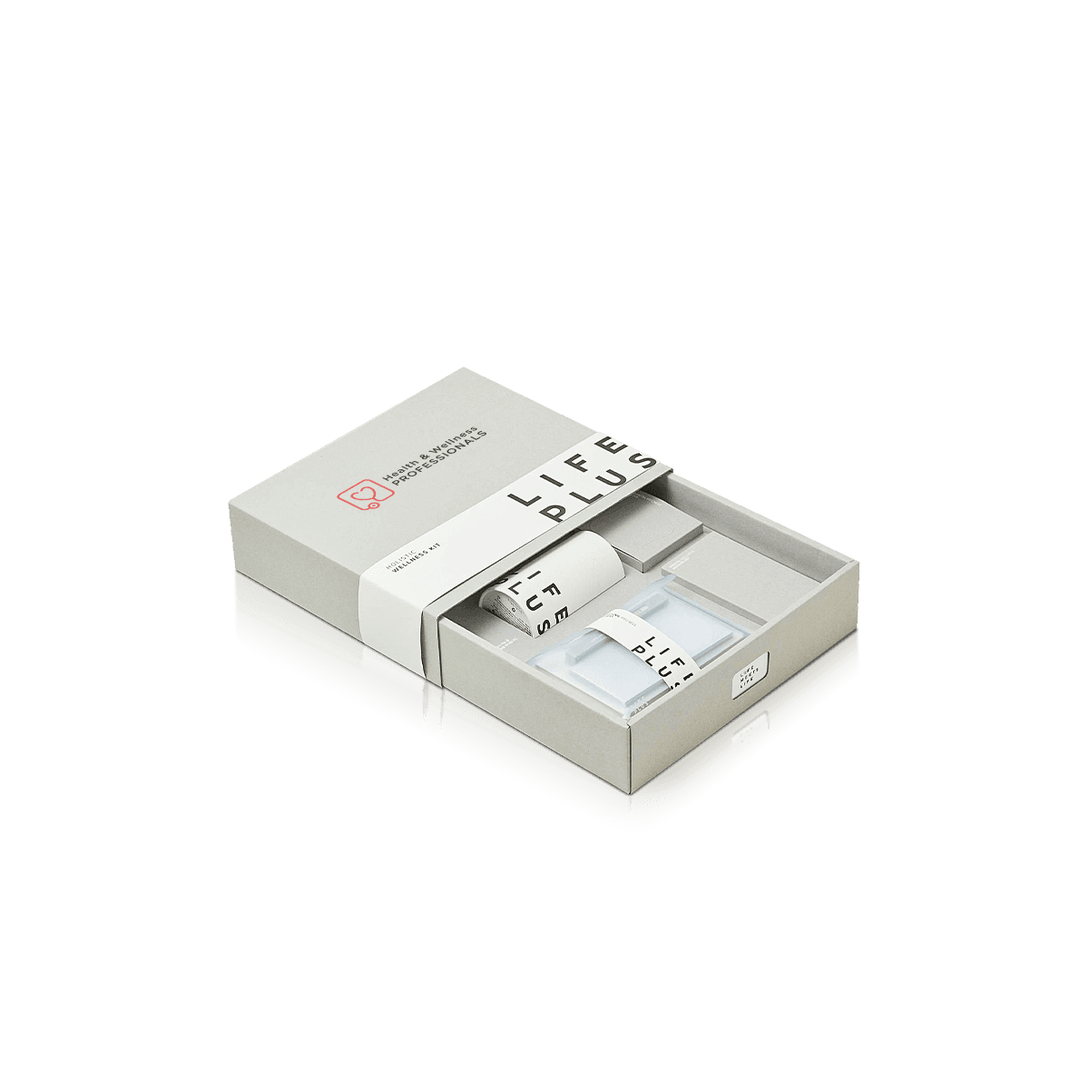
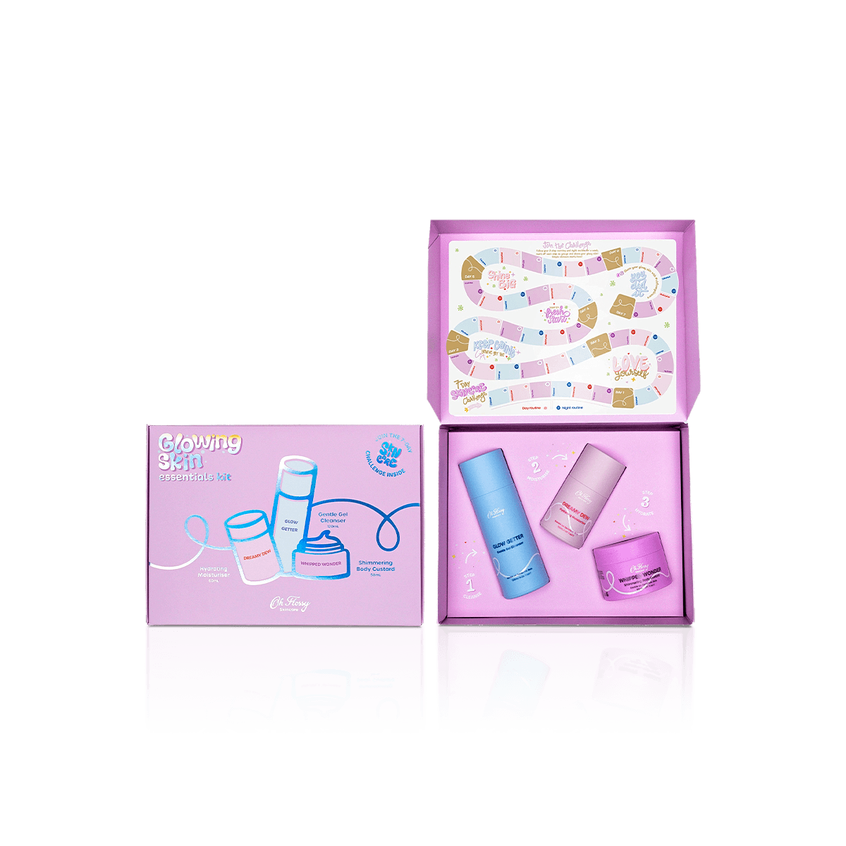
The jar may need a wider footprint and stronger bottom support. The serum may need protection around the dropper and glass body. A squeeze tube may need only a compact folding carton. A routine kit may need several cavities arranged around the order in which the products are used.
Across cosmetics and personal care packaging, skincare needs its own operating system: consistent visual rules across the line, but product-specific structure underneath them.
Standardize What Customers Recognize
Logo position, typography, color hierarchy, finish placement and variant identification can remain consistent even when dimensions change.
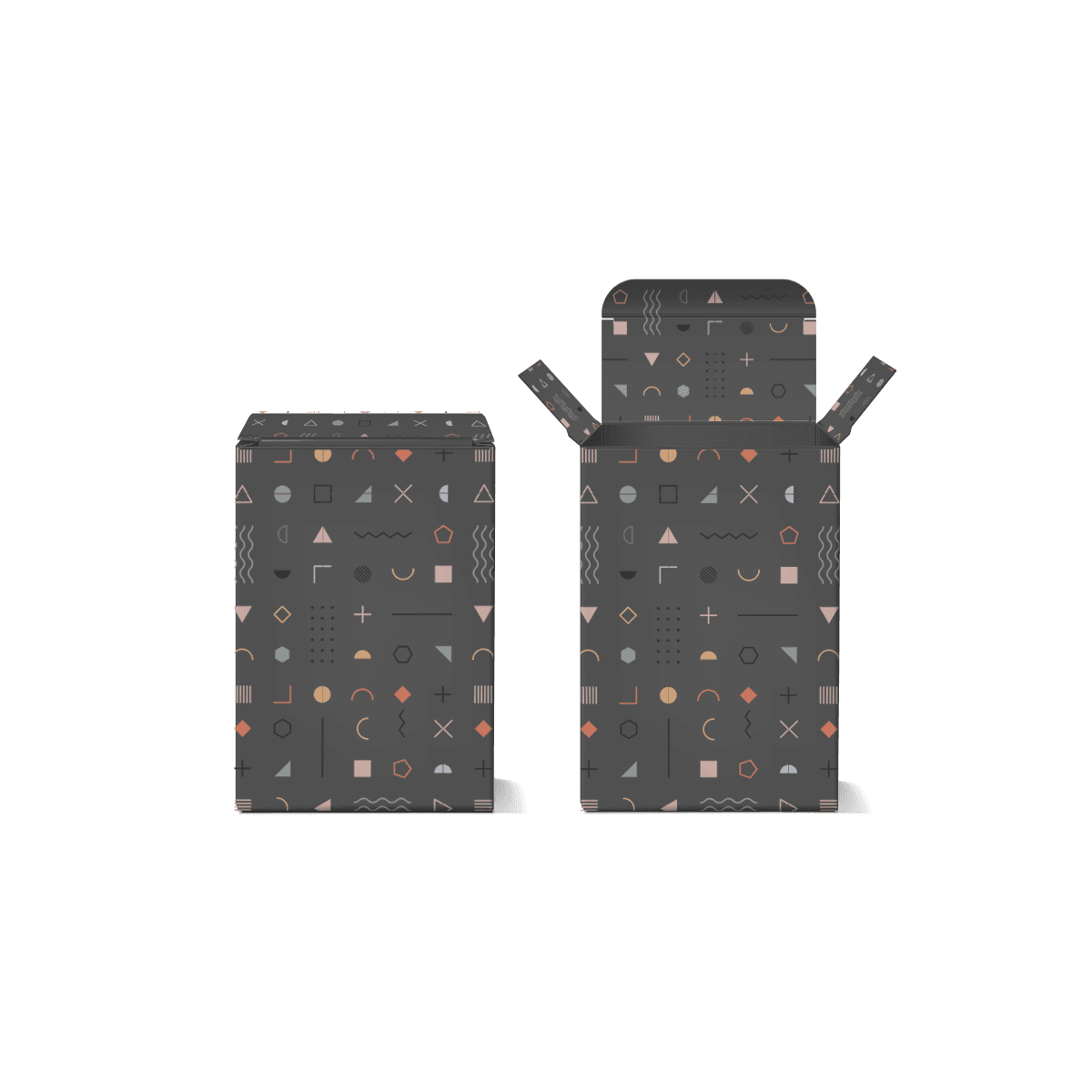
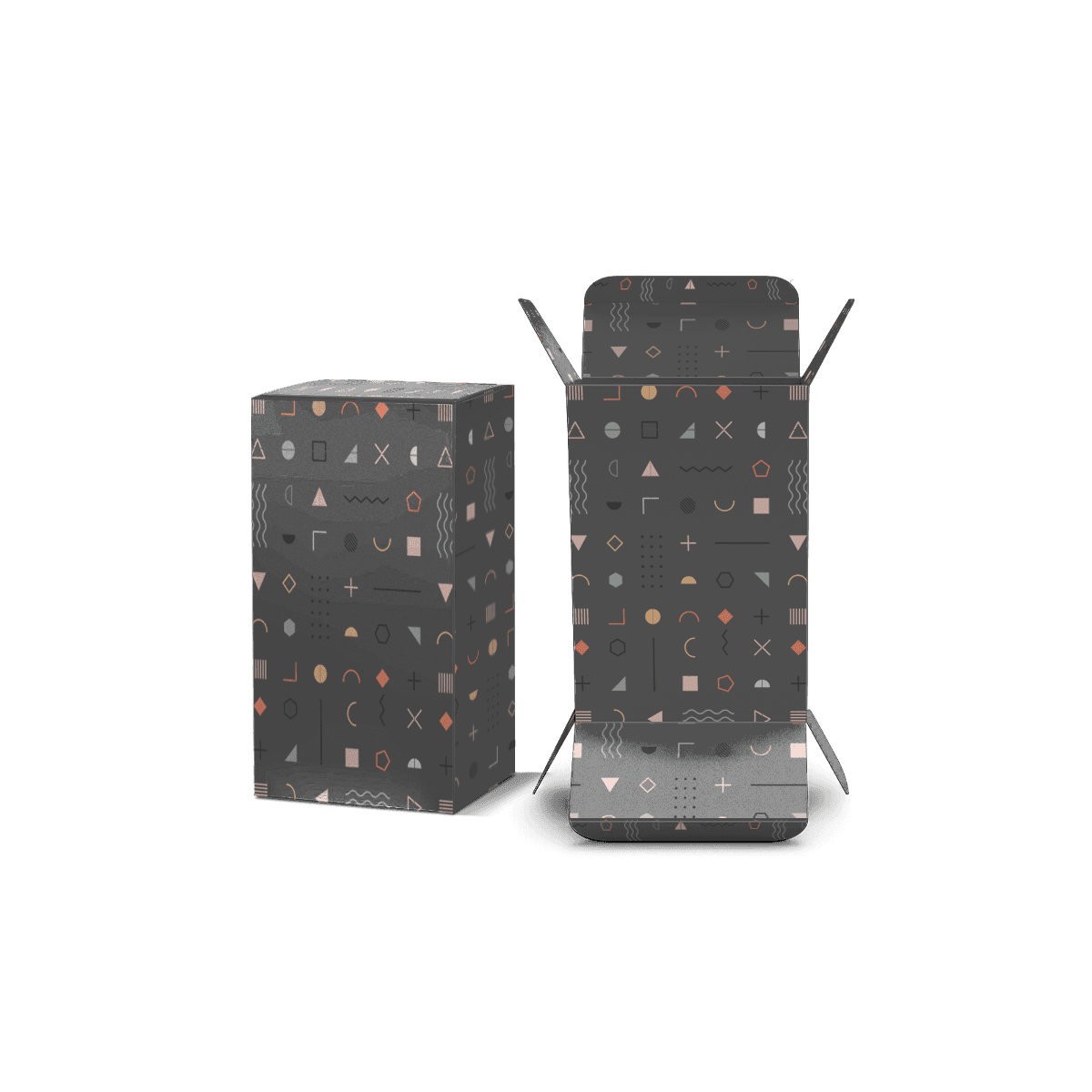
A moisturizer carton can be broad and shallow while the matching serum carton is narrow and tall. If the logo, product-name zone and color system behave consistently, both still read as part of one skincare line.
That is usually a better result than enlarging one product’s box simply to make it physically match another SKU.
Let the Container Change the Structure
Container weight, material, closure and shape should determine how much support the box needs.
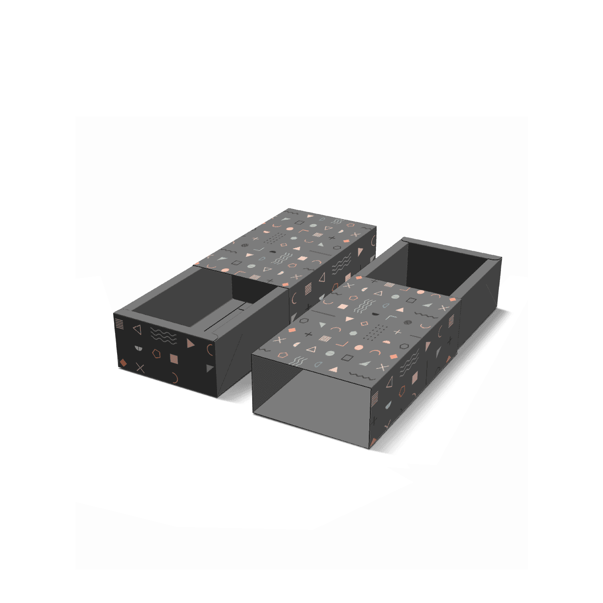
A lightweight plastic tube may work well in a straightforward folding carton. A heavy glass jar may need heavier paperboard or internal support. A dropper bottle can require more controlled movement so the pipette or closure is not asked to absorb load.
The brand language can stay stable while the engineering changes behind it.