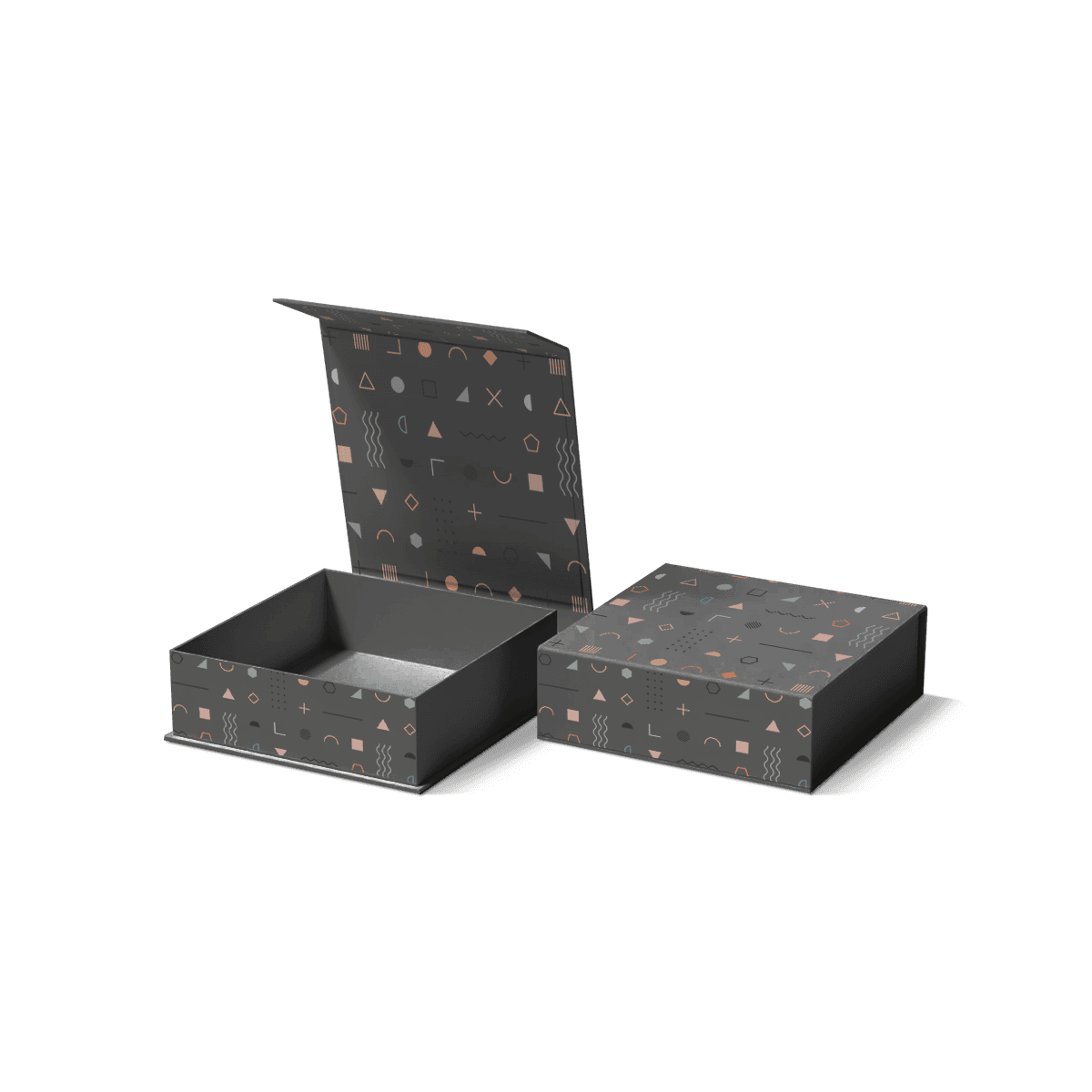
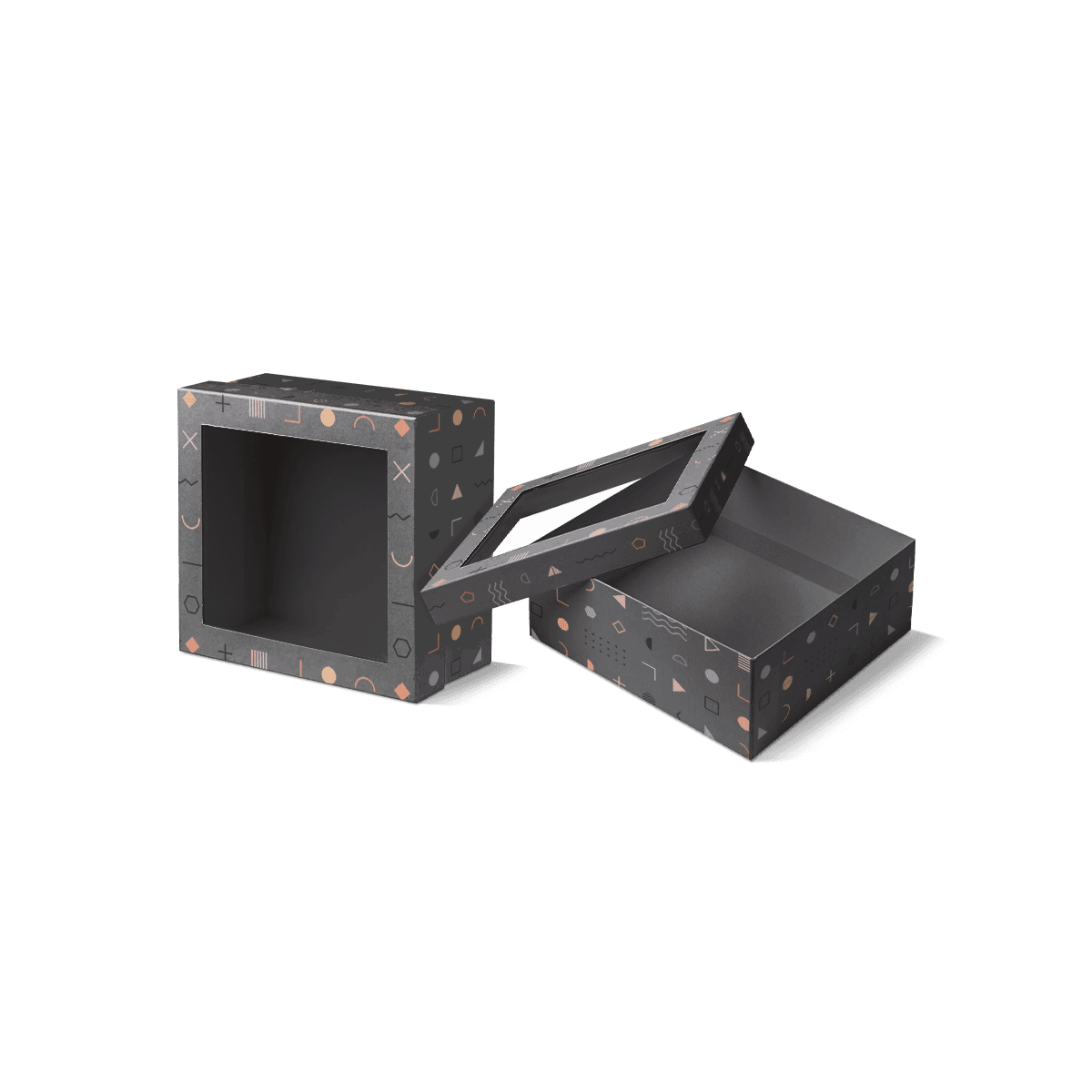
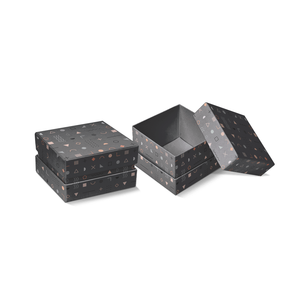
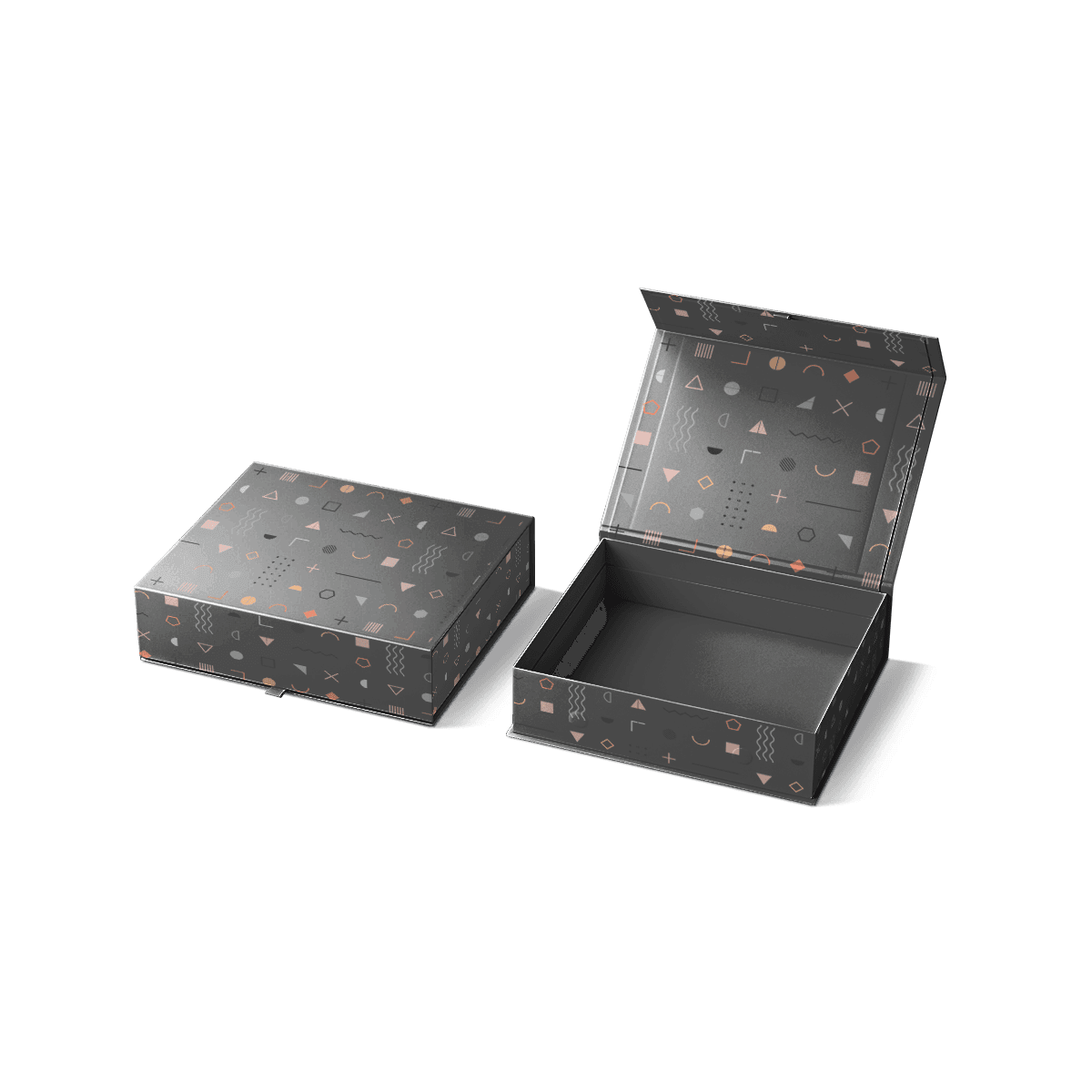
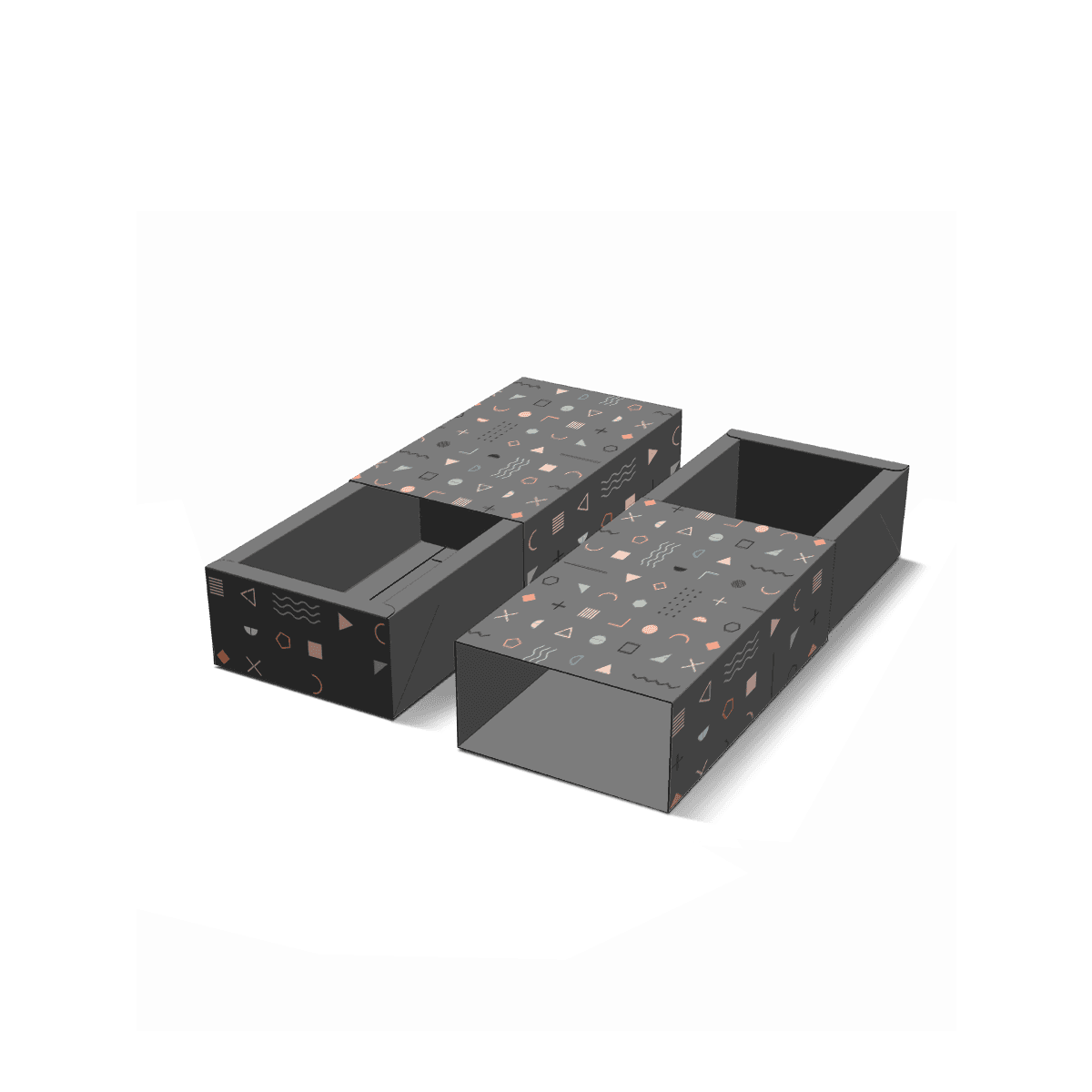
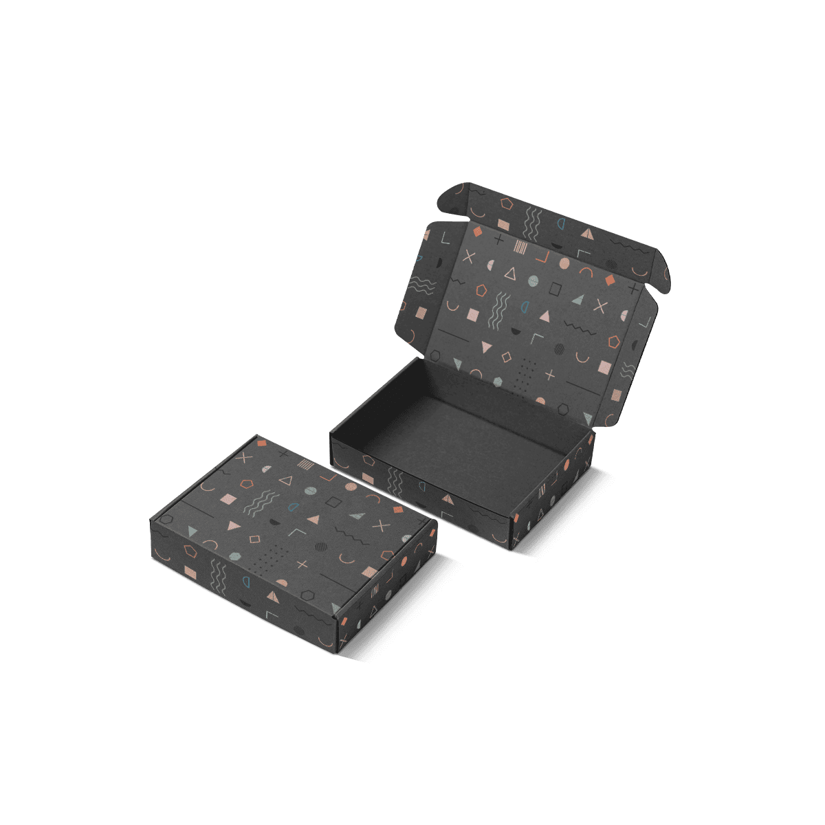
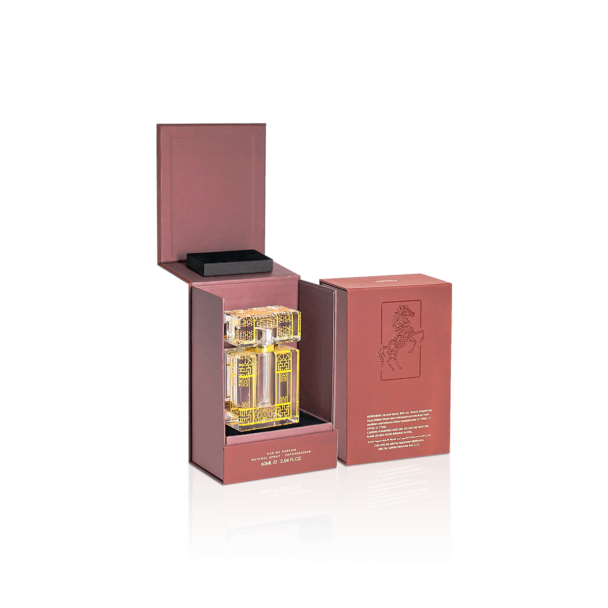
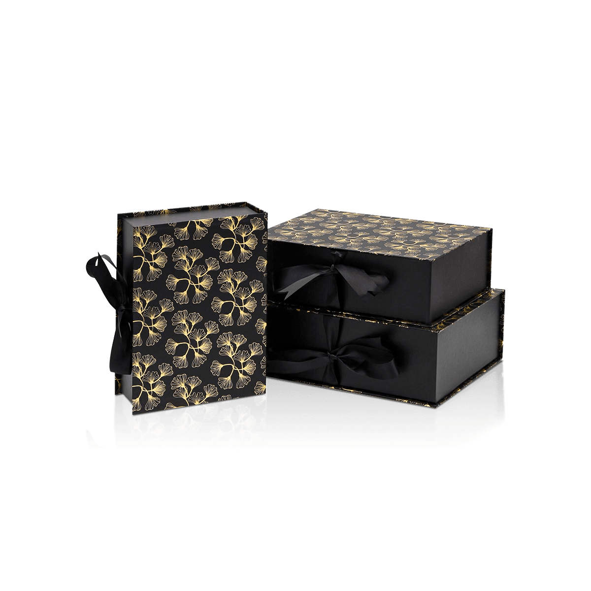
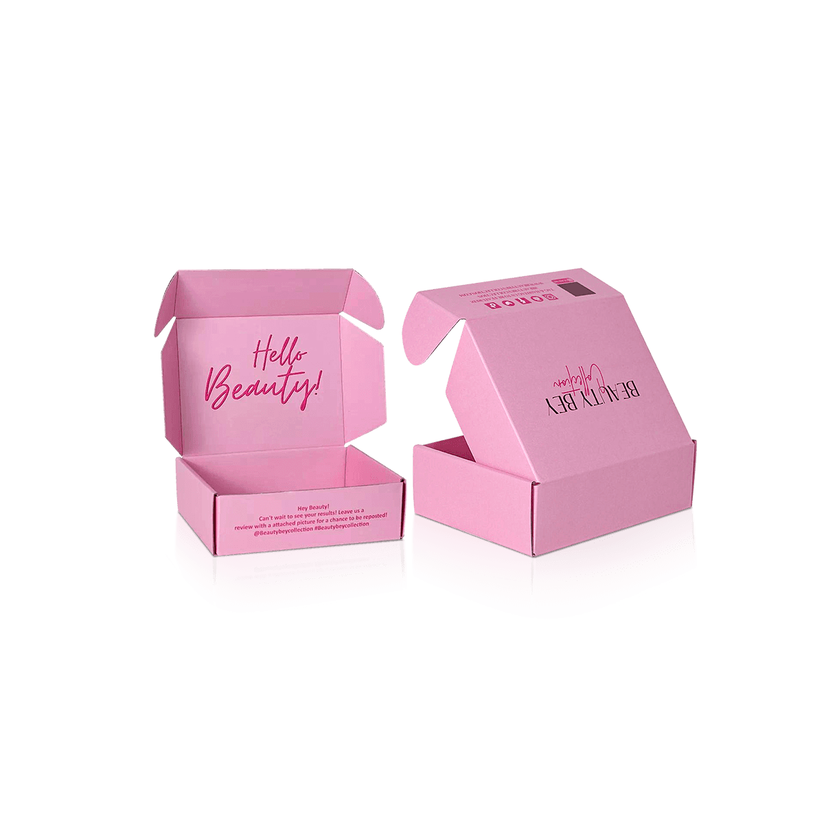
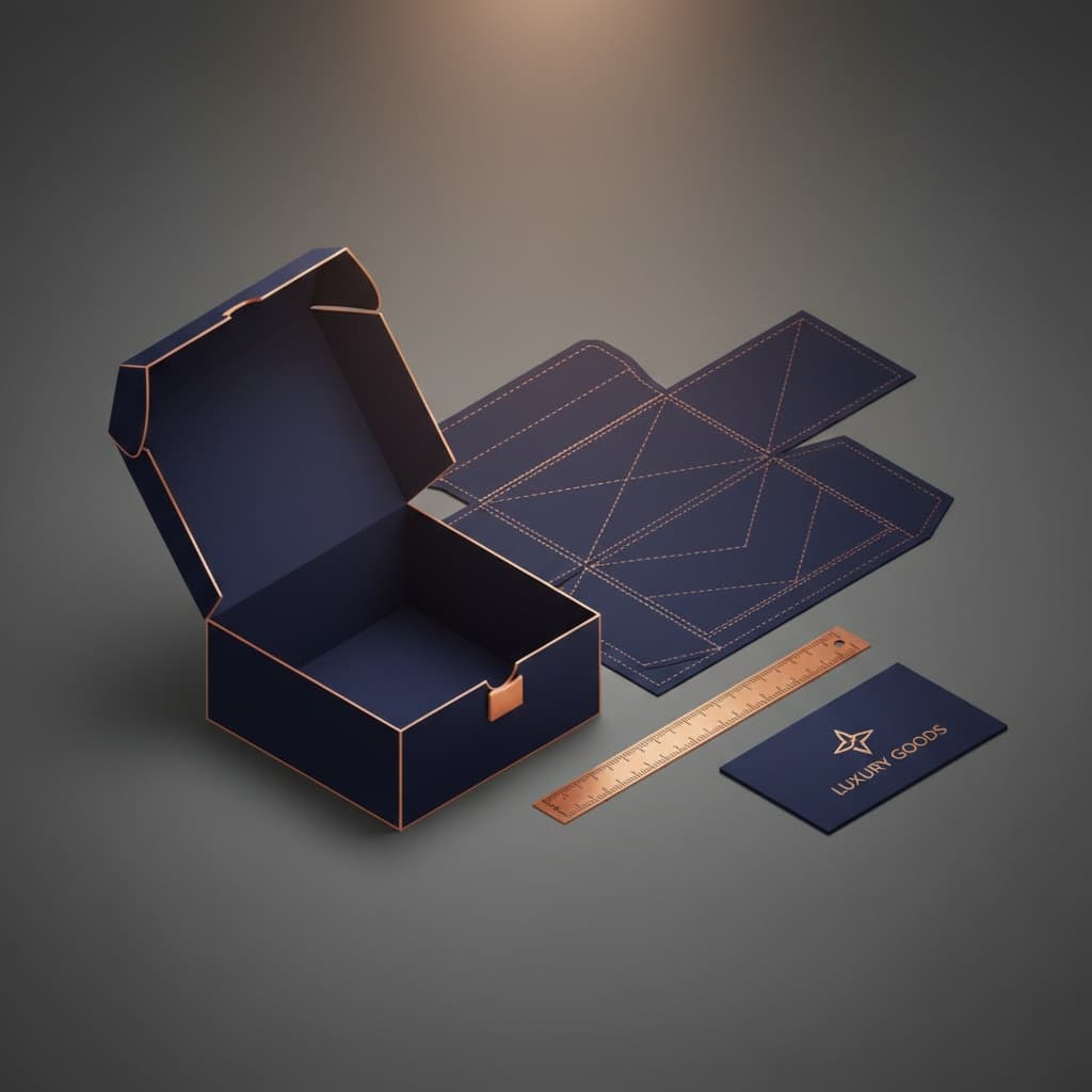
Artwork that works perfectly on the outside can become awkward when transferred directly to interior walls.
The reason is geometry. A flat design becomes several visible planes after the box is assembled. The base, side walls, turn-ins and insert all affect what the customer actually sees.
Large uninterrupted color fields usually tolerate those transitions better than detailed graphics that depend on exact alignment from one surface to another.
Avoid Critical Artwork Across Corners
A logo, thin border or line of copy should not depend on two separate wrapped faces meeting with screen-level precision.
Small manufacturing tolerances become much more noticeable when artwork tries to cross an internal corner continuously. Even a slight shift can make the design appear broken.
Critical brand elements usually work better when they sit comfortably inside one visible surface. Patterns can cross transitions more successfully when minor changes in alignment will not damage the overall appearance.
The same principle applies to internal foil or embossing. A premium effect loses its purpose if its position makes a corner seam or wrap transition more noticeable.
Inside Color Needs Its Own Approval
An interior color may look different from the same nominal color used outside because paper, lamination, texture and lighting change how it is perceived.
A deep exterior may also affect how the inside is judged. A pale interior next to a very dark rim can appear brighter than expected. Two printed papers using the same artwork values can still feel different when their stocks or surface treatments differ.
When exact brand color matters across both areas, CMYK and Pantone packaging printing becomes relevant to the approval process.
A physical pre-production sample is particularly valuable when matching interior and exterior color is part of the design. Custom Packly can arrange fully custom paid pre-production samples when exact physical approval is needed.