Skip to content
Details

Custom Branded Boxes

Turn different box sizes, products and e-commerce shipments into one recognizable packaging system with controlled color, artwork placement and brand cues.

One Brand, Several Box Jobs

A logo printed on a box does not automatically create branded packaging. Recognition comes from repeating the right visual cues consistently even when the box size, structure or product changes.

That is the main job of Custom Branded Boxes.

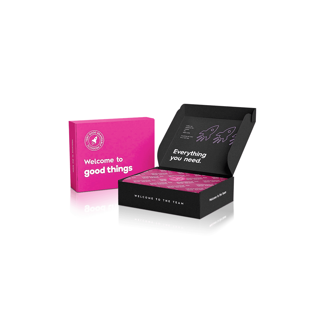
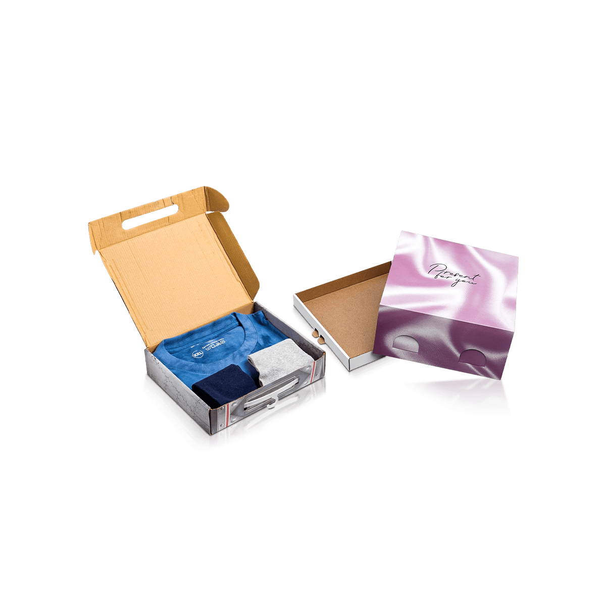
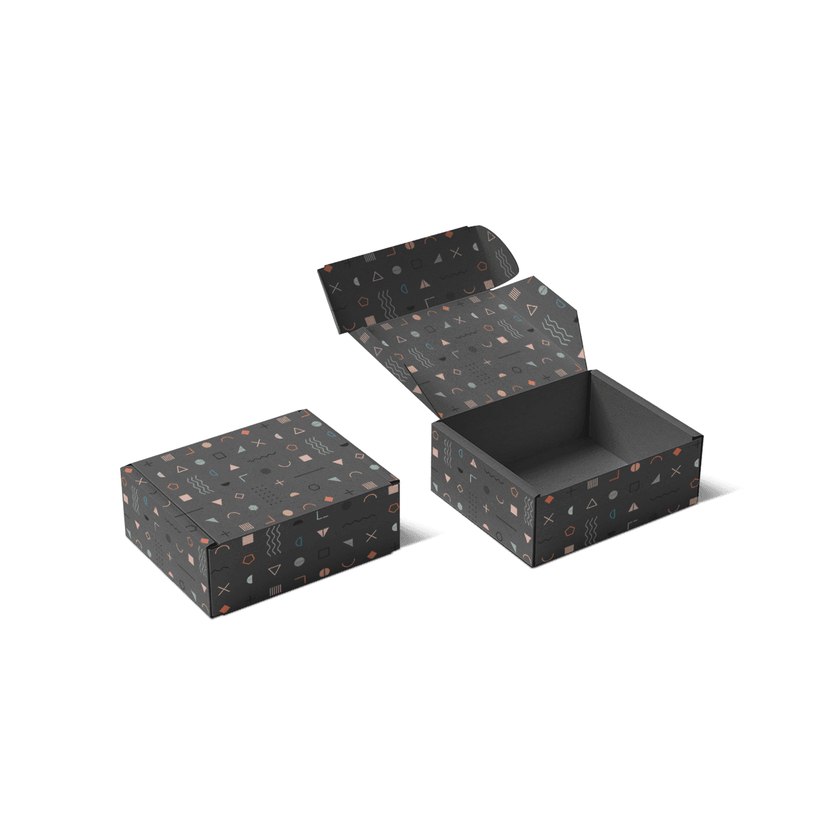
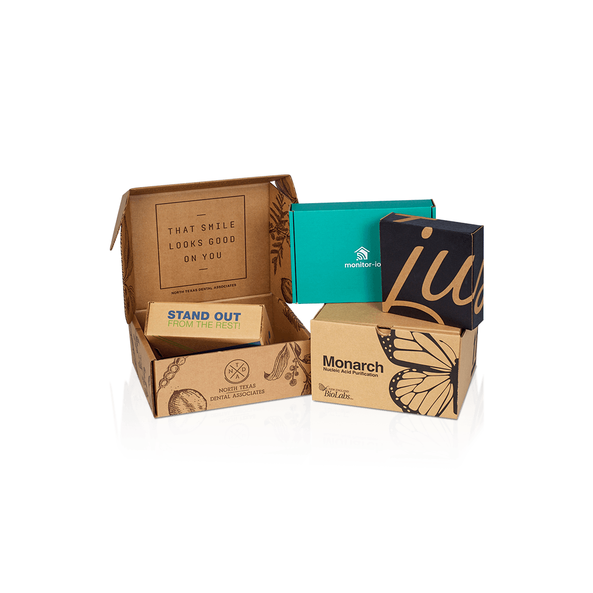
An e-commerce business may use a small corrugated mailer for accessories, a larger box for bundles and a folding carton around individual products. Those packs do not need to look identical. They do need to look as though the same company made deliberate decisions across all of them.

For brands selling online, e-commerce retail packaging often spans several physical structures. A workable identity has to survive those changes.

Fix What Should Stay Constant

Decide which brand elements should remain stable across packaging.

That may include:

  • logo proportions and preferred positions
  • core brand colors
  • typography
  • graphic shapes or patterns
  • image treatment
  • tone of messaging
  • recurring inside-box elements

The exact layout can change when the box proportions change. The recognizable ingredients should not.

Allow the Structure to Change

Do not force one box style onto every SKU simply to maintain visual consistency.

A small retail product may fit a folding carton. A DTC kit may need a corrugated mailer. A premium launch set may justify rigid construction. The identity should adapt to the structure rather than forcing the structure to adapt to one artwork template.

That distinction separates a packaging system from a collection of boxes carrying the same logo.
Give Every Panel a Role

Branded packaging becomes clearer when each surface has a purpose.

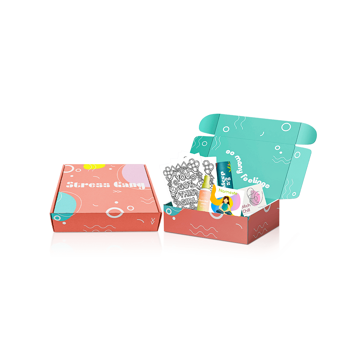
The largest panel does not always need the largest logo. A direct-to-consumer box may need room for a shipping label, handling marks and carrier wear. A retail carton may need product identification and a barcode. An interior lid can carry messaging that makes little sense on the outside.

Treating every panel as advertising usually creates clutter.

A practical hierarchy is to decide what should be understood before opening, during opening and after the product appears.

Outside Recognition

Exterior artwork should let customers recognize the sender without making operational elements difficult to place.

If a mailer ships directly, reserve a clean label zone early in the artwork process. Do not put the main logo, campaign message or key illustration exactly where a 4 × 6 shipping label is likely to cover it.

That small decision prevents fulfillment from destroying the composition after printing.

Inside Reveal

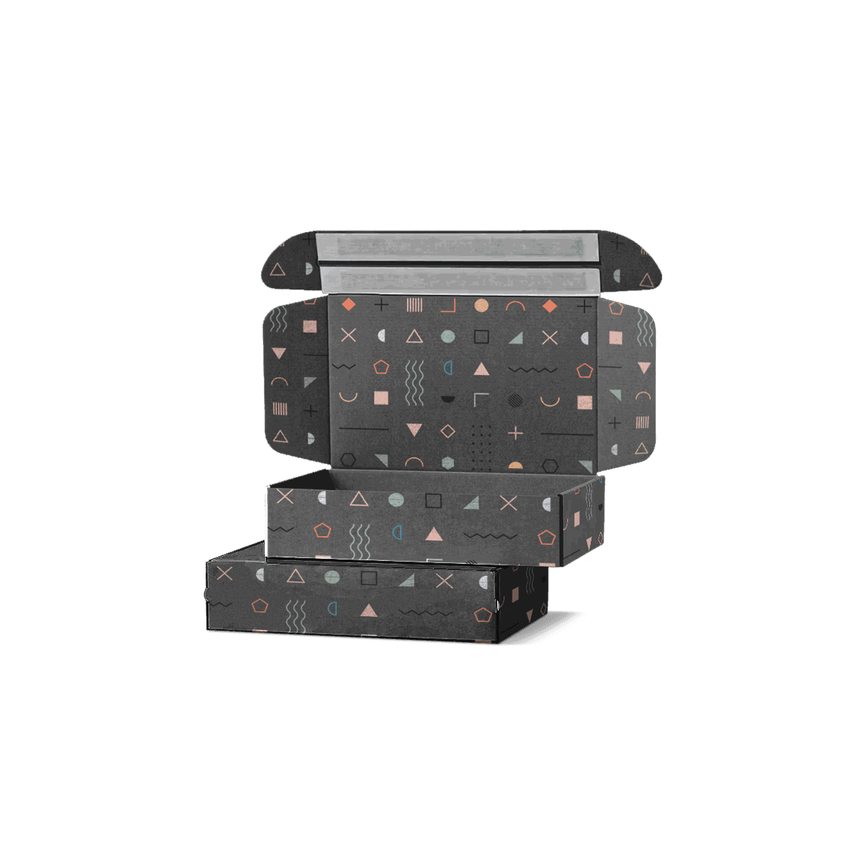
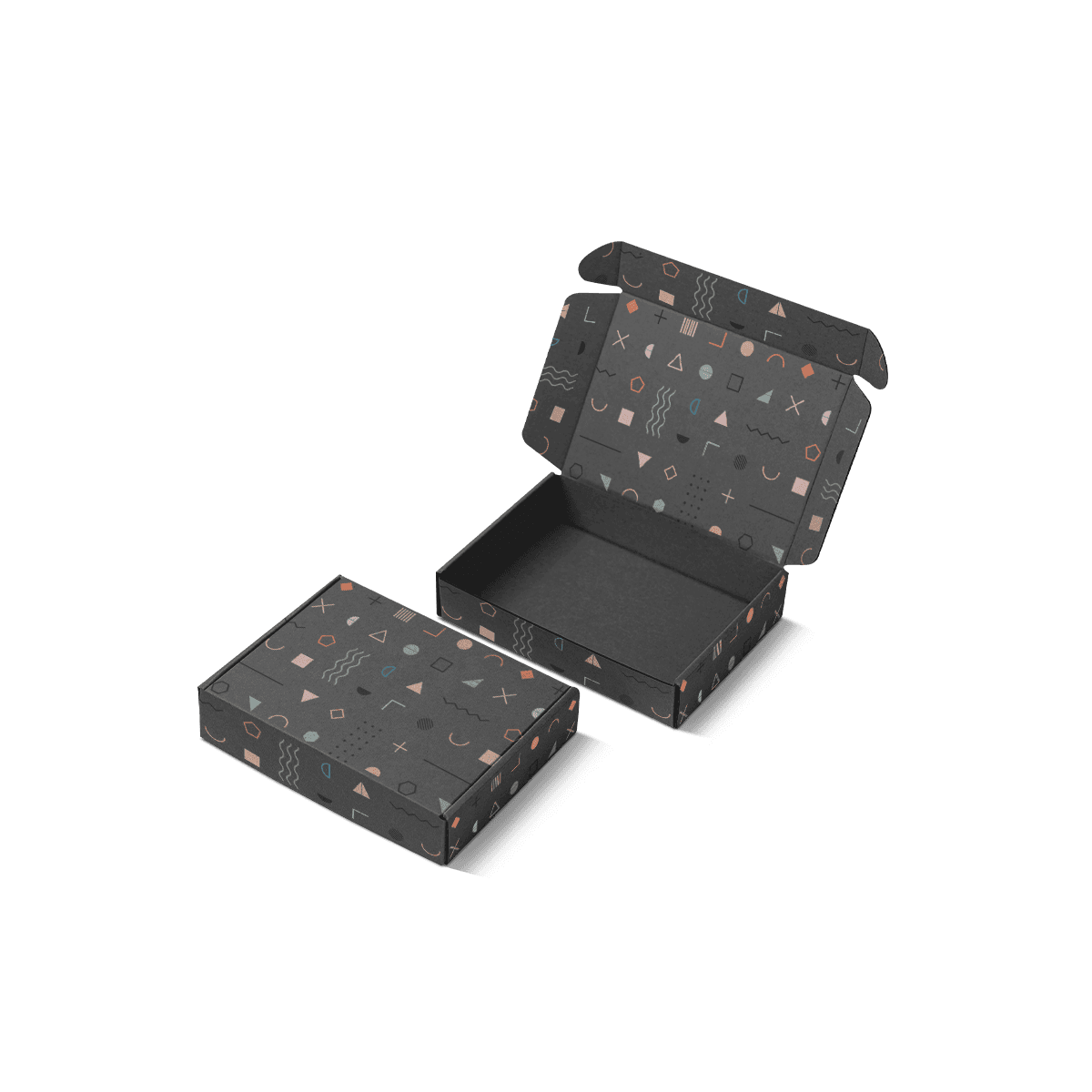
Inside print has a different job. It can carry a welcome line, instructions, campaign graphic or secondary brand message that appears only after opening.

The interior does not need to duplicate the exterior design.

For corrugated shipping packs, Printed Branded Mailers are the more specific structural choice when the shipping mailer itself is the primary branded surface.

Product-Level Identity

Individual cartons can carry product names, variants and required sales copy while still borrowing the visual rules of the outer packaging.

Printing method, artwork reproduction and repeat print consistency often determine the specification for custom printed boxes.

Color Changes With the Substrate

A brand color does not exist independently of the material beneath it.

The same artwork can reproduce differently on a bright white liner, natural kraft surface, coated paperboard or wrapped rigid box. That matters when several packaging structures need to feel visually connected.

A saturated blue printed on white stock may appear cleaner and brighter than the same ink treatment on brown kraft. Fine pastel artwork can lose contrast on a darker natural surface. Large dark areas may also make surface wear more noticeable on a box that travels through parcel handling.

Choose the substrate and print approach together.

For brands where one shade is central to recognition, CMYK and Pantone printing should be evaluated before multiple packaging SKUs enter production.

CMYK suits full-color imagery, gradients and artwork using many colors. Pantone spot colors can be valuable when a specific brand shade requires tighter control.

Neither method fixes poor artwork preparation or inconsistent material choices.

If two boxes are expected to look closely matched, record the stock, liner and print specification rather than approving color only from a screen.

Scale Artwork, Not Just the Logo

One common branding mistake appears when a successful design from one box is simply enlarged or reduced for every other size.

The result can feel wrong even when every graphic element is technically present.

Imagine an e-commerce brand using three mailers: a compact accessory box, a medium apparel mailer and a larger multi-product box. On the medium box, a 4-inch wordmark may feel balanced. Scaling that mark proportionally onto the smallest box can crowd the lid. Applying the same ratio to the largest box can leave too much empty space around it.

The fix is not three unrelated designs.

Create rules for logo scale, margins, artwork density and secondary graphics that respond to panel size. The visual relationship stays consistent even though the measurements change.

This approach also works when custom product packaging requires different structures around products with very different dimensions.

A packaging system should preserve recognition without pretending every box has the same canvas.

Structure Changes the Brand Experience

Branding is experienced through opening, holding and unpacking as well as through print.

A corrugated mailer communicates differently from a folding carton or rigid presentation box even when they carry the same artwork.

Custom mailer boxes suit direct shipping when the outer pack can carry the brand while protecting the order.

Folding cartons make more sense for lighter product-level packaging, retail units and secondary cartons that may travel inside another shipper.

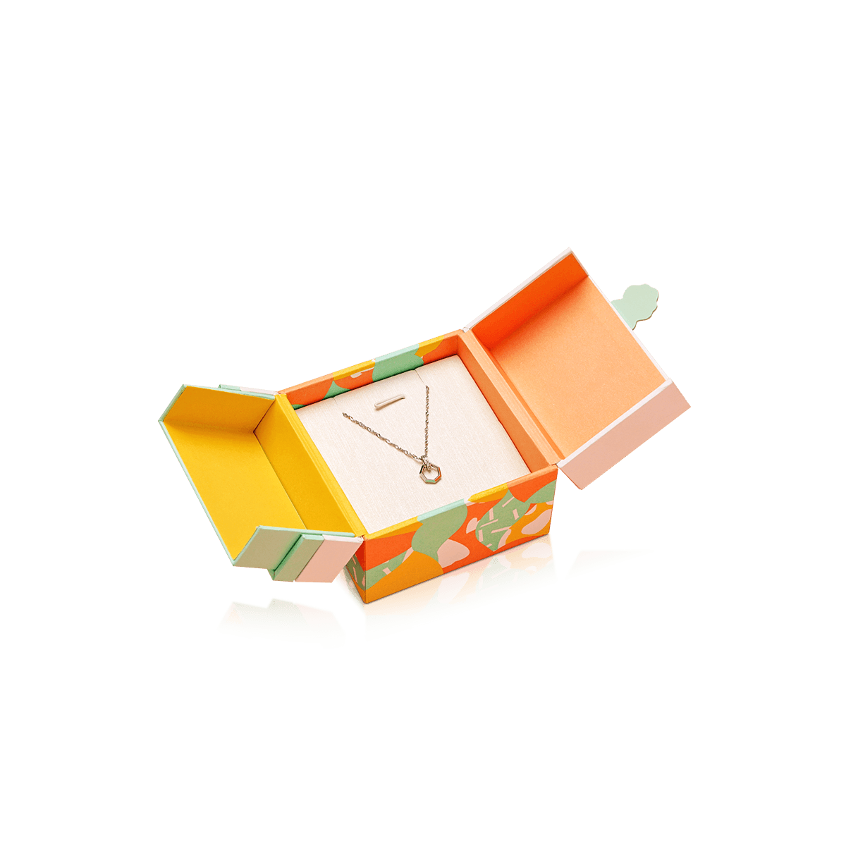
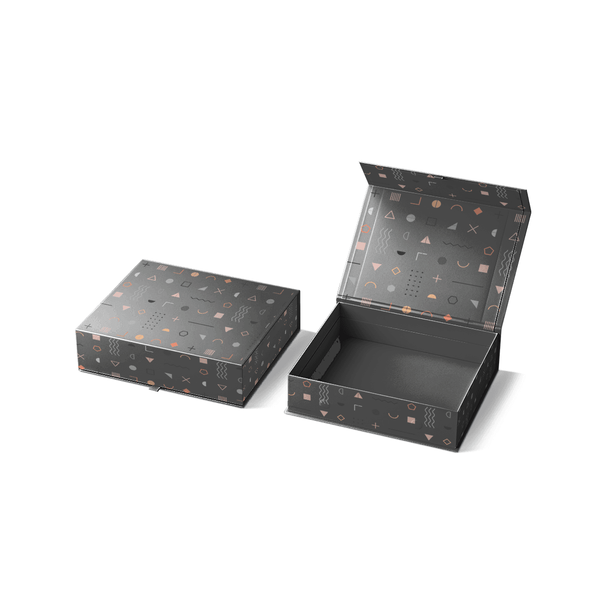
Custom rigid boxes shift the experience toward presentation, gifting and higher-value products where the box itself may remain with the customer.

Do not judge these structures only by how much printing they accept.

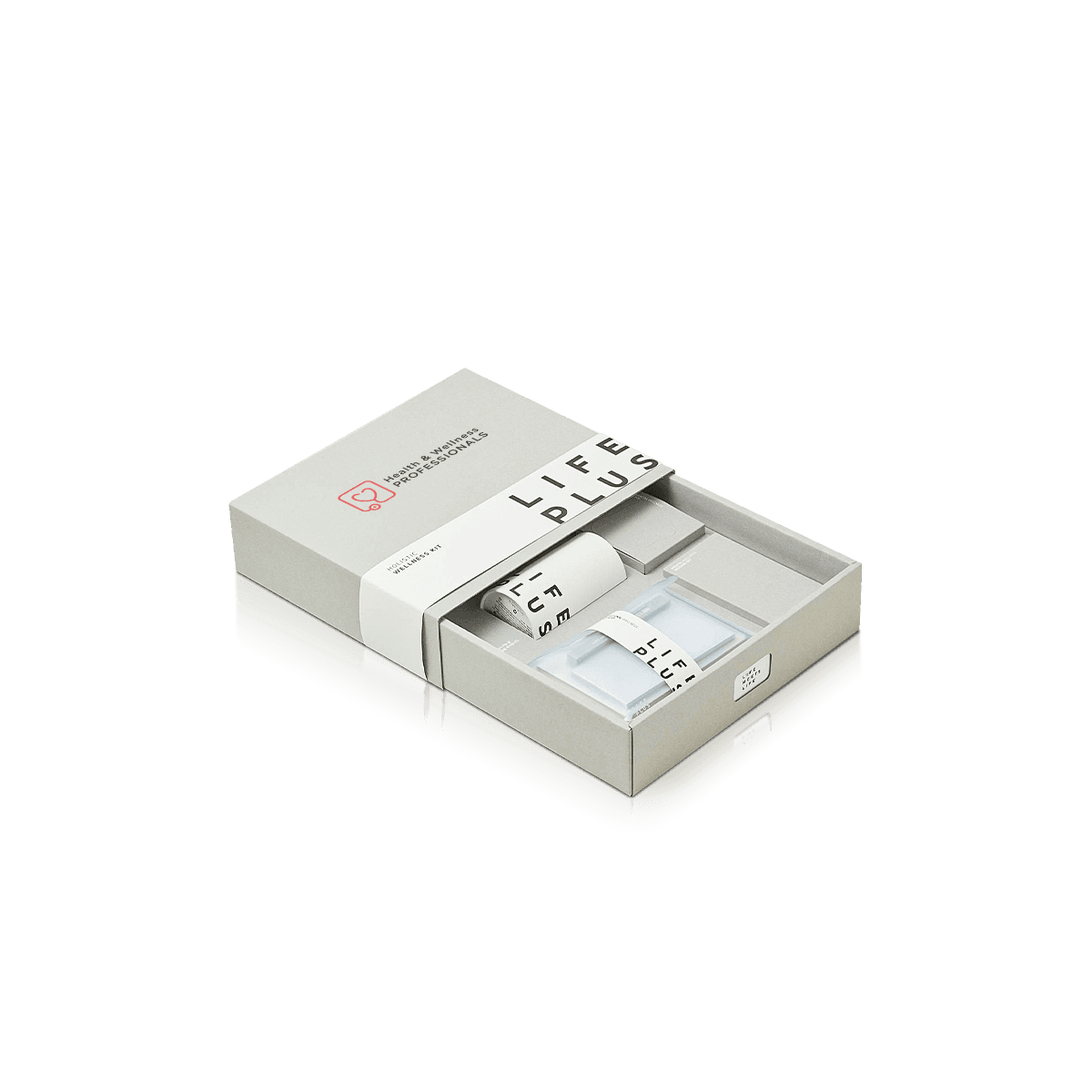
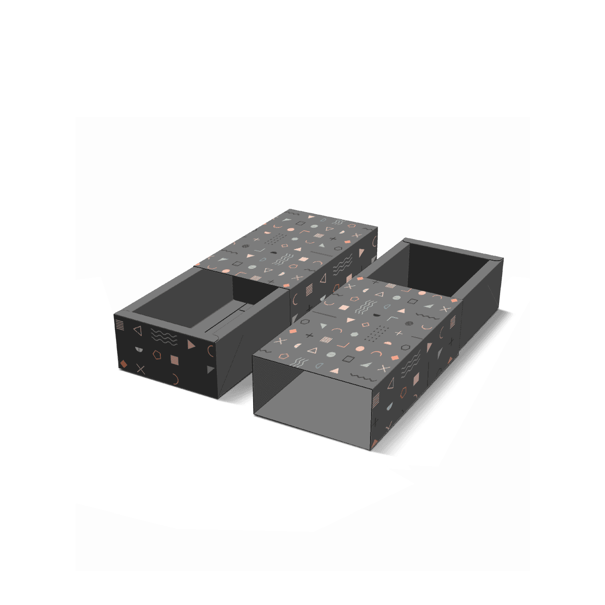
Opening motion matters. A tuck-front mailer reveals a large inner lid. A drawer box creates a slower sliding reveal. A two-piece rigid box separates lid and base. A folding carton usually puts more emphasis on the product graphics before opening.

Brand artwork should use those physical behaviors rather than sit on top of them.

Dielines Control Visual Continuity

A dieline determines where every graphic element meets a cut, fold, tuck or glued edge.

Ignoring those mechanics can make a strong flat design look poorly aligned once the box is assembled.

A stripe that appears continuous across two panels needs to account for the crease between them. Typography near a fold may distort visually. Artwork on a dust flap may disappear entirely after assembly. Inside graphics may need to be rotated on the flat file so they read correctly after the box opens.

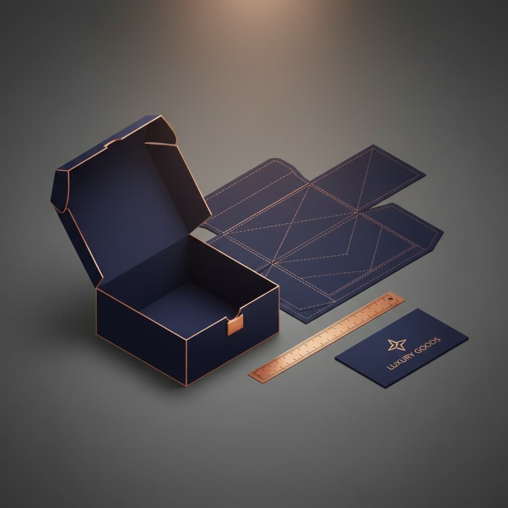
Once dimensions and structure are settled, the dieline generator can establish the panel layout before final artwork is placed.

Keep logos and important copy inside safe areas. Extend background artwork through bleed areas where required. Check panel orientation instead of assuming every face points in the same direction on the flat file.

Free design and dieline support can help resolve these issues before production. A free 3D mockup also makes it easier to review how artwork moves from the flat dieline into the assembled box.

A 3D preview validates visual placement. A physical custom sample is still the stronger check when board feel, finish, fit or physical opening behavior matters. Fully custom pre-production samples can be arranged as paid samples, while free sample examples of previous work can help assess general construction and print quality.

Finishes Need a Hierarchy

Finishes should strengthen the identity already present in the artwork.

If the package requires several special effects before the brand feels recognizable, the underlying visual system may be doing too little work.

Matte and gloss finishes change the overall surface character. Soft-touch can introduce a more tactile feel. Foil can isolate a logo or graphic detail. Embossing and debossing add physical relief. Spot UV can create targeted contrast against a different base finish.

The differences among packaging finishes matter most when deciding what should receive emphasis.

Use one process to solve one visual job.

A foil logo may already create enough contrast on a restrained rigid box. Adding spot UV, embossing and another metallic element may compete with it rather than improve it.

E-commerce shipping adds another constraint. Decorative surfaces on an outer shipper will experience more rubbing and handling than surfaces protected inside another carton.

Put expensive finish work where customers can appreciate it and where the packaging route allows it to survive.

SKU Systems Need Visual Logic

As a brand adds products, packaging can become harder to identify internally as well as externally.

A warehouse employee should be able to distinguish two box versions before opening a stack. A customer should be able to recognize the brand without confusing one variant for another.

A controlled variable system can solve both problems.

Keep the main identity stable, then assign product differences through one or two secondary elements such as:

  • a controlled color band
  • product name placement
  • an illustration field
  • a small variant mark
  • a side-panel code
  • insert or interior color

Avoid rebuilding the complete design for every SKU.

The fewer variables that change, the easier it becomes to control artwork approvals and reorders.

This is particularly important when the same product line uses several dimensions. Packaging files should identify the correct structure, dimensions, artwork version and product SKU clearly enough that a reorder does not depend on somebody remembering which PDF was used last time.

Build the Economics Around Reuse

A branded packaging system becomes more efficient when structural decisions can serve more than one artwork cycle.

A permanent dieline can support seasonal graphics. The same mailer size can carry several product variants. A standard insert can sometimes accept different printed cards or sleeves.

This reduces the number of completely separate packaging specifications that have to be produced, stored and reordered.

Custom Packly starts US custom box orders from 100 units, which allows new brands or new packaging systems to begin without immediately committing to very large production volumes.

Once the main brand system is proven, bulk custom boxes can support higher quantities, warehousing and scheduled deliveries as packaging demand grows.

US production and free shipping support domestic supply, with a standard 4–6 day turnaround after final artwork and specifications are approved. Premium offset printing can support brand-heavy work where print quality and recurring color control matter. Complex structures, specialty materials or advanced finishes may require additional time.

When dimensions, quantity, substrate and print coverage are established, an instant custom packaging quote can be based on the actual branded specification rather than an undefined request for a “premium custom box.”

Brand Standards Should Reach Production

A normal brand manual may define logo spacing, typefaces and digital colors without saying anything about corrugated board, kraft stock, spot colors, coatings or inside print.

Packaging needs an additional production layer.

Record the decisions that affect the physical result:

  • approved box structure and dimensions
  • stock or corrugated specification
  • exterior and interior print areas
  • CMYK or Pantone values used in production
  • finish locations
  • approved artwork version
  • logo placement rules by box size
  • recurring blank zones for labels or operational marks

This does not need to become an oversized manual. It needs to be precise enough that a future production run can reproduce the same decisions.

For brands preparing a new system from scratch, packaging design that strengthens brand recognition starts with structure and product fit before decorative choices are finalized.

That order matters. Branding cannot compensate for a box that packs badly, ships inefficiently or fits the product poorly.

Let Each Box Keep Its Own Structure

A branded-box system should tell the next designer, buyer or production team what can change without forcing every package into the same physical template.

A new SKU can use a different box size without inventing a new visual identity. A seasonal campaign can introduce new artwork without moving the logo randomly. A retail carton and an e-commerce mailer can look different in structure while still belonging unmistakably to the same brand.

Keep the permanent cues limited enough to repeat reliably.

Give temporary campaign graphics defined places to change.

Then let each box structure do its own job.

That is how Custom Branded Boxes become a packaging system rather than a logo repeated across unrelated cartons.

FAQs

Because the box starts communicating before the product is even touched. Branded packaging gives one surface for logo visibility visual identity and product messaging instead of leaving the delivery looking anonymous.

Less usually performs better. A focused design with clear logo placement one or two strong visual elements and readable information often feels more polished than artwork spread across every panel.

Yes when board feel print finish insert fit or color accuracy will affect the launch. Sample kits and proofing are common steps for branded packaging because they help teams check real-world presentation before a larger run.

Standard E-commerce Boxes work when speed and basic fulfillment are the only goals. Custom Branded Boxes make more sense when repeat orders, gifting, influencer mailers or retail crossover packs need to look more recognizable and cohesive.

Often yes for corrugated mailers and shipping formats. Inside print can carry welcome messaging campaign graphics or instruction panels and leading US suppliers commonly offer inside printing on corrugated box styles.

Process

How it works

Your Packaging Journey, From Idea to Production and Delivery

01

Tell Us Your Specs

Custom packaging boxes

Tell Us Your Specs

Provide size, quantity, printing, and finishes.

02

Get a Fast Quote

Custom packaging boxes

Get a Fast Quote

Instant transparent pricing, no hidden fees.

03

Design and Approval

Custom packaging boxes

Design and Approval

Artwork checks, revisions, and final sign-off.

04

Produce

Custom packaging boxes

Produce

Expert manufacturing to meet deadlines.

05

Ship to Your Door

Custom packaging boxes

Ship to Your Door

Hassle-free, flexible delivery options.

Get Your Quote for Custom Branded Boxes

Share your product details, size, quantity and artwork needs. We’ll help choose the right packaging style and send a clear quote.