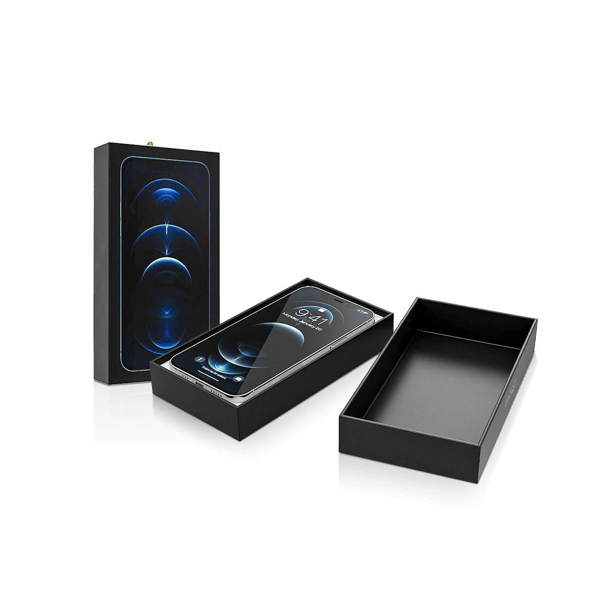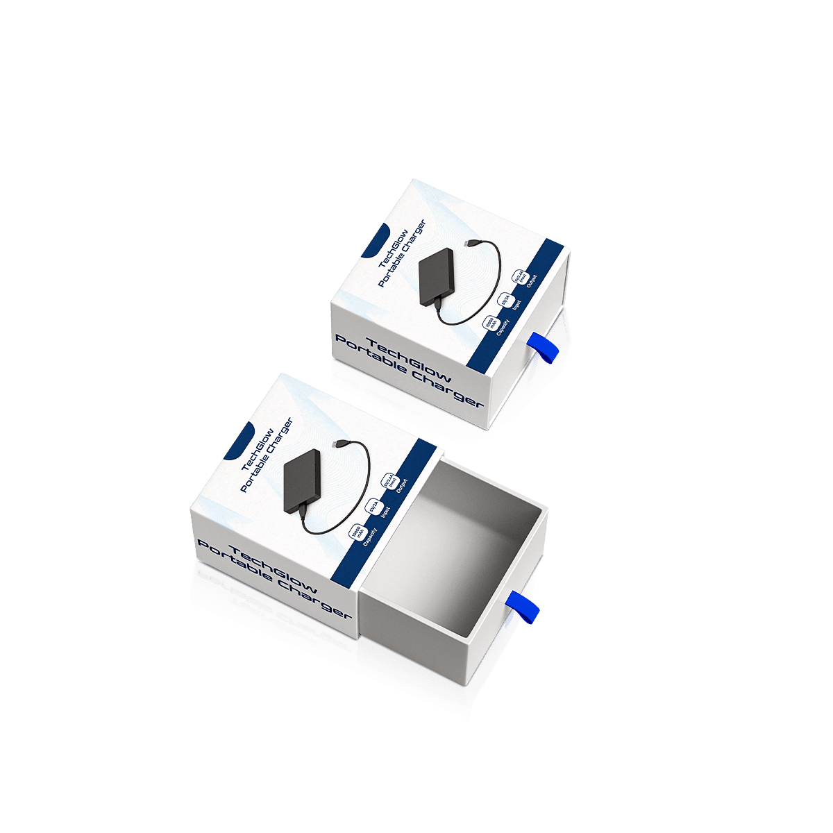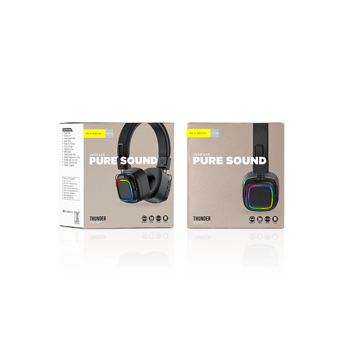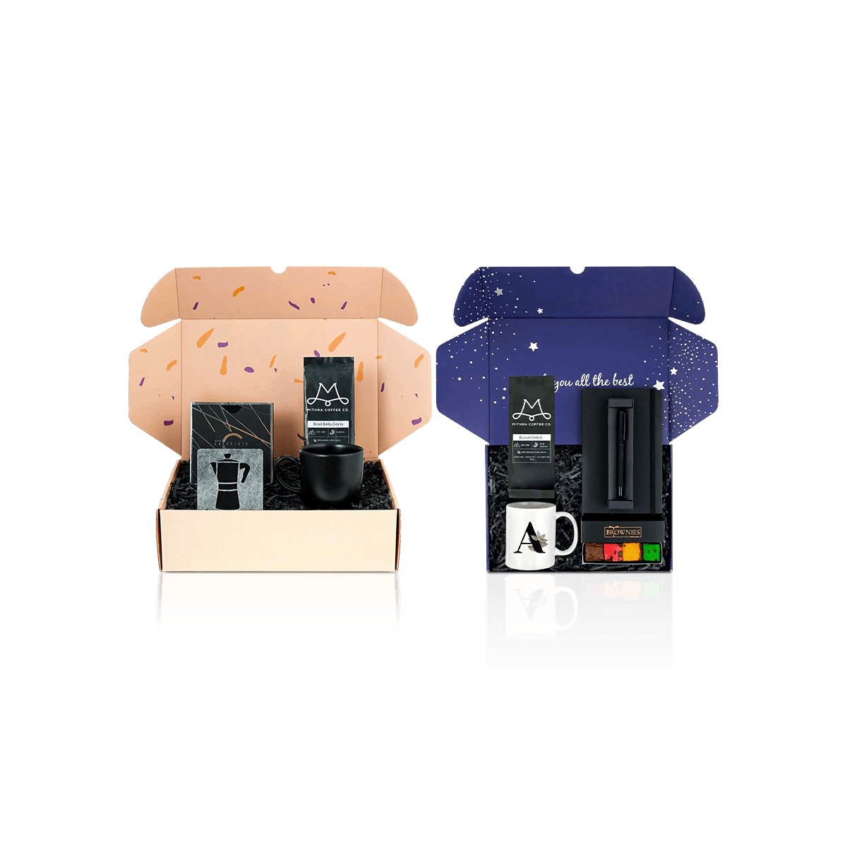
One Brand Line, Different Physical Shapes
Tech accessory brands often want a wall of products to look like one system. The problem is that the products inside those packs rarely behave alike.
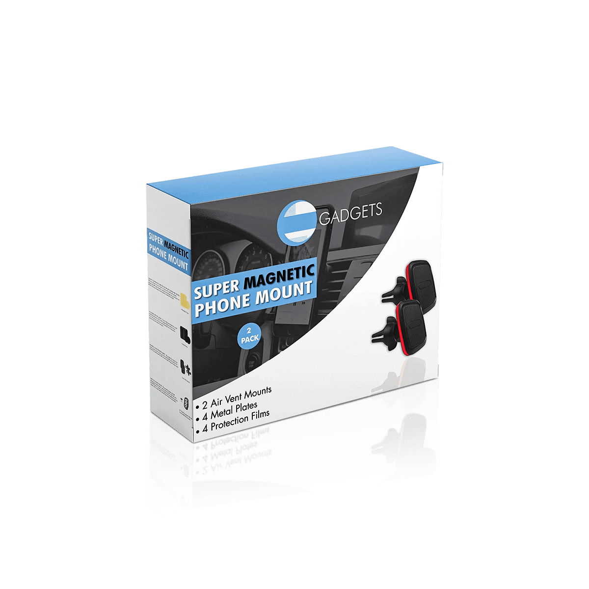
A compact USB hub is flat and relatively dense. A stylus is long and narrow. A phone mount may have an irregular body with projecting arms. A dongle occupies almost no space but may be sold with a short cable or adapter. A small desktop accessory kit can contain several unrelated shapes.
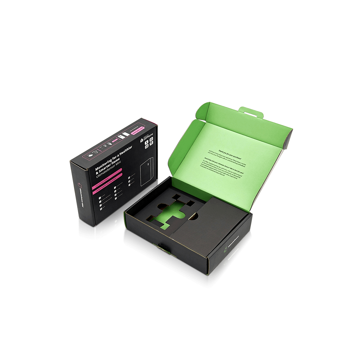
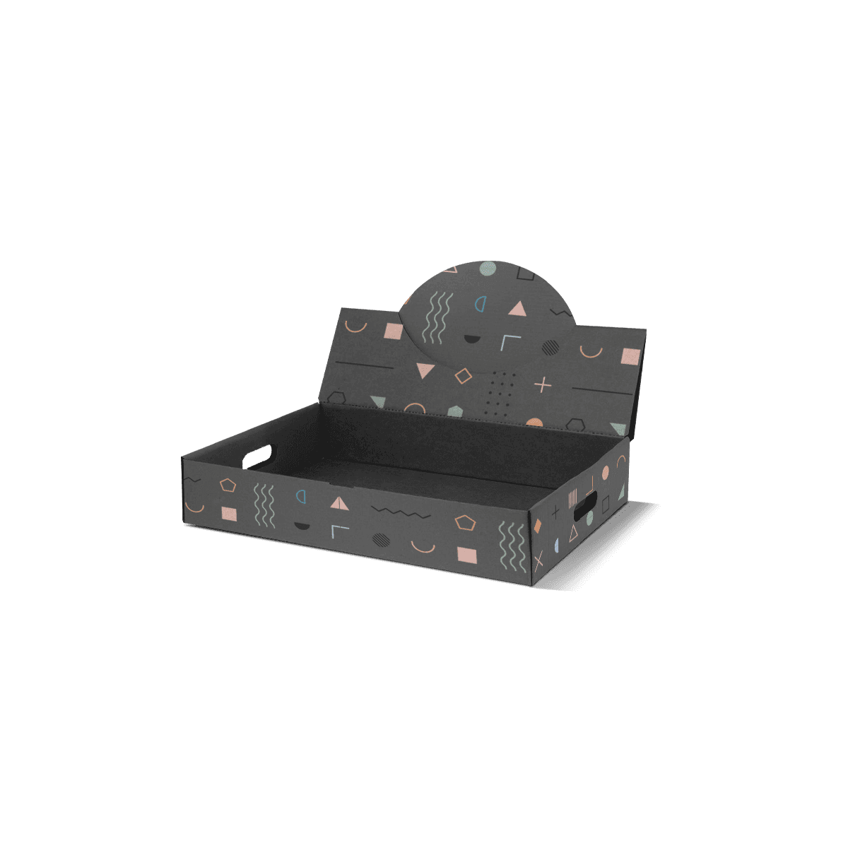
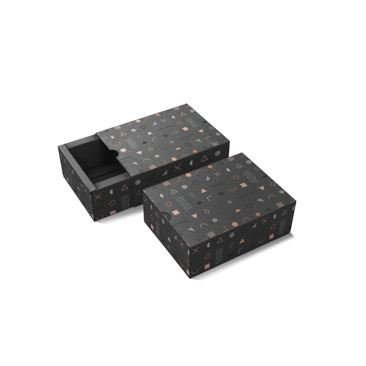
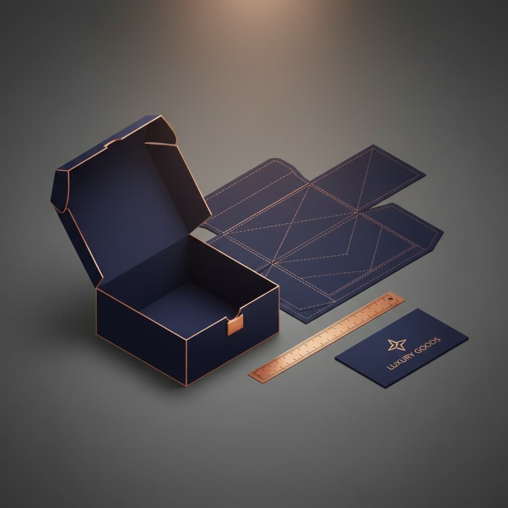
Custom Gadget Accessory Boxes solve that assortment problem. The goal is not to force every accessory into an identical carton. It is to create enough visual and structural consistency that the line belongs together while each product still gets the space and support it actually needs.
If the main item is a wall adapter, charger boxes should carry the plug-clearance and wattage decisions rather than forcing those requirements into a generic accessory pack.
If the product centers on earbuds or a charging case, earphone boxes handle audio-specific case, cable and tip organization more directly.
Gadget accessory packaging owns the space between those specialist products: mixed electronics add-ons that need to look coherent across a retail or e-commerce assortment.
Consistency Should Be Visible From the Outside
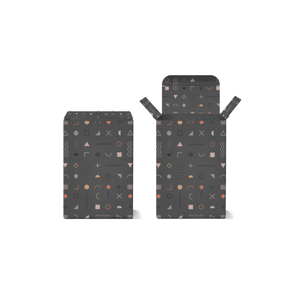
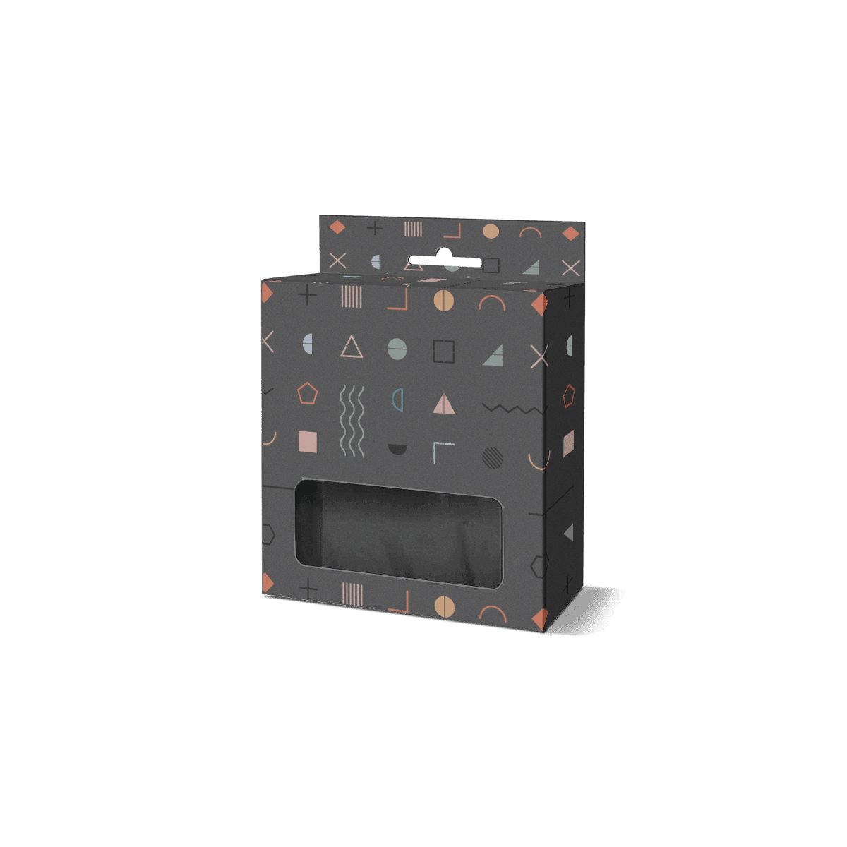
A brand can repeat a logo position, typography system, color architecture, specification zone or product-image treatment across several accessory SKUs.
Those repeated elements give the line visual order.
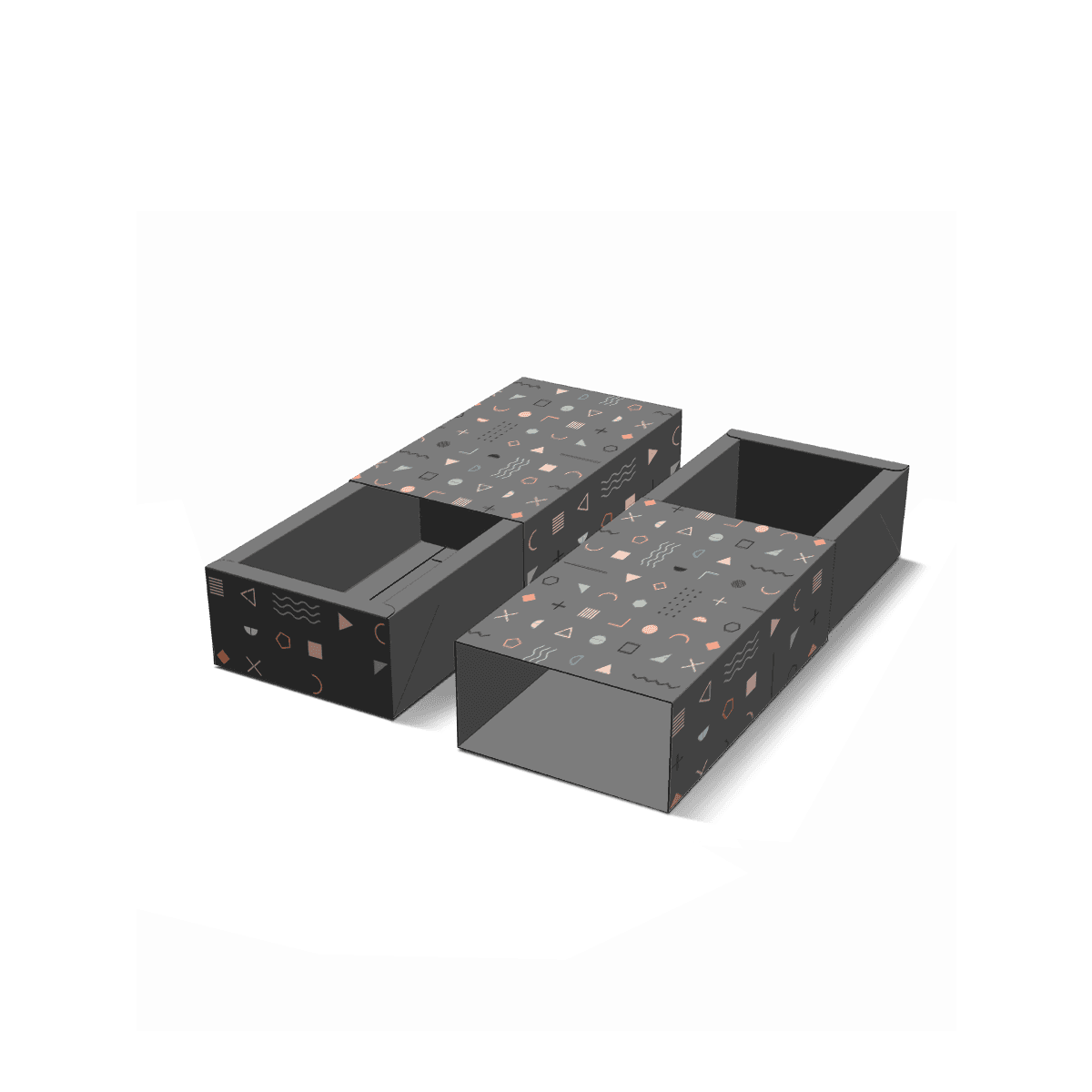
The structure underneath them can still change. A slim stylus carton does not need the same depth as a phone mount. A USB hub may need a shallow tray while a compact accessory bundle needs several compartments.
Consistency should come from the system customers see, not from wasting board so every product can occupy the same physical cavity.